HOME | DD
 Nephterys — Artemis
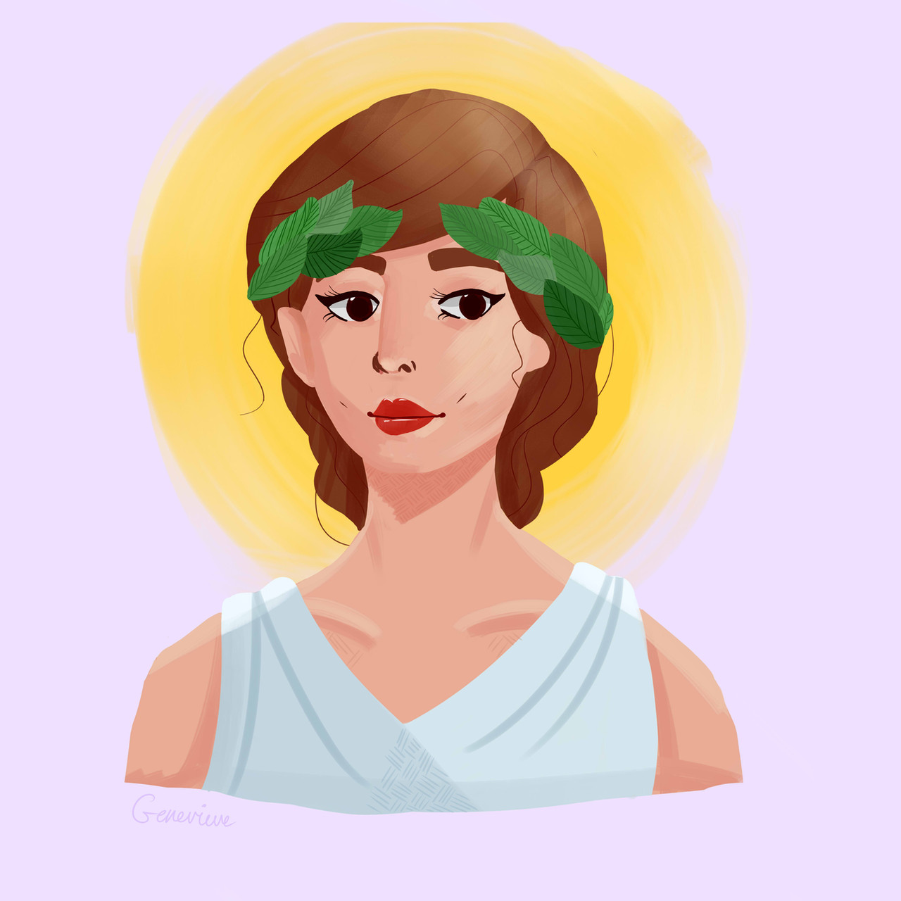
#artemis #diana #myart #goddessofhunt #greekgoddess #greekmythology
Published: 2019-03-24 01:59:05 +0000 UTC; Views: 941; Favourites: 43; Downloads: 2
Redirect to original
Description
this was a long study of how shading works. i stupidly didn't use any references for the shading(except 2 tumblr ''how to draw..'' posts). i know it's not that good, the face features are off, the colour palette could be better, the shading is kinda bad etc etc but i'm a little proud of it.so here's my goddess <3
Related content


Comments: 11

Yo. Here from ProjectComment to comment on your piece.
So, I'll start with the cons, just because I like to save the good things for last. The way you painted this is very remnsicent of pillow shading; that is to say, shading without an easily distinguishable light source. When you paint, the very first thing you will want to identify is where your light is coming from, so that you can correctly portray your lighter and darker color blends. It adds a sense of realism to the picture, somethin you want to aim for when imitating life in a medium such as art. Also, i believe you could stand to add more detail to your picture. It seems rather simplistic, with many areas of rest without much to look at as a whole, not including the general subject of the picture.
Now, you did well anatomy-wise. Your features line up well enough, though your shoulders do go downwards too quickly (and remember the collarbone). You have a good sense of color, and nothing is too highly or lowly saturated on the picture that it becomes an eyesore. You also have appealing brush strokes, very smooth and controlled.
Thats about it from me, signore. Keep practicing, and youll become a lot better.
👍: 0 ⏩: 1

thank you for the critique! also, you mentioned adding more details, could you tell me how I could improve that? I've tried to make the drawing as interesting as possible(well, as interesting as a study can be) but it does look quite boring.
I'm quite bad at making my drawings look realistic. and yes I definitely need to improve shading^^
I'll definitely keep the advice in mind. and I hope I'll become better someday <3
👍: 0 ⏩: 1
Just add more points of interest. Now its important to note that you shouldnt go overboard with it, and too much noise in one design can make up for a clunky picture thats both hard to draw and look at. You wanna strike a balance; expression in simplicity. A guy with a purple shirt and cargo shorts is just as interesting as the same guy with millions of bits and bobs, a trench coat and like 67 belts on his loop.
Brookes Eggleston is a good resource for character designers. Id say you look into him first.
👍: 0 ⏩: 1
Thanks for the advice!
👍: 0 ⏩: 0


")
