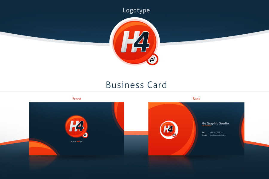
HOME | DD
 Nexert — Nexert Logotype Final - ID

Published: 2011-04-09 23:50:07 +0000 UTC; Views: 2245; Favourites: 32; Downloads: 111
Redirect to original
Description
Final Version of my LogotypeRelated content


Comments: 13

 (Smile)")


one note that i see as a mistake, the logo is clean and simple and has no obvious graphic symbols , it's a logotype, but as i tend to see a logo as a logo designer, the "x" bugs me.
it bugs me because the solid gray shape on the right of the x is an arrow weather you like it or not , and it points backwards....and that is a clash with the tagline that says next generation, see what i mean?
👍: 0 ⏩: 1

 (Wink)")


")
