HOME | DD
 nextmario — aero minimal WIP

Published: 2006-08-11 09:48:39 +0000 UTC; Views: 13479; Favourites: 14; Downloads: 4021
Redirect to original
Description
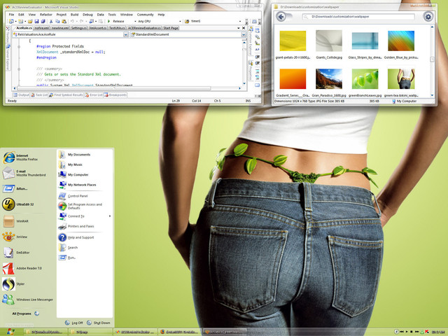
I will update the skin every 1-3 days as I find time to work on it. Download and give feedback. Please no mods/rips until I do an official release. I'd like to have a stable foundation before anyone customizes it.This is essentially an OPEN ART project to create a minimalistic aero interface that is open source, original and functional. I'm having a tough time meeting the functional part since transparency is a design element that's difficult to use effectively. I'm close to a pre-release. I should have done an opaque theme first, much less to worry about.
[This is ALL original work now, as you can see by my lousy widgets


 ]
]A note about minimalism. I consider Windows Classic theme to be as minimal as I would go, about the only thing I would change are the buttons. A good example of this is HmmXP which I still use. Some styles are too minimal where visual indicators like borders aren't distinct or the active window is hard to find. Good GUI design takes all of these into consideration. I'm certainly no expert in GUI design. I know what doesn't work for me. I strive for simplicity and usability.
[8/12]
Didn't start work on start panel yet. I wanted to be sure I liked the main window first as I will be using elements from there on the start panel. Added some inside roundness and applish active window.
Here's an early design for start panel: [link]
Not worthy of it's own screenshot yet. Will not be doing compact version


 It's open source, so maybe others will mod it.
[8/13]
More tweaks. Min/max/close buttons smaller. Not so much for close, I like its size to let in background. Start panel is almost done. Will redo separators and add a glyph for "All Programs". Still haven't figure out how to render the title bar text better. SkinStudio is so finicky.
[8/15]
Added shadows. Took a step backwards this weekend. Started from scratch instead of overlaying a theme I was given permission to use. All work will be original work, so there will be no open source issues.
[8/18]
Been busy with that overrated thing called work. Well I tried to work on it a little bit tonight and SkinStudio is completely hosed. It doesn't recognize half the properties of my skin! It just stopped working. I even opened skins it came with and the properties for those a re screwed up. Aaaaaaaaaaargh! I'm assuming it's something related to the last update I did a few days ago. It doesn't make sense since there was no update SkinStudio.
[8/19]
Don't have much time to work on it today. I changed the scrollbars. Maybe find time tomorrow to finish this up and have a pre-release.
Added all grippers, reworked start panel to match substyles, added Luna Blue substyle, close to limited release!
[8/23]
I haven't had much time to work on this, so I'll let you guys download what I've got. This is very much a work in progress. Since it's open source, I might as well let you guys try it out and give me feedback. Please give me feedback.
You must have Segoe UI font to use preview. I didn't add any substyles using the the more transparent, reflective inactive windows yet. The next preview will have them.
[8/24]
You asked for it, here's what I was saving for later. Blinding white, color-vacuum black, luna blue and wtf wood. Shadows, etc.
Wood is dead


 Someone wanted pink. These are the final colors: black, white, blue and pink. I'll start to concentrate on the inside widgets.
Tip: If you want shiny, use a dark background with the white substyle.
[8/25]
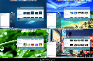
It's inevitable, so before anyone asks I made a glass substyle. I'm not really into 'glass' themes but I can see the attraction. I still use luna blue and starting to like black.
-
I reworked the glass substyle. The first one was awful.
[8/26]
Added just a touch of bling to the start panel. Changed the taskbar background, the reflective arcs were giving a bubbling effect on dark backgrounds.
-
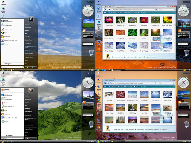
Paid some attention to white. The inactive window is a more translucent white. Originally, I wasn't going to do a glass substyle so I was using a very transparent inactive window for the white. Anyway, take a look. I actually like the white now. If used with milk or mac'ish icons it would be a clean desktop.
-
Changed buttons, up/down left/right spin, tabs, grid headers, start panel hilite, progress bar. Can't figure out how to skin menus on applications.
[8/27]
Changed menu hilites, scroll bars, sliders, probably other things I forgot about. I'm closer to a beta than I thought.
Related content
Comments: 66

Point taken on the inactive title. Will likely change to dark gray almost black on white blurring. Needs to be diferent than active title which is black.
I really need two styles-one for light backgrouds (black text) and one for dark backgrounds (white text).
👍: 0 ⏩: 0

You can thank transparency for the m/m/c buttons. They used to be subtle but since the caption uses transparency as well, they were hard to see. I might reduce them in size or maybe go with a lighter color. It's on my to do list before any kind of release.
👍: 0 ⏩: 0

May I get a poll of which screen resolutions most of you use? I"m guessing 1024x768.
👍: 0 ⏩: 1

nextmario;
1280x1024 for me
👍: 0 ⏩: 0

...just thoughts
Consider making scrollbar thinner; maybe a 14 --- perhaps use a design similar to Nun for even greater minimalism --- I personally think Vista's thumb grooves look cheesy but that's just me 
Soften tabs with slight button style shape; I know you are shooting for minimal but a touch of style here goes a long way
Maybe reduce m/m/c buttons one level or two to make less... something I dunno...just less
Have you played around with a small radius on the corners?
...just thoughts; thanks for sharing your talent!
👍: 0 ⏩: 2

Nun doesn't work for me. It's too minimal.
Haven't started on the internal window stuff yet. The stuff like buttons, tabs you see are Jemaho's. I'll focus on those after the start panel. I'll keep your comments in mind.
m/m/c. I usually work at 1600x 1200 and when I did screenshots at 1024x768, I realized how bold they looked. I was waiting for someone to confirm this. This will likely change.
I probably will not go with any rounded corners. I see the main style being the basic version. I hope others will create slight variations of it since it's open source so I can work on my next theme which is alreaedy brewing in my head.
👍: 0 ⏩: 0

The reason I chose transparency is there are so many good opaque visual styles: Luna Element, XPMC, ClearLooks, Royal Element, etc. I wanted a challenge. I also decided not to use constant transparency as the end result seems washed out to me not really intended.
I agree somewhat that transparency and minimalism may not go together.Transparency doesn't work that well when there are many windows open, one of the reasons I do not use Vista skins. I'm a software developer and I usually have many code windows open. If a transparent border overlays a window and you multiply that by many windows the desktop is a mess; too easy to click on the wrong window. I'm considering more contrast between the active and inactive window.
I do not mind transparency on the taskbar. Windows do not overlap it and the background comes through to blend in with a nice wallpaper. Same with the start panel. I'll provide a screenshot of the start panel later today. I'm still working on it but what I have in mind will be aesthetically pleasing.
I'm not sure if I'll meet my goals but believe me a transparent theme is much harder to get right than an opaque theme. I tried many, many color combinations and still not satisified. I also tried countless variations in the alpha channel. Had I done an opaque theme I would have already moved on.
All PSDs and images will be provided. It will be easy to create a plain visual style from this.
👍: 0 ⏩: 0

i'd say: keep the transparency the way it is
can't wait to see this thing released
👍: 0 ⏩: 0

wow...i like the transculent glass works...very perfect and outstanding...it look like in a crystal environment...if the border make to crystal clear will make it more crystalised look...
👍: 0 ⏩: 1

Sorry the border will not get any more crystal for the main style. ISee my comments about transparency. I know some of you guys like more transparency and I will create a separate sub style after I feel good about the main style
👍: 0 ⏩: 0

I personally like very much the skin, above all the minimize, maximize & button of closing windows.
It would interest however me to see the start menu.
For the rest I believe that it would be more difficulty to make a minimalistic skin not transparent .
Maurice.
👍: 0 ⏩: 0

I like it! But I think it would make a great minimalistic skin *without* the transparency of the window borders. They look somewhat misplaced.
👍: 0 ⏩: 0


