HOME | DD
 nextmario — pico tea WIP - almost BETA

Published: 2006-09-02 21:26:10 +0000 UTC; Views: 10518; Favourites: 9; Downloads: 1628
Redirect to original
Description
This is now BETA, download here [link]RECOMMENDED accessories:
- Synergy Classic for Winamp by ~Ianwoollam [link]
For this theme to look right,
Get Segoe UI font. I don't distribute copyrighted material. There are many skins which distribute this.
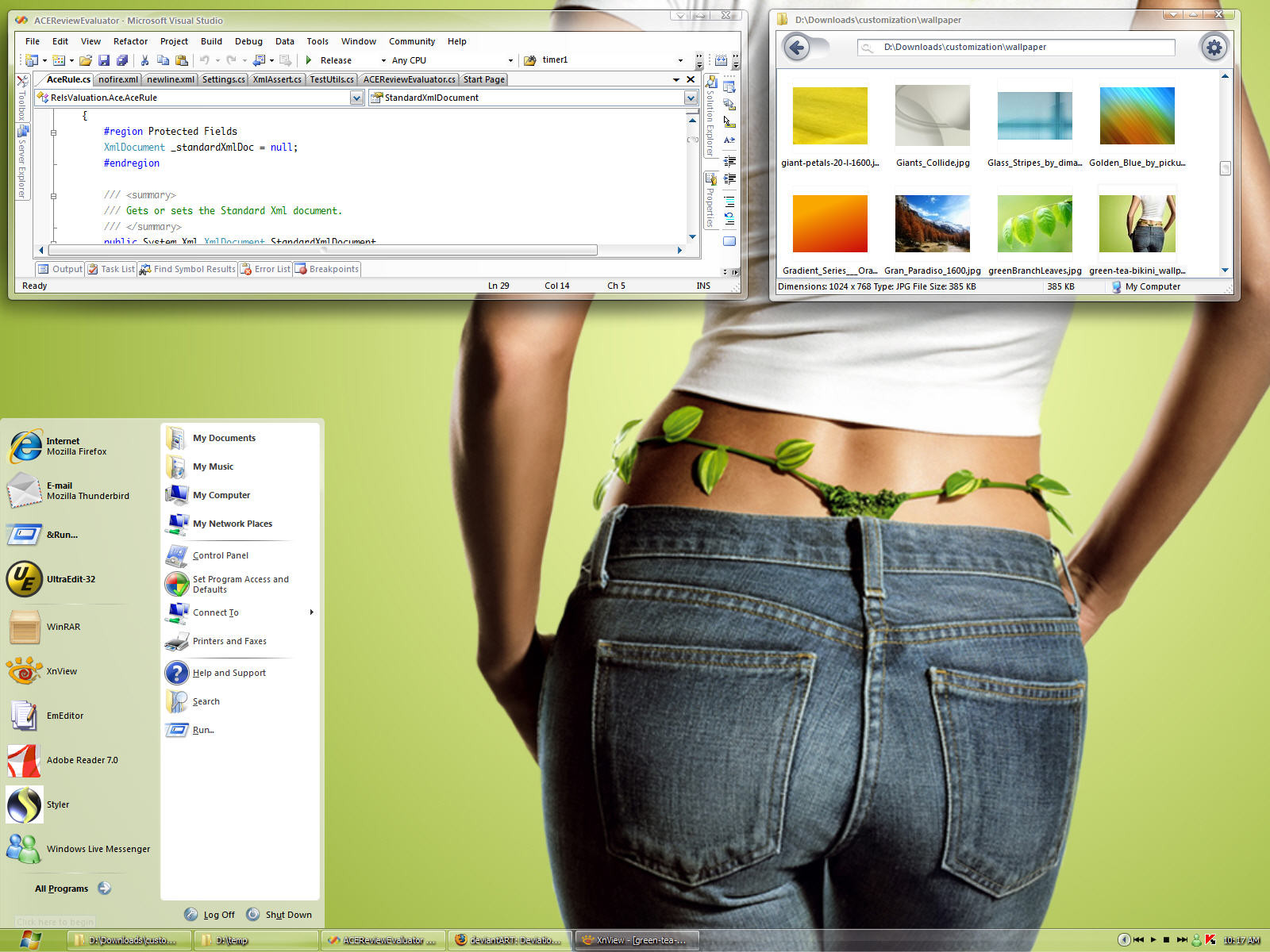
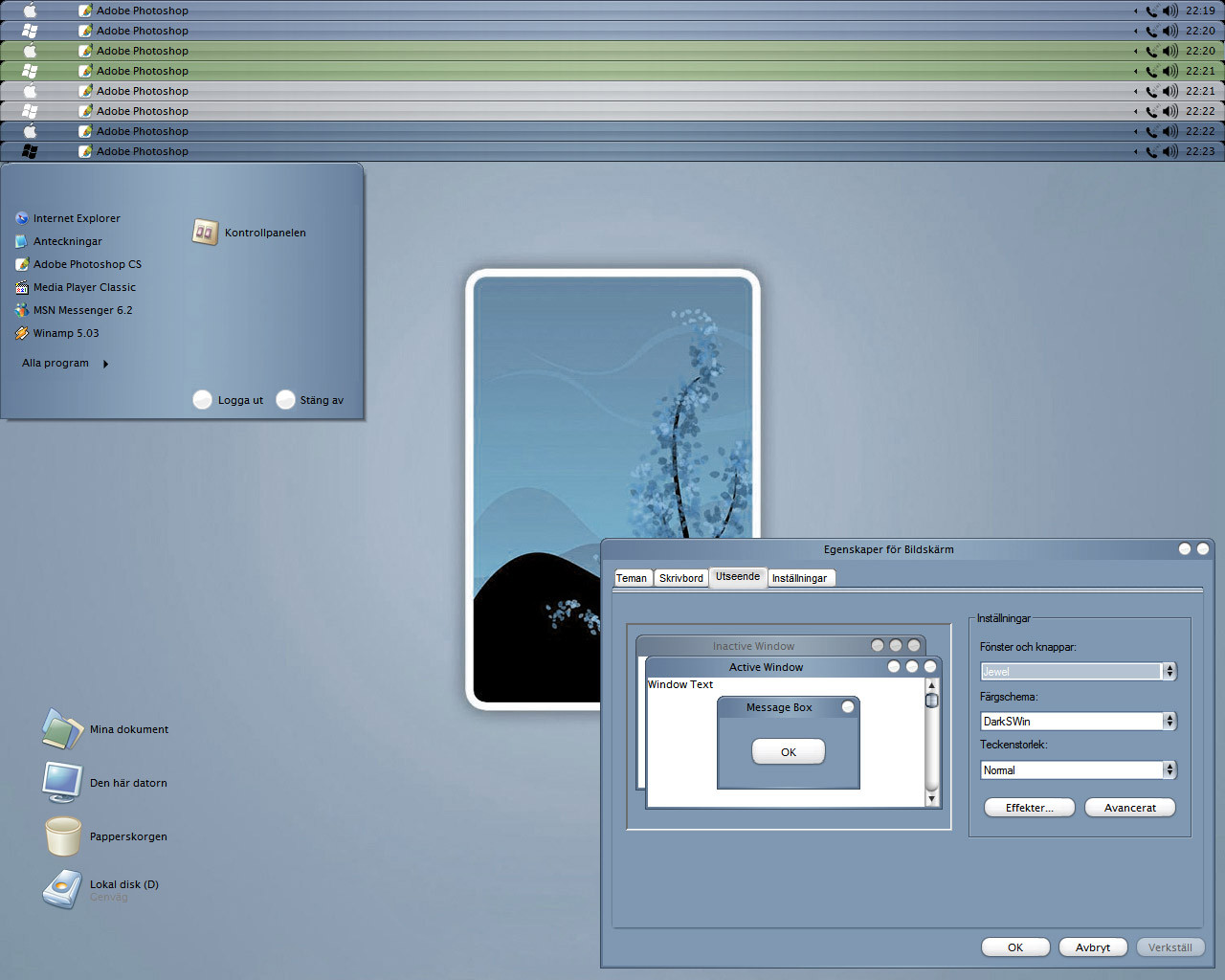
This is another attempt to make a clean theme void of all the bling found in most window blinds skins. It's called pico, thinner than nano
 (Smile)") The windows are flat! I tried to remove as much of 3d effects in Windows XP. Again, this will be open source but not yet. This is an offshoot of my previous aero minimal theme. I didn't do aero minimal justice since I created too many substyles, each worthy of its own theme.
The windows are flat! I tried to remove as much of 3d effects in Windows XP. Again, this will be open source but not yet. This is an offshoot of my previous aero minimal theme. I didn't do aero minimal justice since I created too many substyles, each worthy of its own theme.I don't think I'll be able to make this ultra clean. Window applications rely too much on the shadow colors specified in system. The reason why Apple interfaces work well is because they have clean, simple lines and lack all the 3d lines, separators found everywhere in XP. It's not getting any better with Vista. The only way around it is to create darker themes where the main color draws your attention. Something which I can't do with white. Unlike some minimal skins, I will not create a skin at the expense of usability.
[9/02]
* removed border around combo box drop-down button
* increased opacity around inactive window's min/max/close buttons. buttons were
fading into dark/green backrounds
* decreased inactive title font to 12 pt
* mdi button glyphs (cannot skin complete button, aaargh)
* tweaked scrollbars
* logoff/shutdown button to tea colors (can't make them hover)
* centered vert logoff/shutdown buttons
* grippers tea color
* styler toolbar
Let me know if the styler toolbar is too small. I'm a software developer so I like maximum usable area for coding.
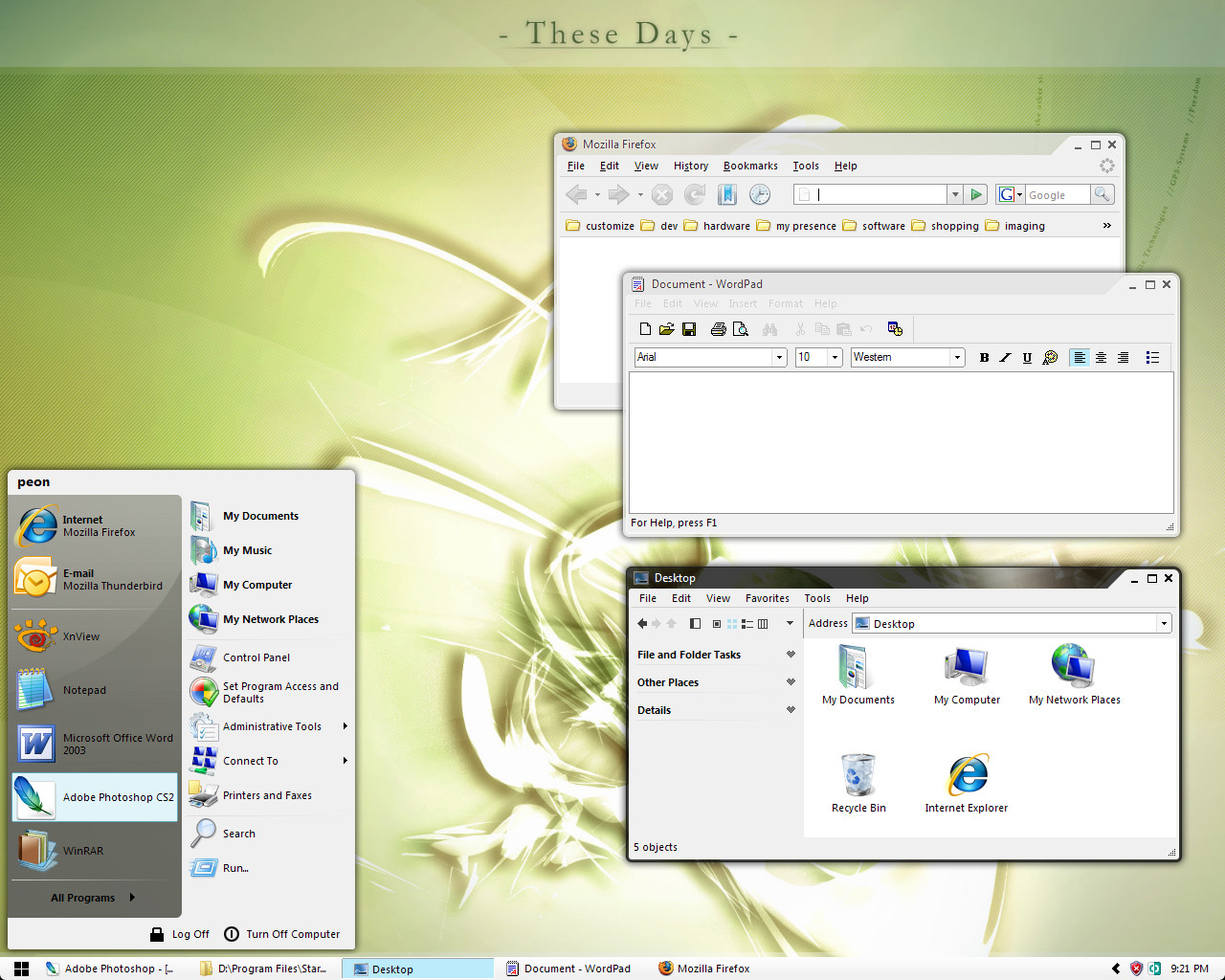
[9/03]
* improved styler toolbar, changed some icon glyphs, added new folder button
too much of a good thing is bad. i went overboard with the green. having less green has more impact.
* changed most glyphs that were green to black.
* changed styler
picoized even more
* removed borders on toolbars, menus
* taskbar gripper
* start panel separator
* all programs glyph
hmmm, i need to put back the border that separates menus/tool bars. Visual Studio 2005, my bread and butter app, uses it to outline controls. will be adding borders back in next preview. not so pico
")
* re-added borders
* active opaque default
* minor tweaks to styler toolbar
i'm working on a minimal shellstyle for this
* scrollbar normal to green
[9/4]
* 3px glass trim as taskbar (like original)
* added two substyles
- complementery color, to aid finding active window (white and glass is confusing with lots of windows open)
- green
* sunken edit on styler bar
* working on MDI windows
* other tweaks, lost my notes
[9/5]
* better spacing, alignment of controls on windows
* more white space at the top, feels roomier
* shaded styler toolbar w/ more whitespace
- may create a simple version for cleaner effect
* yzdock for L R T B
* simplified icons in styler, i know not much but i can't stand loose ends
Close to BETA
[9/8]
* skinned MDI windows/buttons
* skinned toolbar window/buttons
* slight glow on buttons
* transparent application icon
* changed a few on styler toolbar
* other tweaks i don't remember
* shellstyle (use at your own risk. WindowBlinds support for shellstyle sucks! It sometimes refuses to load a shellstyle. You have to switch unload Window Blinds, use a normal plain visual style, then reload WB. Sometimes you have to do this many times. Even if the shellstyle loads, WB might use a generic one whenever it feels like at any time!)
Related content


Comments: 30

can u share me the wall?
And by the way, nice work, if i still on XP, i will download it now
")
👍: 0 ⏩: 0

How do I change my look, from old silver Windows one to one like yours??
👍: 0 ⏩: 0

looks cool... but now i can hardly decide if i should use Aero Minimal or this one
 (Wink)")
👍: 0 ⏩: 1

thanks. aero minimal isn't complete but works well enough. i quickly realized each substyle needed its own theme. pico tea will be more thorough. i'm using as my main theme for real work and will fix any aesthetic/usability issues i encounter. if you like green/white, it's an obvious choice.
👍: 0 ⏩: 1
yup
though i'm a red-lover, thus i recolored it accordingly for personal use
👍: 0 ⏩: 2
It will be open source soon. So, if the red looks nice, uplaod it. Other s may like the red better
👍: 0 ⏩: 1
maybe i'll do that
thanks for making the skin available as Open Source

👍: 0 ⏩: 1
No problem. Please wait until an official release though. The only reason is I want you to have a more stable foundation. Probably a week out. You've seen the official beta thread [link] ? It contains a few fixes you probably want.
👍: 0 ⏩: 1
yeah i saw it... right after i downloaded this here version
👍: 0 ⏩: 0
hmmm ... i was going to make a black/red theme next
👍: 0 ⏩: 0


Great work!But can you give us a version of top taskbar, if possible.
👍: 0 ⏩: 1
Just drag the taskbar to the top. It looks just as nice up there. Disregard the corners, I cheated. I created an imaging slicigng utility to slice my mockups. I slice the bottom of 3px glass trim substyle active window and use it as the top taskbar, dito for the bottom. That's why you can see a bit of a shadow around the corners.
👍: 0 ⏩: 0
i put the original taskbar with better proportions
👍: 0 ⏩: 0

Love the taskbar, very "top of the screen" friendly
*downloads*
👍: 0 ⏩: 1
The original taskbar had 3 px glass border. I haven't decided whether to go with the completely opaque white or glass yet. If it's opaque then it will be 3px smaller in height.
👍: 0 ⏩: 0

WOW, beautiful design, cant wait to install
+fav
👍: 0 ⏩: 1
thank you. it's a work in progress and screenshots always looks pretty. usability feedback is appreciated once you install it.
👍: 0 ⏩: 0
holy cow, that thing is huge! i'm even at 1600 x 1200. imho, that folder icon is a complete waste of space. gotta love Vista skins; eye candy at the expense of usable screen space. i do like the small task-oriented icons. if there are hooks for it in window blinds, i'll try to do something similiar in 'minimal' way.
👍: 0 ⏩: 1

I agree
I also think your right about not sacraficing usability. Most minimalistic styles aren't suitable to actually be 'used'
This however is a great style. Unfortunately I don't use Windowblinds so if you or someone can make a port of this, it would be appreciated.
")
👍: 0 ⏩: 0

It seems very nice but I wish you could make this skin and the previous one vista like in terms of the side bar in windows. The bar that includes the details and information of the current folder and etc. I'm hoping you could put that bar in the buttom horizentally if you understand my point
👍: 0 ⏩: 1
Are you referring to common tasks? I'm old-school and use the keyboard for almost everything except Photoshop. I have most of the graphical helpers turned off as it takes up screen space. I might implement your suggestion in this theme if you can do a screenshot and post it somewhere where I can get a better idea. imageshack.us is an easy way to post a screenie.
aero-min was just a foundation for my themes, and I will not be enhancing it anymore.
I am creating a minimal green tea Styler theme and mini-buttons to control WinAmp from the taskbar. I should have these ready within the day.
👍: 0 ⏩: 1
[link]
Here you go. I would like this type of bar (as thin as that one) on your skin and I would certainly use it. Keep doing this type of skin it's a very nice and appreciated change.
👍: 0 ⏩: 2
ok, this is done in a shellstyle. i'll see what i can do. something else to learn.
👍: 0 ⏩: 0
Is there a Vista skin for XP where those tasks are functional? If so, please provide link to style.
👍: 0 ⏩: 1
I just took the first one I could find.
[link]
👍: 0 ⏩: 0

Very minimal - you've succeeded quite well. I'm partial to green so it's an excellent color choice. I like the min/max/close buttons on this theme better than those on aero-min. I like it so far.
👍: 0 ⏩: 0