HOME | DD
 nichangell — ZACHATTAK

Published: 2007-11-17 00:40:53 +0000 UTC; Views: 1324; Favourites: 40; Downloads: 18
Redirect to original
Description
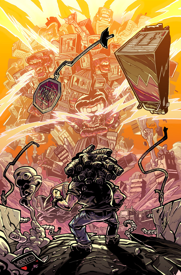
i really don't know if i like thisi think its something todo with the fact that because of all this gallery work ive been doing my mind is stuck in 'standalone picture' mode.
this being part of a story, not only that, a fight sequence means my mind cant get it.
thumbnailing 7STRING led to a want to do up one of my little sketches all proper like... this is like 40 pages into my planned epic but ive only drawn 8.
tell me what you honestly think
i know i like the background so if you dis that i'll kick you
been listening to roni size hence the name
Related content


Comments: 53

cheers dude
checkout the new one for perpsecto joyz
👍: 0 ⏩: 1


Hmm.. well, you see that background....
I kid, I like and I love the motion blurringness you got going, although I think maybe that dude is a bit too.. blocky/sharp in colour? Takes your eyes away from the guy with the string skills.
skills that kills
AHAHA I just noticed the loo role!
👍: 0 ⏩: 1
haha
string skills that kill
that mite have to be the title of the book
7STRING: string skills that kill
rad
👍: 0 ⏩: 0

cheers
thats my fave bit also
👍: 0 ⏩: 0

gnarly  (Smile)")
👍: 0 ⏩: 0
gnarly
👍: 0 ⏩: 1

Loving the background a lot!
I agree with some of the below comments; perhaps try moving your viewpoint to get a more interesting angle to show the movement more dramatically? I am very attached to that background though ")
👍: 0 ⏩: 1
cheers
i do believe you're right
👍: 0 ⏩: 0

I don't want to be a prick so if you don't want to read just don't...k....
I think you should change the angle if you want to make it more dynamic, it'll be hard (cause i've tried doing this and it blows), an stead of making it flat on try having zach hitting the bad guy towards the reader...if you don't know what i mean then tell me and i'll e-mail you,
Also the blackout line around zach needs to be a bit thinner or at least broken up as this is making him more fixed,
The backgrounds are flipping awsome and zach and crew are coming on....canni wait to see this,iof you need help then I'll try my best to help....
but i didn't realise how much work comics take...I've only done about 2 pages of mine and it needs alot of work.....also i like the notes....blammo and alls
👍: 0 ⏩: 1
yeah its mental innit
i appreciate everything you've said there and in fact have even started a mach 2 where the baddy is coming towards us so i do believe we is on the same wavelength
i really want to be well into this but i know theres so much work ahead
crazy shit
👍: 0 ⏩: 1
work is the shit....bring on the fun
👍: 0 ⏩: 1
fun is the work... shit on the bring
👍: 0 ⏩: 0

I think a dust cloud emanating from Zach's feet would be triple win.
👍: 0 ⏩: 1
hehe.... too right my man
i WILL get on that horse
👍: 0 ⏩: 0

xo i love how the trashcan goes flying. WHO WOULD THROW OUT A FULL ROLE OF TOILET PAPER ??? ..i mean..awesome pic :c.
👍: 0 ⏩: 1
LOL
you would if it was that scratchy stuff.... me? I GO FOR QUILTED
👍: 0 ⏩: 0

Zachs feet look tiny compared to the other guys. It's nice to see the gweeeeeblade in action xxxxxxx
👍: 0 ⏩: 1
GWEEEEEEEEEEEEEEEEEEEEEEEEEEEEEEEEEEEEEE EEEEEEEEEEEEEEEEEEEEEEXXXXXXX
👍: 0 ⏩: 0

I love the way the b/g buildings look like they have little window eyes looking around.
... maybe I've gone mad but thats the first impression I got.
👍: 0 ⏩: 1
hehe.... you may have gone mad
BUT I LIKE IT!
👍: 0 ⏩: 0

nevermind...the black character doesn't have elbow pads...just shoulder pads and knee pads, make those white.
👍: 0 ⏩: 0
5. The parts of the character that aren't black, make them pure white. That includes the knee pads, shoulds pads, and elbow pads. Also make the
👍: 0 ⏩: 0
I know how can fix this without moving any thing.
1. Notice the broken light pole? I see the circle around it, so color it in and show the light, make it a neon green color...very very bright, but still show the broken glass etc.
2. Make the pink and green music spark different shades of grey, but do it without going to black.
3. Make the guy's jacket match his shoes. Get rid of the blue and make it the same red as the shoes.
4. Make the orange and green patch on his pants red, but make the pants orange.
👍: 0 ⏩: 1
interesting points
i'll have a fiddle but the colours in these characters have been set down for years... id rather change other things before i changed colours.... but for a one of piece sake... i'll check it out
thank you
👍: 0 ⏩: 1
ur welcome..I try to be of any help I possibly can. I took highschool Gaphic Design for 2 years in a row where we studied color and contrast.....over and over again, before even moving on to doing actual assignments.
👍: 0 ⏩: 1

hey dude. awesome image, although perhaps a bit of foreshortening or summin? bring a bit of punch into it? not sure the side angle is doin justice to the action in the image.
but ultimatly it look wikid.
👍: 0 ⏩: 1
gotcha my man.... i am so getting on this horse
HOW DO I REPLY TO YOUR NOTE?
👍: 0 ⏩: 1
ha lol. erm im not sure. isnt there a reply button?? or perhaps u just have to write a new one. .... i did notice they had changed some things about it, hmmmm, ,,,,,
👍: 0 ⏩: 0

I'm with these guys. The pic could totally use some more dynamic elements.
Getting that, without changing the background, may require moving one of the characters into a different pose, or something.
Otherwise, ULTRA PERSPECTIVE GET!
👍: 0 ⏩: 1
im a gonna redraw my dude
PREPARE
👍: 0 ⏩: 1

I think it all looks very well drawn, but somehow a little static, like perhaps some dust coming rom the guy on the left's feet, to suggest that the impact has slid him back a bit, and I couldn't say what is was about the guy on the right, but something just makes him not look like he's taken out the lamp post. Like, don't take it badly, I think it looks awsome, everything is drawn awsome and your characters look brill, but there are a couple things that are missing that make them look like they aren't quite in your maticulously drawn background. Couldn't say what those things are though, unfortunately lol.
👍: 0 ⏩: 1
cool words
i kind of did go for the characters looking like they were stuck onto the bg, i like that cut out look
but you're right about the stuff
im gonna try something.....
👍: 0 ⏩: 1
maybe some thicker lines round the lamp post, so it looks on the same level as the guy who hit it?
👍: 0 ⏩: 0

I agree with the other person who said that there is a great sense of movement. I don't think it's static, but I also agree that your awesome angles aren't there as much. It might be cool to try drawing the same thing but from a different perspective. Great job all round!
👍: 0 ⏩: 1

Sorry to poop on the parade, but I think it may be a little wrong on the composition it doesn't have the lovely angles that you normally do which give that hyper exaggerated in a good way feel it's side by side streets of rage-esque makes ME have a more static feel, O O O maybe it's the portrait A4 ness maybe if you cropped off the top which isn't doing too much it would have a very nice long shot of him bllam-oi-ng him across the page? although then you'd lose your lovely background...slightly.
👍: 0 ⏩: 1
truuuuuu
i get what your saying... it think it is my over zealous protection of my background which has eaten up my dynamic
still... i want to redo it now with some awesome perspecto shit so thank you
liked the streets of rage analogy
helpful
👍: 0 ⏩: 0

cheers
i'll need more convincing tho....
👍: 0 ⏩: 0
awesome
glad you said that... i was afraid i had lost that somewhere in the inks
cheers
👍: 0 ⏩: 1

Oh no! It's wonderful
👍: 0 ⏩: 1
| Next =>