HOME | DD
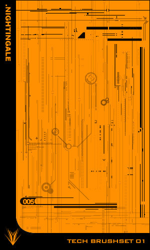
 Nightingale01 — Propellant.02

Published: 2004-07-05 11:49:15 +0000 UTC; Views: 723; Favourites: 25; Downloads: 249
Redirect to original
Description
I've been working on and off on this for a month. I'm not sure my self if it is finished or not. It started as something to keep me 'amused', you could say. Just something to kill time with. Perhaps I went a little far.
3 stocks were used, and two old renders.
Edit
Ignore the photographic specifications. Seems like a bug in dA.
Related content


Comments: 53

Orange orange!!! Heehee!! It looks like something taken from the top of a building... I lover your new renders.. They seem to looks more like actual odjects only a lot more sureal... It sort of makes me think that you see the world like this and want to show everyone...
👍: 0 ⏩: 0

ncie concept here  (Smile)")
 (Wink)")

👍: 0 ⏩: 0


the largest stock was taken with that camera. that is why it displays it.
great job.
👍: 0 ⏩: 0


nice renders man and nice bg pic as well, great 2d as always and i lvoe the color orange man..
👍: 0 ⏩: 0

its quite cool.... maybe you should add some other colors... but else i think its cool
👍: 0 ⏩: 0

kewl and structural look.
great renders.
like the brighter colors, too.
very kewl 2D designs as well.
nice work, man!
mP
👍: 0 ⏩: 0

OMG, this is just an instant 

👍: 0 ⏩: 0


Your 2D is god! i like the composition throughout the piece, but however, I'm not sure what the piece is expressing to me, I don't clearly see the concept...cause everything's so ....orange and blended in in the background, only the 2D stands out a lot and making it technicle. Not my fav. from you, but one of my fav. 2D from you.
I am actually kind of confused by this piece, I'm not sure what you're trying to say in it. Maybe you're confused too? (except for when you do the 2D) It's nice and all, but I'm not sure what you need on there, something's weird and I couldnt really tell, but 2D looks nice though. Maybe it's you stick a render in there with a construction site that didn't quite blend in. Cause only the abstract render with no shape in there....I'm not sure, but if I just take a look it's fine, not when you notice the details.
nice lighting though. I like it, don't get me wront it's just something....
👍: 0 ⏩: 1

I'm not trying to express anythng. I wanted something chaotic with all sort of randomness going on. I dunno, I just felt like trendwhoring it up the whazoo.
Thank you for your input, Sophie. I'll keep your points in mind the next time I'm doing somehting like this.
👍: 0 ⏩: 0

This is something very interesting I like much the way everything mix together perfectly and the color that you chose
👍: 0 ⏩: 0


loving the orange color and perty nice tech work.
👍: 0 ⏩: 0

awsomeness!!! I love the colors, and how the renders blend in with the stock pictures. Very very good job!

👍: 0 ⏩: 0


fantastic 2d elements as always..o jisy think that that vectorish circular shape on the top left doesnt fit in with the rest of the 2d..
👍: 0 ⏩: 0


that looks awesome.... great 2d composition... the colors are cool too
👍: 0 ⏩: 0

Nice typography Night
Colors match and renders/stocks look good
👍: 0 ⏩: 0

Love that abstract render. 2D works perfectly in this piece. Great colors and use of stock too.
👍: 0 ⏩: 0


very sweet 2d man
👍: 0 ⏩: 0


... This... Is... NICE ")
I really love this piece, they're not my favourite colours, but I'll give you a
👍: 0 ⏩: 0


I like the structur in the Background, the 2d is good too but the objects above the background doesnt fit with the rest although they have the same colour. Thats the next point:
I think you could do more with colours, use more and i would take off a bit saturation.
But overall good piece.
👍: 0 ⏩: 0


w00t nightingale great piece lol, modelling skills really improved
👍: 0 ⏩: 1
Modelling? o_O There aren't any. Those are all photographs.
👍: 0 ⏩: 1
w00t o.0 lol I see then, still impressive work though
👍: 0 ⏩: 0

I really like this piece.. It cought me eyes attention going through the heaps of art in deviantart's repositories.. Nice!
👍: 0 ⏩: 0


not sure about the abstract render in it, rest looks pretty nice, good work
👍: 0 ⏩: 0

Whoa. That is just amazing.
I think I will have to say this is THE best thing I've ever seen here on deviantART.
Great job! So many details.
👍: 0 ⏩: 1
* liqid realises he's replying to his own comment. o_O
Could you tell what font that is? It's amazing!
")
👍: 0 ⏩: 0

| Next =>