HOME | DD
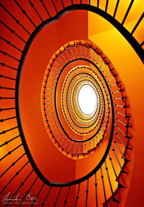
 Nightline — Abstract Face

Published: 2005-05-11 23:29:17 +0000 UTC; Views: 4098; Favourites: 108; Downloads: 349
Redirect to original
Description
Vienna, Austria / 2005-------------------
This image may not be used for any purpose without my written permission.
Copyright 2005 Christian Öser
Related content


Comments: 43


haha, we did similar experiments with staircases [link] ~
👍: 0 ⏩: 0


I love how so much of your work is so focused on abstract shapes and lines. Very nicely done.
👍: 0 ⏩: 1

Simple and stylish.. really, really nice. Colors and composition really please me. And you have lots of other great pictures, too. You definitely earn many "wows", keep up the good work.
👍: 0 ⏩: 0


I love this. It's simple yet so alive with detail and great composition/colors.
👍: 0 ⏩: 0


RAW Fotos will ich demnächst auch mal ausprobieren, soll ja noch ein Bischen interessanter sein als JPG
Das Bild auf jeden Fall gefällt mir gut, der gelbe Streifen passt prima da rein, lediglich der obere Teil der Wand ist für meinen Geschmack etwas (zu) hell.
 (Wink)")
👍: 0 ⏩: 1

Der eine findets zu dunkel, der andere zu hell... ")
")
👍: 0 ⏩: 0


interesting colors and composition, and the detail just awesome
👍: 0 ⏩: 0

find ich gut, inspiriert mich auch mal dort wieder photos zu machen !
👍: 0 ⏩: 0


Neat and clean. Ich mag den Kreis in Kombination mit den anderen Linien, den Kanten der Stiegen. Die gelbe Linie ist auch ein hübscher Blickfang.
Hauptbibliothek?
Ich kann mir nicht helfen, das Fenster erinnert mich an Waschmaschinen...

👍: 0 ⏩: 1
Danke, ist die Albertina!
Das Bild hab ich übrigens für meine neue Ebay-Freundin gemacht, damit sie sich gleich auf ihre neue Aufgabe im Haushalt einstellen kann.

👍: 0 ⏩: 1
Lol, das hättest einfacher auch haben können - oder hast leicht gar keine Waschmaschine daheim?
👍: 0 ⏩: 0


hehee, I see it! I see an abstract face or something!
👍: 0 ⏩: 0


cool, nahaufnahme eines smiles... muss man erst auch noch drauf kommen und das auge dafür haben
mir gefällt vorallem die wand -> total weiss und schwarfe linien und ein metallisch aussehendes fenster
der boden passt insofern, dass er genau das gegenteil zur schön sauberen wand darstellt.
👍: 0 ⏩: 0


Hehe, das ist cool. Das Gesicht guckt empört aus meiner Sicht. Sehr gute Komposition.
Warum machst du die Bildunterschriften/Copyrights eigentlich immer in dieser "scharf" Schrift? Würde nicht eine 1-px Schrift besser aussehen (wie bei deinem Ava)?
👍: 0 ⏩: 1
Danke!
Die Schrift finde ich schon ganz passend, nur mach ich sie teilweise auf weißen Rahmen zu stark, das stimmt schon. Wer die Deckkraft wieder mehr runtersetzen!
👍: 0 ⏩: 1
Ich rede auch garnicht von der Schriftart oder so.
sondern davon: [link] (wird gelöscht, sobald du es gesehen hast!)
Ich versteh schon, dass man für Prints andere Arten von Datein hochladen muss. Aber die deviation ist doch eh eine gesonderte Datei, oder?
Ich persönlich mag diese waberigen Schriften nicht, denn sie sehen aus, als hätte man die Schrift bei der Originalversion draufgemacht und erst danach die Bildgröße verkleinert... vielleicht findest du es ja besser, so wie es ist, aber irgendwie stört es mich... (nicht böse sein)
Nichts für Ungut...
👍: 0 ⏩: 1
Achsoo, du meinst die Kantenglättung!
Ja, das ist dann Geschmacksache. Muss ich mal ordentlich vergleichen beim nächsten Foto...
Aber grundsätzlich füge ich die Schrift erst nach dem Resize ein.
👍: 0 ⏩: 1
ich hab ja nicht gesagt, dass du den Text schon vorm Verkleinern einfügst, sondern dass es so aussieht - weil du "scharf" oder "schärfer" oder "sehr scharf" statt "ohne" einstellst.  (Smile)")
👍: 0 ⏩: 0


Very crisp shot. The definition of line makes this shot.
👍: 0 ⏩: 0

wow. sehr stylish. perfekte aufteilung und farbarbeit.
vielleicht ein bisschen mehr zeichnung in den hellen bereichen wäre noch schön gewesen. natürlich weiß ich aber nicht, wie hell/glatt die mauer war...
naja egal. großartige arbeit, hat mich auch etwas an die gerade zu kräften kommende sonne erinnert.
👍: 0 ⏩: 1

awesome, great concept and as soon as i saw the title i saw the face, well done my friend.
👍: 0 ⏩: 0

raw ist das digitale negativ... da kann man endlich ordentlich arbeiten...
👍: 0 ⏩: 0


Oh no! Someone took the escape pod! What now? What now?!!?
This is really groovy. The stairs are like landscape, the wall a white sky, and the hole a dark moon!
")
👍: 0 ⏩: 1