HOME | DD
 NightmareHound — Gore page 1

Published: 2010-08-12 16:51:01 +0000 UTC; Views: 4782; Favourites: 51; Downloads: 33
Redirect to original
Description
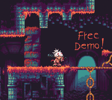
NEXT>>Oh my god I actually finished this page. Took at least a week and bunch of painkillers but it's there.
Oh and I really gotta study colour thumbnails, this is disgraceful. Page full of orange.
How will the whimsical story of our pasty-faced barbarian unfold?! Stay tuned!
Related content


Comments: 18

He's panting like that because he spent hours laughing at Gore's name.
👍: 0 ⏩: 0


Eipä vielä nuolaista, vasta eka sivu valmiina.
👍: 0 ⏩: 0


I like this, especially the fourth panel, but I think the second panel could use a few more bird silhouettes flying up into the air. Other than detail, I think that this looks very well made and thought-out
 (Smile)")
👍: 0 ⏩: 0

I'm thoroughly excited about this :]
And don't think I've forgotten about that shrew plushie. I'm currently getting used to going back to school, but once it settles down, I'm going to work on that cylindrical little bugger.
👍: 0 ⏩: 1
D'aww! May the Shroo gods bless you! Can't wait to see what you come up with it.
Also I guess I better go continuing the comic too : D
👍: 0 ⏩: 1
I hope you won't be too disappointed :sweat:
I didn't exactly have the right color material

👍: 0 ⏩: 1
No worries, a shroo is a shroo despite the colour!
👍: 0 ⏩: 0

Onko tää ny ihan ison projektin alku? Kun Goresta on muutenki ollu juttuja...
Hieno on, värimaailma on tunnelmallinen ja Goren haarniska on magee! Ja noh, jos tyypillä on noin hieno nimi ei voi häntä kuin fanittaman.
👍: 0 ⏩: 1
Aikeena ainakin olisi, jos nyt vaan keskittymiskyky kestää sivujen kanssa, mutta yritän ainakin!
👍: 0 ⏩: 1
Hienoa! Odotan innolla mitä tuleman pitää.
👍: 0 ⏩: 0


This looks like it could be a really cool comic. I'd love to see you make more of it.
The art style you've used is nice; it's detailed, yet not so detailed that making a full comic would be nearly impossible.

👍: 0 ⏩: 0

GOOOOOOORE!
Sweet, I think you style works very well in comics!
👍: 0 ⏩: 0

GORE GORE, LOTS OF GORE
then they get this
Looking amazing so far - especially the colours - however the horned creatures' outlines look a tad too thick to me compared to the rest in the panel on the middle of the page. Niin ja öö vikassa ruudussa tuo heinikko on vähän epämääräisen näköistä, etäisyys välittyy heikosti kun sitä katsoo tarkemmin, mutta ensilukaisulla se näytti suht selkeältä.
BUT HOTDIGGITYDAMN it looks gorgeous
👍: 0 ⏩: 1
Ha ha yeah, guess what part I inked first : D
I probably ought to re-ink them since they do stand out a bit, and holycrap you are right about the last panel too.
And thank yoooo, I hope I can keep this up *flexes imaginary concentration muscles*
👍: 0 ⏩: 0

Nice lineart, it adds alot of character to the panels!
As far as color goes, there's nothing wrong with how you handled palette selection (i.e literal and not garish), but from a thumbnail view I can see that panels 3+4 could use more contrast with the figures. The monsters blend in a bit too much with the trees in panels 3+5, and Gore's armor gets lost a between the color of the rocks even in the bigger view in 4+5. But that tiny little spot on 3 with Gore fishing is a good example of the approach to contrast that really pushes the important parts forward, I could've picked him out easily without the bubble.
👍: 0 ⏩: 0