HOME | DD
 NightmareVaVa — Alpha X Omega Zero
Published: 2010-05-01 04:39:54 +0000 UTC; Views: 4988; Favourites: 67; Downloads: 357
Redirect to original
Description
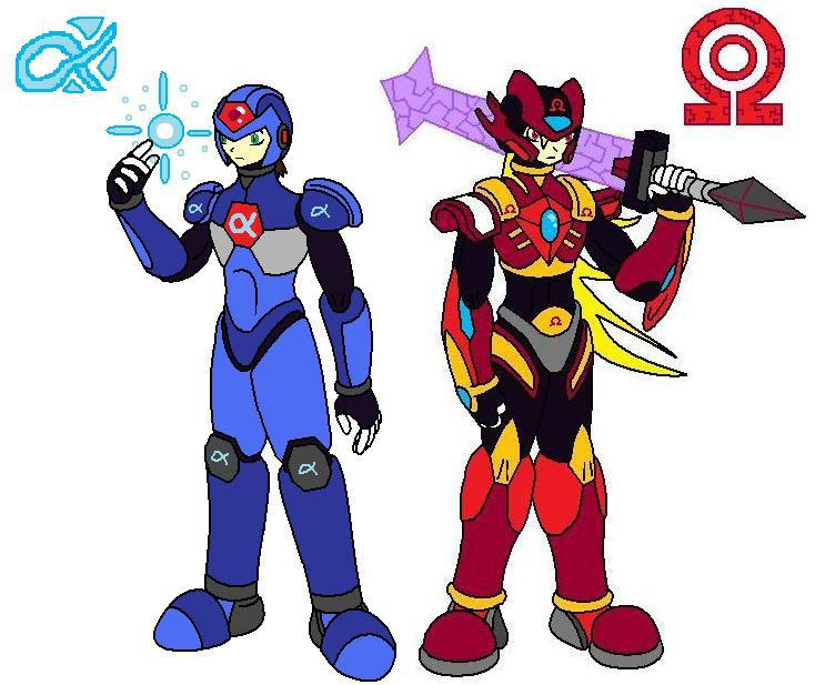
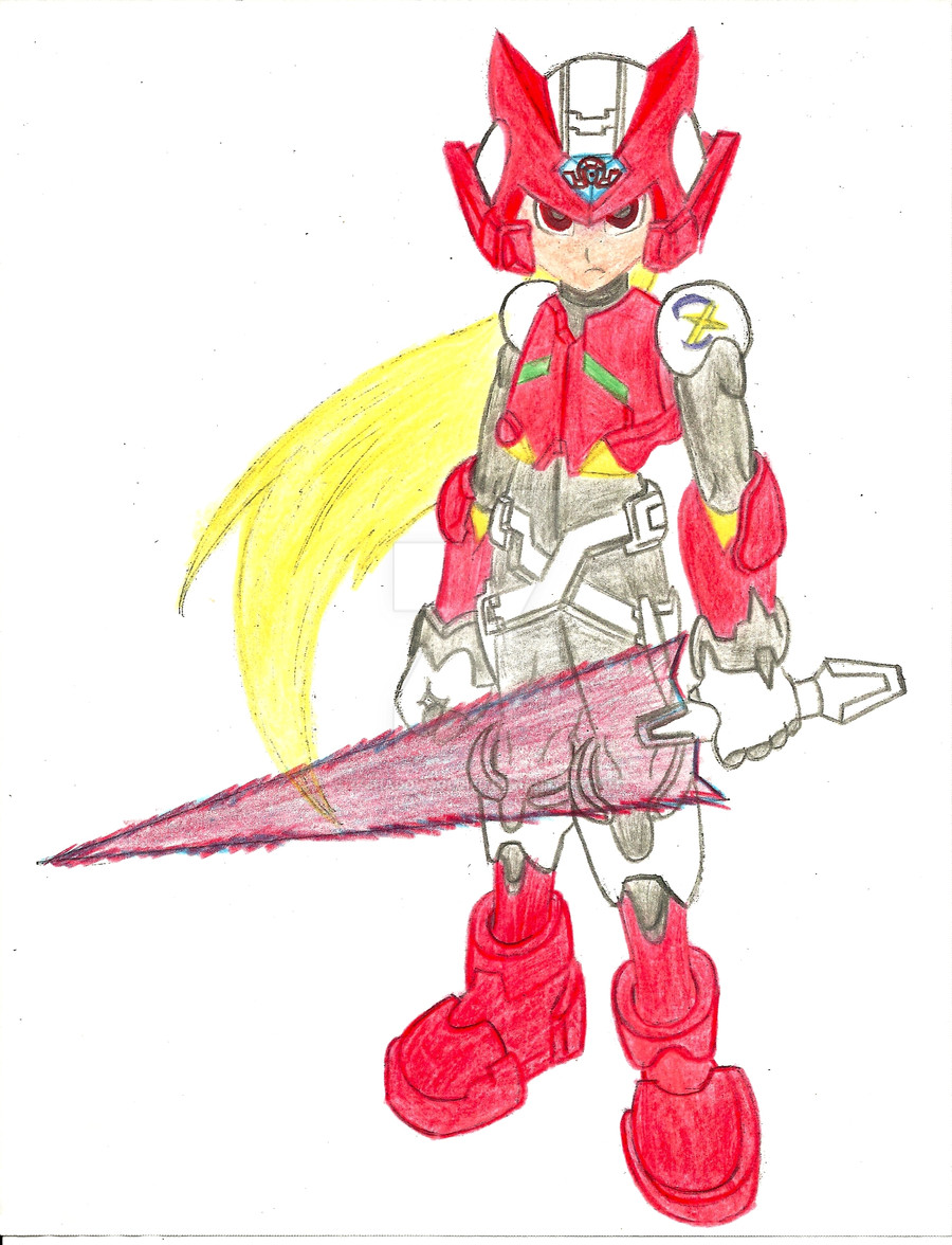
Alpha X and Omega Zero side by side both counter parts of the originals. Omega the body of the orginal Zero with a mindless killer brain, and Alpha X is a "special" reploid that has close relations with Zero and X.Related content


Comments: 21

These designs look pretty sick, especially the Omega design, but I think that these two could use a little less alpha and omega symbols on their body. Having 1 or 2 is fine, but I don't think they need like 5 symbols to show who they are.
👍: 1 ⏩: 0

Its just it. Why did you say ty?
👍: 0 ⏩: 1

A little bit of touching up and this picture would look awesome.
👍: 1 ⏩: 1
If you promise not to be mad, alright. I'll do my best to not be rude (I hate being rude :/):
Well, touch-up #1 would be shading and highlighting. Some of the lines would need to be smoothed out (mostly just the alpha symbol on the blue bomber ")
Alpha's lower legs need to be shaped a bit more. I noticed you weren't using the MMX styled anatomy, so maybe shape them slightly so that it curves inward as it nears the ankles (like a human's leg would). Omega is very nicely done, but I would narrow the legs a bit near the ankles as well (They're fine as is, just an option to make it have a more humanoid feel down there).
You did very well with the eye design, but maybe you could bring them closer together, they look spaced to me.
I'm REALLY sorry if I upset you at all, I'm just pointing out some things that could improve an already well made piece of work. Trust me, i could never do something this good unless I had templates and examples for certain parts and body positions. my art skills aren't exactly the best in the world, and I'm not afraid to admit it.
👍: 1 ⏩: 2

nah constructive criticism but this was before i knew how to use png
👍: 0 ⏩: 1
Fair enough. Do you plan on redoing it, or just move on to newer projects?
👍: 0 ⏩: 1
And one small addition. Going back to Greyhedgehog's comments, I think the heads may be a bit small, along the lines of taking the helmet size into consideration when drawing the head.
👍: 0 ⏩: 0


really it dosent look like it?
👍: 0 ⏩: 1

it looks like them the heads just look to mis-sized
👍: 0 ⏩: 0