HOME | DD
 Nimaru — Sketchover - Solar Eclipse
#sketchcover
Published: 2018-10-23 22:13:34 +0000 UTC; Views: 767; Favourites: 18; Downloads: 5
Redirect to original
Description
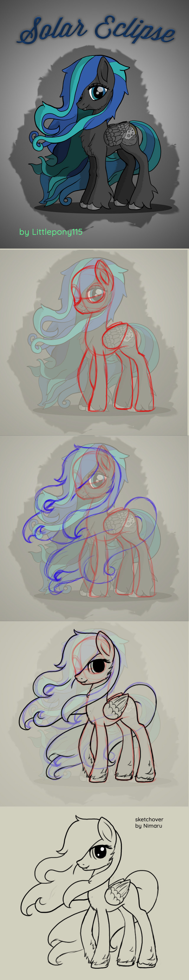
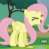
This is an odd one to do because it's really well done overall, but I would definitely do some of the details differently. So I decided to just sketch it and let the differences show for themselves. Generally, if she's standing in strong wind, the hair needs to be consistently blown in the same direction and tighter at the neck and skull. I thought the pose was a bit static so I raised a hoof a little. Also, the wing doesn't make sense because they have long features that cover at least the last half of the wing (both for ponies and birds).
Other than that, it's good stuff. I think the lines are a bit harsh and the cutie mark would look better a bit smaller and with a little less detail/contrast, but that's pretty personal so I left it pretty much alone.
Related content


Comments: 2

I am with you in that the original is beautiful. But that said, I do find your sketchovers more true to the original series. As in I can actually see your versions being used in the real series. Well done Great Brony! Missed your pony art here!
👍: 0 ⏩: 0