HOME | DD
 niteangel — Reactant
Published: 2004-06-30 15:45:54 +0000 UTC; Views: 38573; Favourites: 786; Downloads: 15723
Redirect to original
Description
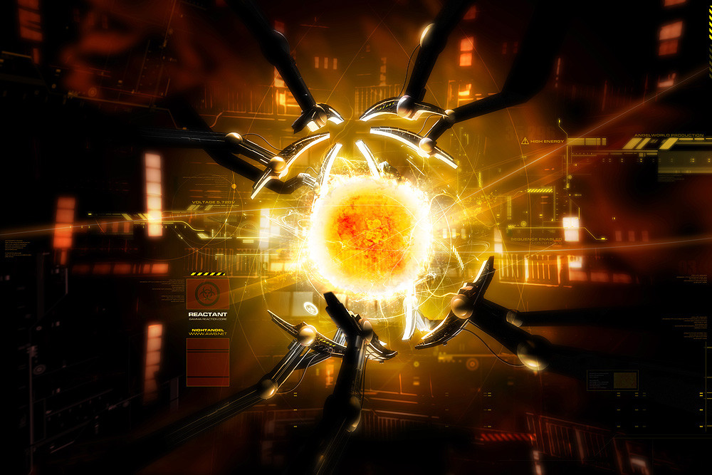
Reactant . Gamma Reaction CoreThe power of the future, the energy of life
Restored. Recharged. Remind you of anything?
3DS Max 6, Bryce and Photoshop. Took 7 hours to render the fireball. Wallpaper version available at Angelworld: [link]
Related content


Comments: 405

yea, you should check out the spiderman2 movie, just saw it today, it's exactly like the core thingy in it
👍: 0 ⏩: 1

I saw it already.
It is not exactly the thing. You don't have enough observation to see the differences.
Btw I have taken shots from the trailer to see that fusion cell from Spiderman 2. I know more than you do.

👍: 0 ⏩: 1
i was only saying my opinion, i was merely describing what was on my mind when i saw the image. i really dont care about the differences, it's the concept i look at. + i honestly couldn't careless if you know more about a fictional fusion reactor thingy more than i do from a fictional (but good) spiderman movie.
anyways, yesterday, my keyboard wasnt working so i was working an on-screen keyboard so when i commented i only could get straight to the point. i just wanted to say you matched fusion ball very well. the 2d in the bg is goes well. but most of all, i look at the detail of the ball.
👍: 0 ⏩: 0

Thats great, and it came out just in time to go along (in similar idea) with Spider Man2. Looks like you put a good amount of work into this.
~Sean
👍: 0 ⏩: 0


This is really cool. Good job! It must took you a long time to finish it!
👍: 0 ⏩: 0

I must say that it was a pleasure viewing this piece. It is not often that you find digital art that is as highly polished as this on deviantART. It is clear that a lot of work has gone into every aspect of this piece, especially the lighting.
When I first looked at it, I saw the core of a reactor, and the massive amounts of energy involved in the various reactions occurring. I also thought of a planet being created, but your subtitle "Reactant - Gamma Reaction Core" has turned me away from that type of thinking. Personally, I think you achieved the futuristic look of a "Gamma Reaction Core" quite well.
The fireball in the middle seems to be the focal point of the picture, as all the vectors are pointing towards it. Even the title of the picture suggests this ("Reactant"). For something as common in this world as a reactor (well, not that common, but there are still quite a few) it's amazing at how unique this concept is. I don't think I have ever seen a picture like this before (or at least not any that I have remembered).
I noticed some red dust-like stuff mainly at the top left corner of the picture and at the middle right part of the picture. Is this supposed to be something akin to a solar flare, except smaller because of the size of the reactions? I'd just thought I'd mention it.
There are a few problems that I noticed in the picture, though. While minor, still think they are worth mentioning. See below:
The edge of the fireball isn't completely circular. This is evident mostly on the right hand side of the fireball. I found it a little distracting, but it doesn't detract from the quality of the picture, in my opinion. (Don't worry; I'm just nitpicking at everything).
At the top right hand corner of the picture there is a little yellow and black striped thingy (not very technical, but I couldn't think of a better name). I don't know why it is there, or what purpose it has in the picture, but if it were my choice, I would remove it. Is there a particular reason as to why it is in the picture?
I also noticed that there seems to be more black area on the left hand side of the picture than on the right hand side. This, in my opinion, unbalances the picture somewhat, although I can't think of any way to improve the balance. It is only a very slight problem (in my opinion), anyway.
Another thing I noticed were the columns of squares on the left hand side. There are the same types of columns elsewhere in the picture, but they are all attached to a wall or some other object. The three columns on the left seemed to be attached to nothing. It doesn't really detract from the quality of the picture, but after looking at all the enormous amounts of details in the picture, I wondered why the columns were there. (It's a bit hard to explain.)
There are two questions I have as well. The first is: At the bottom left of the fireball, there is a little white circle with something in the middle. What is it? Is it just some random design? The second question was: I noticed that it says "Nightangel", when your nickname is "niteangel". I just wondered why, if I'm not intruding. (I'm naturally curious.)
Overall, I enjoyed viewing and critiquing this piece. There are so many little details that you don't notice if you don't look closer at the picture. Excellent work.
(I hope my comments were easy enough to understand. My apologies if they weren't.)
👍: 0 ⏩: 1
Thanks for the long comments  (Smile)")
The fireball isn't intended to be completely circular. I just hate to see a round circle there because even the sun isn't a completely smooth sphere. As it is some energy in form, there is no way it is a complete geometrical thing to me.
My name is Night Angel or niteangel. All my pieces are Night Angel named on the piece. Both are used while niteangel is the nickname here. Don't ask why.
The yellow and black strip is the warning sign. I like this 2D more than other typical 2D line graphics, and that shows how unique this image can be, but not just a fireball with tons of lines.
Thanks again 

👍: 0 ⏩: 0

dude, this is really good an' all, but where's your girly stuff, I thought you only did softer, nice renders
seriously man, off the hook. taking your abstract to a level of realism instead of just random shapes is genius 'cause you have the skills to pull it off. great work with all of the elements, you've got the design skills down to make everything flow very well.
👍: 0 ⏩: 1
It is always good to change  (Wink)")
👍: 0 ⏩: 1
sweet
seriously man, this is kickass. the second download link @ AW doesn't work though. I kept getting a file not found.
👍: 0 ⏩: 0

this is sooo cool. reminds me of spiderman2, when doc oc was creating cold fusion.
very neat! ")

👍: 0 ⏩: 1
Do you think it is cold fusion?
")
👍: 0 ⏩: 1
i don't know...... i don't know.... it cold be...
👍: 0 ⏩: 0

wow... looks like its gonna explode anytime soon...
👍: 0 ⏩: 1
i juz watched spiderman 2... this really looks like the sun doc ock was fooling around with... haha... gj gj
👍: 0 ⏩: 0
This is the most fucking interesting comment I have ever seen.
👍: 0 ⏩: 1

...?
why is that...
oh by the way, i really do dig the fact that you put in an effort to reply to the people that coment on your page... i see that you get alot of people but you still take the time to say somthing back... most impressive
👍: 0 ⏩: 1
That is fun.
Isn't that fucking interesting?
Honestly I mean, what the hell are you trying to say?
👍: 0 ⏩: 1
mostly it is sarcasum... not in the normal bad way... but in the "wholy shit i am blown away my this persons most impressive presentation and concepts"
anyhow...
👍: 0 ⏩: 1
It doesn't even make sense, not to say it is sarcasm or not.
👍: 0 ⏩: 0


Amazing...I just got for my backround for my desktop.
👍: 0 ⏩: 0

Stunning contrast and clarity. While the focal point is apparent, nonetheless there are, as usual, the tiny details awaiting the viewer's scrutiny.
👍: 0 ⏩: 0

not your best, but still very original, and very skillful. I like it a lot.
👍: 0 ⏩: 0

awsome render, and also well done fire ball. i looked at it at night and it was very bright
nice work
fav.
👍: 0 ⏩: 0

oh wow, most impressive
§Sid§
👍: 0 ⏩: 0


wow that is stunning!! great work their looking real!! brilliant... giving u a 
👍: 0 ⏩: 0

lol let me guess? inspired by spiderman?
this looks better than the one in spiderman
👍: 0 ⏩: 0

Aw, man this is cool! Auto
BTW, have you seen the new 
👍: 0 ⏩: 1

omg, so incredibly clean and detailed
fantastic work with colors, the idea itselfs is pretty interesting also
simple yet nice models of thoose robotic arms
and the background is awesome
this is my favourite from you
i'm not sure tho about some elements here, but shh
👍: 0 ⏩: 0


*cries*
Seriously, this is too good...what the hell... I might as well quit my piece of shit art.
👍: 0 ⏩: 0

Nice. But the 2D in the background, do you have an tutorial or tip on that one? Looks kind of like a city or something...
👍: 0 ⏩: 0

Wow... and how long does it take you to do these, exactly? Just curious...
👍: 0 ⏩: 0

Good timing to release this when you did
Very well done.
👍: 0 ⏩: 0


well, i love this image...Perfect...congratulations
👍: 0 ⏩: 0

MY GOD that's amazing.
Seriulsy, I can't even put into words how amazing it is.
+FAV
👍: 0 ⏩: 0

<= Prev | | Next =>