HOME | DD
 Niznize — What's a school kid being like

Published: 2011-09-05 18:10:32 +0000 UTC; Views: 946; Favourites: 19; Downloads: 4
Redirect to original
Description
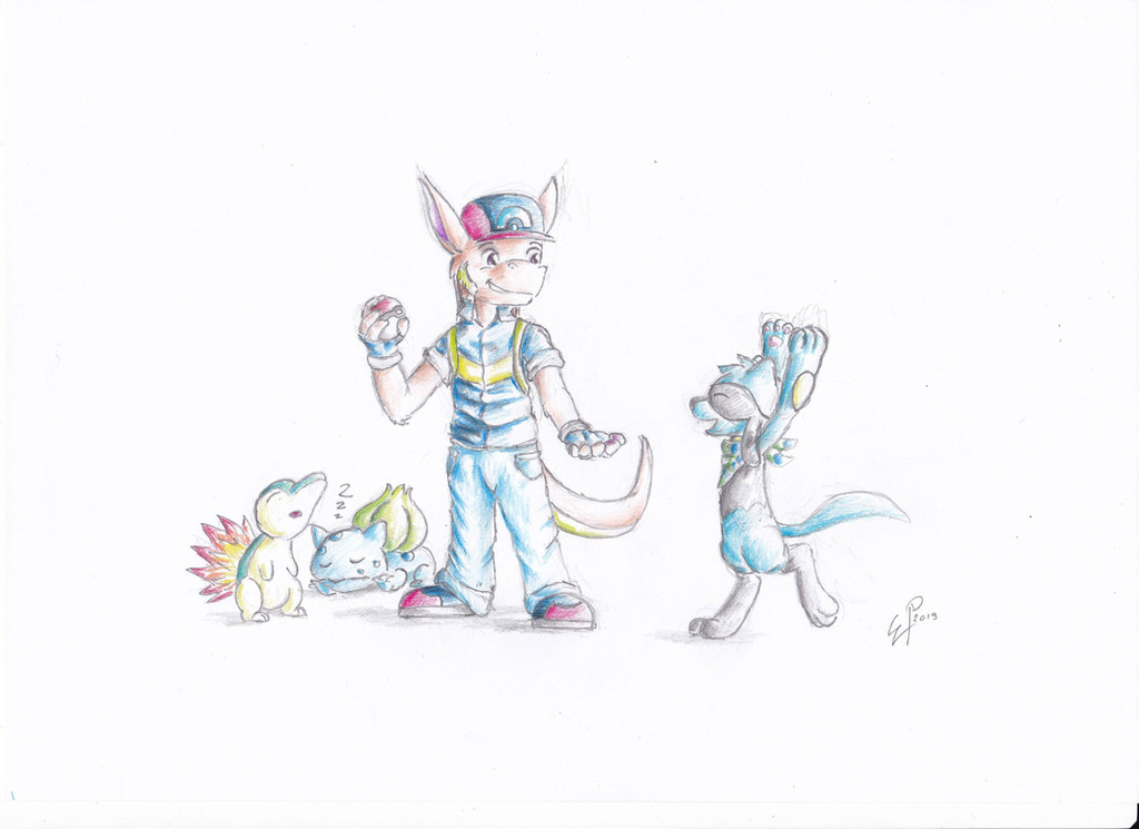
A picture celebrating my school start today. I drew Riolu on my first Math lesson when the teacher introduced himself and I wasn't really interested about him I hope you've got better teachers
 (Smile)")
EDIT: I was kinda unsatisfied with the background, so I edited it in PS to make it look better.
Riolu, Zoroark belongs to Pokémon, by Nintendo©
Related content


Comments: 12

Thanks! What are the best/worst parts? What do you think?
👍: 0 ⏩: 1

I would have to say the best parts are the eyes and the shading on the head arm and tail but to me it looks as if his foot that is stepping forward is shaded a darker colour, but from the other parts of shading it looks as if this should be lighter same where the two legs meet, there is another bit where a lighter bit looks as if it should be closer. I don't know if you want it to look like the official drawings either but the body seems a little fat. The back ground is alright but the monkey bar style thing looks odd... On the other side the colouring is great, as are the expressions and the shading above the nose really defines the shape. like I said its not bad, but needs a couple of improvements to make it really good! The background isn't bad either, but i see what you mean as it being your weak point, but i can't really help you there as i don't even do backgrounds. (if i offended you i didn't mean too, im just trying to give you a comment that actually helps...)
👍: 0 ⏩: 1
I get it, and thank you! The left leg was a pain to do, but you're right. The shadings looks there a bit odd, if you look closer. I'm trying to correct that. And I made the monkey bar in hurry.
Critiques are good, if they've got the purpose to make others better. Thank you again!^^ It must have taken long to you to type in all this.
👍: 0 ⏩: 1
Yeah it did... lol, but i want help with my work too, and i will only get what i give so your welcome!
👍: 0 ⏩: 1
I corrected now what you mentioned. I wanted kinda finish it ASOP, or else I'm always thinking about my drawings, what I still could make better on them, and that's such a pain.
👍: 0 ⏩: 1
yay! constructive Criticism works! ha ha
👍: 0 ⏩: 0

Wow <3 Really greta picture ")
Greta work.
My teachers aren't better x'D
👍: 0 ⏩: 1
And the worst is that this is in the university. I wish I had better teachers/more lessons, because I still can't really feel the sense of my study (what I can use it for).
Anyway, thank you!
Looking at the picture I just noticed a tiny painting mistake. If you can find it, I'll give you a hug!
👍: 0 ⏩: 1
Thats no good x'3
I ahve to practice them,too x'D
LoL i don't fine one D:
👍: 0 ⏩: 1
C'mon! Don't be again that shy! 
And yeah. I guess I corrected the mistake. Maybe next time.
👍: 0 ⏩: 1
x'3 I'm really not sure :3
Okay

👍: 0 ⏩: 0