HOME | DD
 NMRosario — Stump

Published: 2009-05-15 02:49:45 +0000 UTC; Views: 11998; Favourites: 157; Downloads: 260
Redirect to original
Description
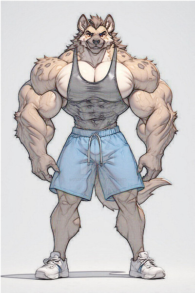
I uploaded this one earlier as my Spaceman character, but this is actually the original form of that drawing (also Stump and the Spaceman are the same character just in different points in his life). Stump is actually my original creation, I designed him back in 1993. His super-powers are pretty basic: super-strength, invulnerability, super-endurance, super-speed, and he's practically immortal (he's over 1000 years old and still appears to be in his early 30s). He earns the nickname of "Stump" simply because of his stature. He's about 5' 5" tall and weighs over 600 pounds.Anyways, the drawing is a vector image created in Adobe Illustrator. Drawn entirely with a mouse, using a pencil drawing as a template. It all consists of filled shapes stacked on top of each other in multiple layers, no brush strokes or gradient meshes.
Related content


Comments: 27

If i was muscled up & in shape...& probably 'roided up, i would look like that hahahaha!! -- i'm 5'2&1/2, though, so, little brother. Seriously, though, awesome work! Got to add him to the extensive list of cool short superheroes who kick major ass!....i think it's up to about 5 or 6 now, with him...
👍: 1 ⏩: 0

I am big fan of your art. I love the way you've captured masculinity and anatomy of male body
👍: 0 ⏩: 0

I have been a fan of Stump for years (and unwittingly also a fan of yours NMRosario.) Thank you for creating him - if I had any talent I would have created him as my ideal man. We used to call these guys "fireplugs" but that term seems to have gone out of fashion - along with "barrel-chested, built like a brick shithouse, and he's a Man's Man."
👍: 0 ⏩: 0


This is a great piece of work!
I love the way you masculated this man, but keeping him looking cute and somehow innocent. I also love the colouring method which is close to realistic, yet still cartoonish.
A well earned 
 (Smile)")
👍: 0 ⏩: 1

Thank you! I was trying to make him look powerful, but intelligent at the same time. Many times muscular characters are portrayed as brainless dolts, but I've always intended for Stump to have above average intelligence. Not Reed Richards level super-intelligence, of course, but he would have probably gotten straight A's in high school at least once or twice (assuming he attended high school).
👍: 0 ⏩: 0

He may be short but he's a fuckin' TANK! Look at the sheer heft and density of those herculean muscles! The lower half of his body is a bit too short but for the love of all that is holy, please don't tell HIM I said that!

👍: 0 ⏩: 1
Stump's a little sensitive about his "tiny lil' legs" so I won't mention it. ")
Actually the drawing was supposed to have somewhat cartoonish proportions with the gigantic upper body, slightly large head and short legs. But, as it got more detailed and realistic those characterizations began to look more like flaws.
Also, his pants are intended to look really baggy (it's nearly impossible to find an exact fit when you're forced to rummage through a Goodwill box, especially if you're built like Stump). So that might be adding to the effect a bit.
Anyways, thanks! And, by the way, "Tank" was actually one of the early names that I considered for the character (along with Brick); but I just thought that Stump was funnier because it's closer to an insult than anything else.
👍: 0 ⏩: 0

jajaja its like some of my friend, the diference its that this is more pumped, i hope i spell it right XD
Good job pal
👍: 0 ⏩: 1
Thank you! This is actually based on a friend of mine, only he's not nearly this big. I like basing my characters off of real people and, if you make the drawing look like one person, then chances are that it's going to look like lots of other people as well.
👍: 0 ⏩: 1
Im agree with that idea. XD
And sorry for taking so much to answer, <: (
Damn a year of delay,
")
👍: 0 ⏩: 0

Faving for two reasons: One is that it's pure vector and the other is that he's a cutie.

👍: 0 ⏩: 1
 (Cool)")

just love it that must have taken some work to do very impressed
👍: 0 ⏩: 1
Thanks! Yeah, it took a lot of time and patience. Right now, the file is so intricate that I can't run any other programs on my computer when I'm working on it. But the real benefit of this method is the versatility. I can create whatever outfit I can think of and just place it over the base image of Stump. So he ends up like a virtual "paper doll" in that you can add or remove any clothing item individually, ranging from nude to fully clothed in his "Spaceman" uniform.
👍: 0 ⏩: 1
ooh now a nude one i wouldnt mind seeing lol great way to work really versatile cool
👍: 0 ⏩: 0

Short, wide and damm heavy... bet he's popular with the ladies though if his Spaceman uniform shots are anything to go by...
👍: 0 ⏩: 1
LOL, well I wanted to make sure people knew that he did NOT get the nickname "Stump" from the guys in the locker room.
Actually, it's not meant to be dirty or erotic in any way, I just get annoyed when artists draw male heroes like they have absolutely nothing between their legs. Unless a guy has taken so many steroids that his genitalia has shrunken to the size of a walnut, then there is going to be a bulge of some kind there.
Besides, it ties into the whole idealized bodies of superheroes thing. If (and I'm making blanket generalizations here) all girls want big boobs and tiny waistlines, then all guys want big muscles and big "packages." I don't think there is anything wrong with acknowledging that.
👍: 0 ⏩: 1
Defiantly not.
City of Heroes/Villians [link] is a game about Supers- you can build a 8' tall Hulking brute of a character but he'll be Ken like between the legs...why? [link]
Why not even a cup like bulge? Certainly not programming limitations!
What is it about games/tv/comics where they will give their Heroes perfected bodies, but ignore the obvious?
👍: 0 ⏩: 0

Yeah mouse is the way to go... although occasionally I think things might be easier with a graphics tablet.
👍: 0 ⏩: 1
The problem with tablets is that they are just so expensive. If I have a mouse go bad, then I can a new one for about $10. To get a tablet with a decent sized working area, you're looking at hundreds of dollars. For instance the active area for a $1 mouse pad is about 8x9 inches, to get a tablet with an equivalent active area, you're looking at almost $500. So, I think for now I will stick with a mouse.
👍: 0 ⏩: 1
yeah I suppose if you get a proper professional tablet. Occasionally I'd just want just a simple one for doing my initial drawings cause some shapes are harder to draw with a mouse.
👍: 0 ⏩: 1
Very true. I've learned that circular objects are very difficult to draw with a mouse. I find myself drawing them in segments and then correcting them one anchor point at a time. I hate using the circular shape tool, because then it's too perfect. A little bit of imperfection helps the drawing to appear "alive."
Even though artists strive for perfection, I've found that it's actually the enemy of good art. It needs to retain that fallible human touch otherwise it just loses all of it's "soul." That's my theory anyway.
👍: 0 ⏩: 1
Yeah... but also sometimes you don't want a perfect circle, but want a circular shape.
👍: 0 ⏩: 0

i like it so much. Impressive that it's pure vector! it must take you a lot of hours to complete it.
👍: 0 ⏩: 1
Thanks. This one has taken a lot of time. I've been working on it off and on for over a year now. All the body hair, freckles and razor stubble had to be drawn in one hair or freckle at a time using a mouse. I did a bit of copying and pasting for the chest hair, just to add some density, but for the most part it was all drawn with the pencil tool.
It's been more of an experiment to see just how detailed I can get with pure vector art.
👍: 0 ⏩: 0