HOME | DD
 nokari — CS5 Box Set - Apps

Published: 2010-07-05 03:12:10 +0000 UTC; Views: 60212; Favourites: 403; Downloads: 15365
Redirect to original
Description
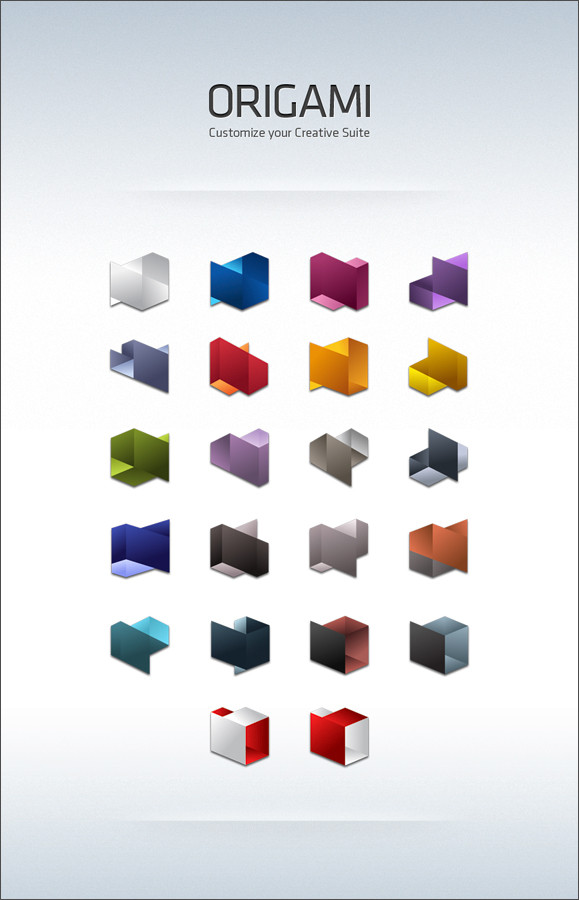
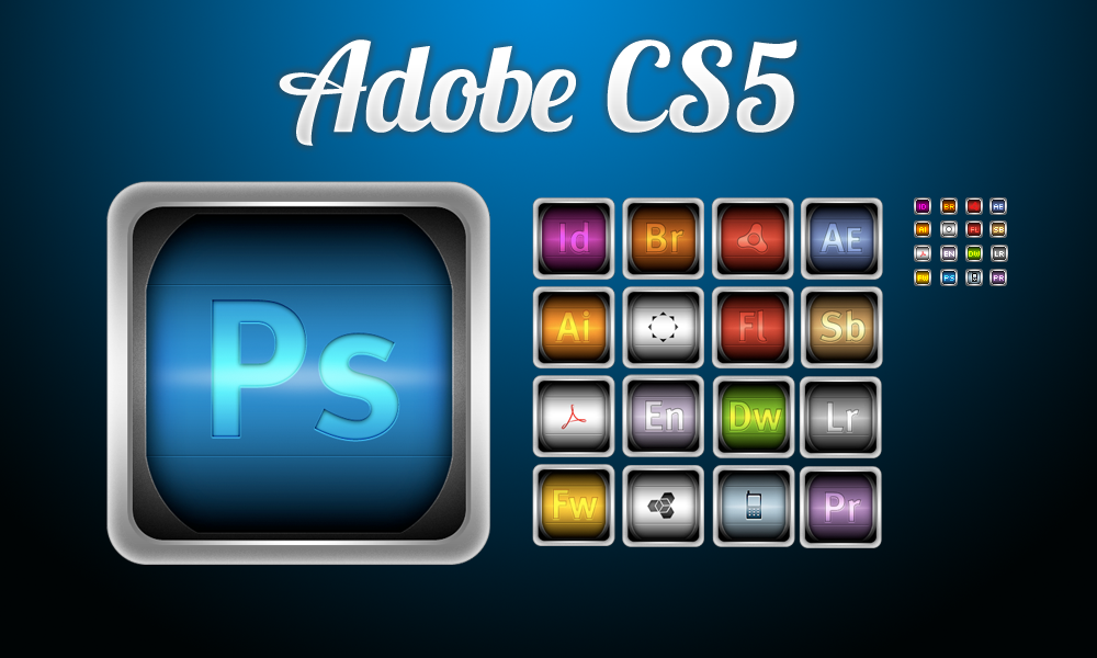
- Includes 62 icons in total.- PNG and ICO formats so they can be used on both Macs and PCs.
- PNGs are 512px and ICOs range 512px to 16px.
- 4 text options per icon.
Includes: After Effects, Photoshop Standard and Extended, InDesign, Flash, Illustrator, Fireworks, and Dreamweaver.
Other Adobe icons: [link]
Related content


Comments: 104

Not every one does, but most of them do.
👍: 0 ⏩: 0


tu link ya no forula no se si podrias chacrlo de antemano gracias ^^
👍: 0 ⏩: 0


Does it have an Illustrator icon with IL. That's the one thing that drives me nuts... is people using AI for icons... WHY? Why use AI? I don't get it. We don't use AP or AF or AD... why AI?
Otherwise... AWESOME Set!!!
I'll have to give it a download for a closer look. [--- hopes for IL surprise inside ---]
👍: 0 ⏩: 1
No version of Illustrator has ever had IL icons. It has always been AI, but I don't know why.
👍: 0 ⏩: 1
I agree it has always been AI(for Adobe Illustrator)... but that doesn't mean it wasn't stupid then and isn't stupid now. IL all the way!
👍: 0 ⏩: 0


Text isn't very great, but It's AWESOME! I love it!
👍: 0 ⏩: 1
What do you think would be better?
👍: 0 ⏩: 1
I really don't know
I think the text on PS, FL,ID is better than on AE..
Somethings like.. the text is a little big and it get out of the shape..
But, It's absolutely COOL
👍: 0 ⏩: 1
Would you prefer an option without any text?
👍: 0 ⏩: 1
Uhm... No
Wow, I just open the zip file ")
But the orthers are not really great (Dreamweaver - 2 for examble). THe text couldn't create a 3D - feeling like 'Flash -2'
👍: 0 ⏩: 0


AWESOME icon set!  (Smile)")
👍: 0 ⏩: 0


omg that's so awesome. love these icons!!
👍: 0 ⏩: 0

The price on the market for the complete program set.
👍: 0 ⏩: 1
[link]
The Master Collection is $2599.
👍: 0 ⏩: 1
Hmm, I see. Expensive. Better to buy each when I need them than to buy them like this.
👍: 0 ⏩: 0


Oh man, I like this. Finally some icons that give homage to the wonderful CS5 splash screens.
👍: 0 ⏩: 0

I cant wait till you do the rest of them! (that is, if you are going to)
👍: 0 ⏩: 1
I'm not sure about all of them, mostly because only a handful have the geometric splash screen design, but right now I'm just trying to find a picture of the InCopy splash and I'll have another 6 more icons up.
👍: 0 ⏩: 1
Awesome! Im not sure how many other programs they have, but I just need Premier and Soundbooth yet... I figure those are part of the 6, but either way, great job!
👍: 0 ⏩: 1


Great icons! Downloading.
You know though i have stopped being a fond of newer adobe applications, i mostly use the basic tools, and most of artists do so as well. They should renew the suite every 3 years, not every year and a half. I believe i will stay with CS5 for a long time, till CS7 probably is released...
👍: 0 ⏩: 1

Same here the next Cs6 will probably be just a few new cool things, and stick it out 'til 7, until then I''m loving my CS5 Extended =]
👍: 0 ⏩: 0


imho
you better make the text readable instead of rotating it. youll get more favs instantly as you do so.
no skewed text would be better
👍: 0 ⏩: 2

Could I see what the originals looked like?
👍: 0 ⏩: 1
They're in the download. I distorted all the text for each one to match the covers of their respective packaging.
👍: 0 ⏩: 1
So the download has two versions of each? One with straight text and one with the packaging-matched?
👍: 0 ⏩: 1
Yes, though it's 4 versions, each one with color and white version.
👍: 0 ⏩: 1
It's based on the packaging, but I might include those in a later update.
👍: 0 ⏩: 1
great, but a bit of up down text movement.
the idea of taking their intro screens into icons is perfect.
but lets suggest im gonna line them all up at my desktop, and whats gonna catch my eye is the different position and scale of text.
if you fix even these. its gonna be HUGE fav
maybe to achieve that result gonna need to scale down the text a bit.
anyway great work.
👍: 0 ⏩: 1
Keeping the whole icons balanced is more important. The text going up in down is also done on purpose to reflect the changing shapes themselves. Scaling down the text just makes it harder to read.
But I am thinking of adding no text versions.
👍: 0 ⏩: 1
| Next =>