HOME | DD
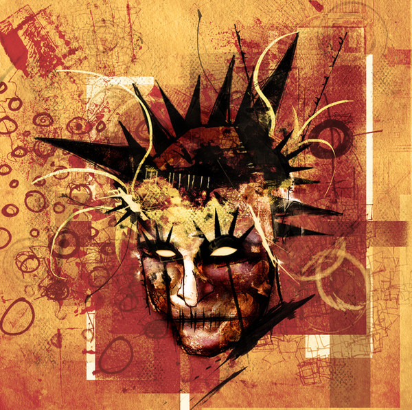
 Nonsense-Prophet — Fester Jester

Published: 2008-06-22 19:02:12 +0000 UTC; Views: 817; Favourites: 22; Downloads: 0
Redirect to original
Description
ExperimentalRelated content
Comments: 15

do you have one of these thats simpler and in white and black?
👍: 0 ⏩: 1

'Fraid not. Why is that?
👍: 0 ⏩: 1

Im looking for a good logo to have and My theme was going to be monochromatic Jester but nvm. Its changed to .... something with the word vibe that evokes a feeling of deep bass
👍: 0 ⏩: 0

This is great! I love the color pallete and subject, also i think you did an excellent job of capturing emotion on this. I can kind of see what gnaime was talking about with the circles. I think it's a cool idea, but maybe if they where slightly more transparent or just a little less intense they would mesh behind the central figure a little better.
👍: 0 ⏩: 1

Thanks, this one was a kind of experiment in non restraint. I enjoyed the chaos of the creation process but I agree that it could benefit from a little reigning in
👍: 0 ⏩: 0

I think the circles take away from the work. But fullview is great because you can ignore them.
👍: 0 ⏩: 1

Yeah originally I envisaged a somewhat different more graphic screenprint feel, like some of my less recent works but I guess I got a little carried away with the character and ended up with a hybrid of two styles. Could be interesting to further develop this one on a less busy background perhaps?
👍: 0 ⏩: 1

yeah I think the "goopy" fluid shapes among all the hard edgy elements clashes too much for some reason. I would rather see scribbled circles or something of that style? It will be interesting to see where you take other pieces like this one in the future for sure.
👍: 0 ⏩: 0

awesome! it makes me think of the bad of batman, "the joker" in french but I don't know if it's the same in english 
great!
👍: 0 ⏩: 1

Cool! Thanks! Yeah it's the same, the Joker.
I know what you mean, he certainly has a similar feel to his character.
👍: 0 ⏩: 1

yes, exactly, there is something mad in your character and in the Joker.
👍: 0 ⏩: 0


