HOME | DD
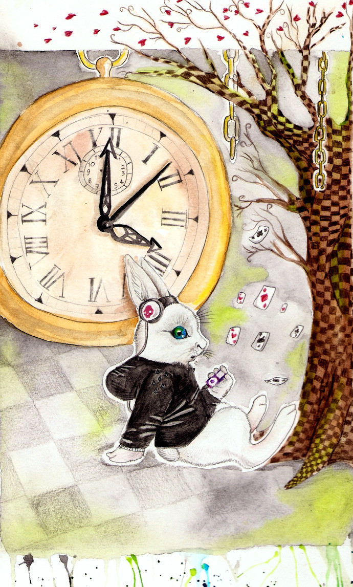
 Nortiker — Always on Time

Published: 2009-12-05 21:34:27 +0000 UTC; Views: 2777; Favourites: 121; Downloads: 0
Redirect to original
Description
Playing off of the "I'm late, I'm late!" thing. I really like the rusty look. Gave me a excuse to use color burn.And I love that watch!
I may fiddle with the text more..
Related content


Comments: 48

I love this...it represents to me, to make the best of every moment!
👍: 0 ⏩: 0

Alice in wonderland lol i really like that rabbit!
👍: 0 ⏩: 0

Very slick. It makes me think of a wooden relief of something in metal.
That watch is gorgeous too. Just enough design to make it stand out from any regular watch without being consumed by it.
👍: 0 ⏩: 1

Thank you so much! 
👍: 0 ⏩: 1
You're welcome.
I love to give such comments!
👍: 0 ⏩: 0

I love this! I'm using it for inspiration for my A-level graphics work I like it so much. We're illustrating Alice in Wonderland and making front covers and when I found this it gave me loads of new ideas
👍: 0 ⏩: 1

Ooh, I like this a lot. I like how it looks like an ancient paper scrap. ^^
👍: 0 ⏩: 1
Thank you! ")
👍: 0 ⏩: 1
You're welcome and welcome~ XD
👍: 0 ⏩: 0


Thank you!
👍: 0 ⏩: 0


This is very beautiful.
I really love the pose of the rabbit and how the chain is flowing. The texture is awesome too.
👍: 0 ⏩: 1


Perty.  (Smile)")
👍: 0 ⏩: 1
")
👍: 0 ⏩: 0


Really cool, I really love the textures and just the rusty tone of it.
👍: 0 ⏩: 1

That's awesome o3o I like the concept too. The text could use some fiddling though, I read it as "Always on Jime" x3
👍: 0 ⏩: 1
I flipped the "t" around and it was just not working. xD Maybe I'll find a solution later. Bah.
👍: 0 ⏩: 1
Lol, it looks fine, I'm just blind

👍: 0 ⏩: 0

There you are!
May I say that my mind Alice and Wonderland. Wow, I love this. The texture that you used is perfect for the piece. The watch ties it all together too. Wonderful work friend.
👍: 0 ⏩: 1

I really like this!
I say if you do more work on this I would like to see the black border integrated more into the design instead of just being sharp edges.
👍: 0 ⏩: 1
I didn't really notice it before, but I've removed it! This was for a branding ad, (That I don't like so I just used the image.) and that was on it.
Thank you!
👍: 0 ⏩: 1
Actually I think the black border was nice! It helped pull the image together and made a nice frame (especially on the greenigh DA background)
What I was suggesting was to pull sharp black edges of the border into the image, like following the contours of the texture.
👍: 0 ⏩: 2
I'm not sure what you mean, I've been rereading it trying to understand but the English just isn't clicking. o_o
👍: 0 ⏩: 0
*greenish... I hit enter too quickly it seems.
👍: 0 ⏩: 0

Agreed with Tamia. ^^ I think I like the rusted look too--it manages to look colored without really being colored. If that makes any sense. It probably doesn't. XD
The line style is <3. ^^
👍: 0 ⏩: 1

...That is seriously pretty. xD And cool. I can't decide which one more.
Nice work! ^^
👍: 0 ⏩: 1

