HOME | DD
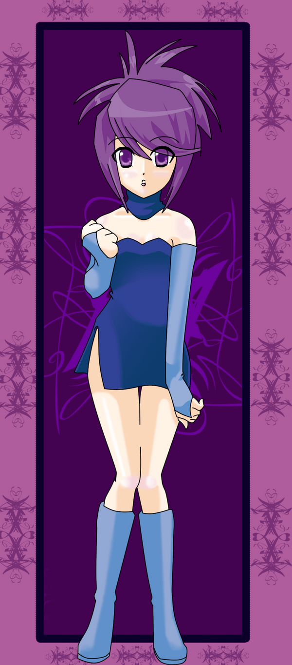
 nukunukuneko — Okami

Published: 2008-04-30 09:17:10 +0000 UTC; Views: 5869; Favourites: 236; Downloads: 183
Redirect to original
Description
EPIC FAILDA failed me in uploading lol
this picture crashed my internet like everyday this week
loool
you can use this as a wallpaper if you want
i did XD
origonal size
3900x2984
tools: photoshop, tablet
Related content


Comments: 92

 (Wink)")

")

XD you make me wish I was better at drawing boobs. OMG I wanna draw girls now
👍: 0 ⏩: 1

Dude, I would watermark the crap out of this if I were you. I see a lot of something very similar to this every day. Thieves just love anime.
👍: 0 ⏩: 1

D:
thanks for the warning
👍: 0 ⏩: 0


Aamatseru never looked better! I especially like the lines and the colors.
Simply gorgeous.

👍: 0 ⏩: 1
XD i have a tablet
plus i'm uploading tutorials when i finish them
👍: 0 ⏩: 1

I'm about to get a table .Which table do you have ?
👍: 0 ⏩: 1
yeah...sorry about that ...
👍: 0 ⏩: 1
i have an intuos3 6x8(i think thats the size lol)
👍: 0 ⏩: 1
mmm mine was on sale so i'm saying a little over 300 dollars regular price
bamboos i know are $100
👍: 0 ⏩: 1
yup
they can even be as high as 1000
👍: 0 ⏩: 1
well some people don't have that kind of money 
👍: 0 ⏩: 1
the bigger the size the more expensive it is >
👍: 0 ⏩: 1
I know .Well, I hope to one soon . I want to improve .
👍: 0 ⏩: 1
I know .Well, I hope get to one soon .
👍: 0 ⏩: 0


Very, very pretty. I like the anatomy, and the eyes look gorgeous.
👍: 0 ⏩: 1

Totaly well done, very good photoshop use and the colors are <3 too ^^
👍: 0 ⏩: 1

The style is done so amazingly! I really like her pose and the way the background flows, So much creativity, Nice work
👍: 0 ⏩: 1


i looked up what she would look like in a human form lol
👍: 0 ⏩: 0

I like the colours and background in this one! My main gripe though is the shading; it looks inconsistent in some areas, particularly her backside. Also, it looks dodge/burnt. Use light and dark colours instead of the dodge/burn tool. Another thing, her boobs look a bit awkward; try moving the right one in a bit because it looks a little too long.
Her skin in particular needs some shades of purple and brown, rather than a simple shadow or midtone burn. Real human/humanoid skin has shades of green, blue, purple, and red in it. Try using that when shading. Her hair needs some better texture as well, to give it more of an effect of hair.
I think what I like best about this picture is the folds in the clothing; it makes it look almost real. Try to draw the highlights and shading in it differently though, to give a more realistic effect, and use some different colours instead of gray or the highlights burn.
Last of all, the background looks cool but I would recommend you not rely too much on the gradient/layer effects. They look flashy but can also be a bit too bright if you're not careful.
It is a very nice picture though, and it looks like you're improving!
👍: 0 ⏩: 1
i dont use dodge or burn tools
i rarely use gradiants
👍: 0 ⏩: 1
Well, the shadows did look like they were painted using the burn tool, though they are probably just darker versions of the base colour. Try using different colours for shading, like blues, greens, and such. It'll help them look better ^^
👍: 0 ⏩: 0

amazing detail. almost looks like a female inuyasha inverted colors and style XD. Must fave
👍: 0 ⏩: 1
thanks
i never watched inuyasha by the way
👍: 0 ⏩: 1
it was actually interesting. maybe you should check it out.
👍: 0 ⏩: 0


| Next =>