HOME | DD
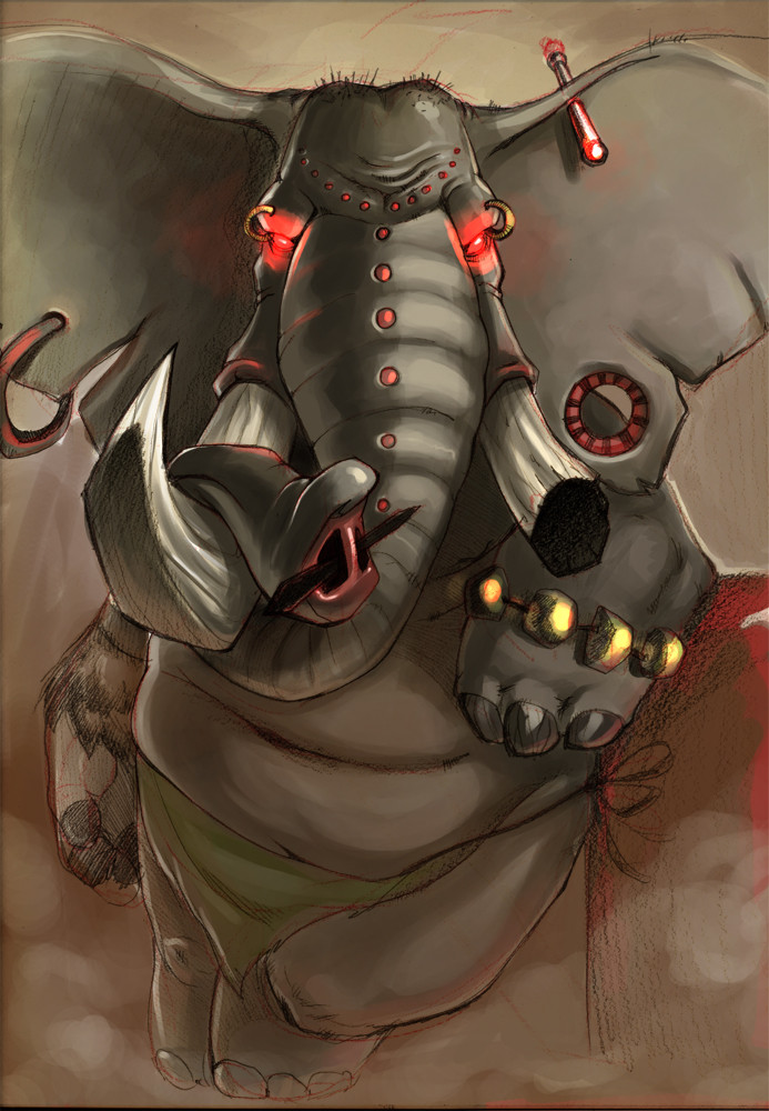
 Nutthead — Dragon color ver2

Published: 2007-05-03 14:43:41 +0000 UTC; Views: 972; Favourites: 14; Downloads: 19
Redirect to original
Description
This one you already know...i made the update long time ago and I think you should check out the difference here's the [link] to the old deviationhope u prefer this one

Related content


Comments: 18


Nice! I see the bounce light on the left side. Adds more dimension to the piece. You should try placing the character on a medium grey or muted blue background to add even more mood. Nice piece regardless!
~Chad
👍: 0 ⏩: 1
")
Thanks for doing the drawing!

👍: 0 ⏩: 0


 (Wink)")

е, да, има повече обем...ама тоя намацан фон що не го оправи и него

👍: 0 ⏩: 1

ahahah e sega ot monitora na stydioto we4e wijdam za kwo migoworish
👍: 0 ⏩: 1
👍: 0 ⏩: 0

da we,iskah da se izgawrq s kosata
👍: 0 ⏩: 0

hmmm, be ne6to sa se caknali obemite na tva.
osobeno rogata - predstavi si go gledan otpred - tva osvetlenie gi pravi razli4ni... Ili pone na men taka mi se struva. :}
Taq svetlinka ot vutre6nata strana na kraka mu e nevuzmojno da e tam.
Mnoo qka jvininka si mu vkarala v okoto, napravo e sq 6te me pogledne! xD :}}}
👍: 0 ⏩: 1

I think, this one looks better.
Great coloring and shadding job. Srsly.
👍: 0 ⏩: 1
haha of course it's better...i put lots more effort this time
👍: 0 ⏩: 0
