HOME | DD
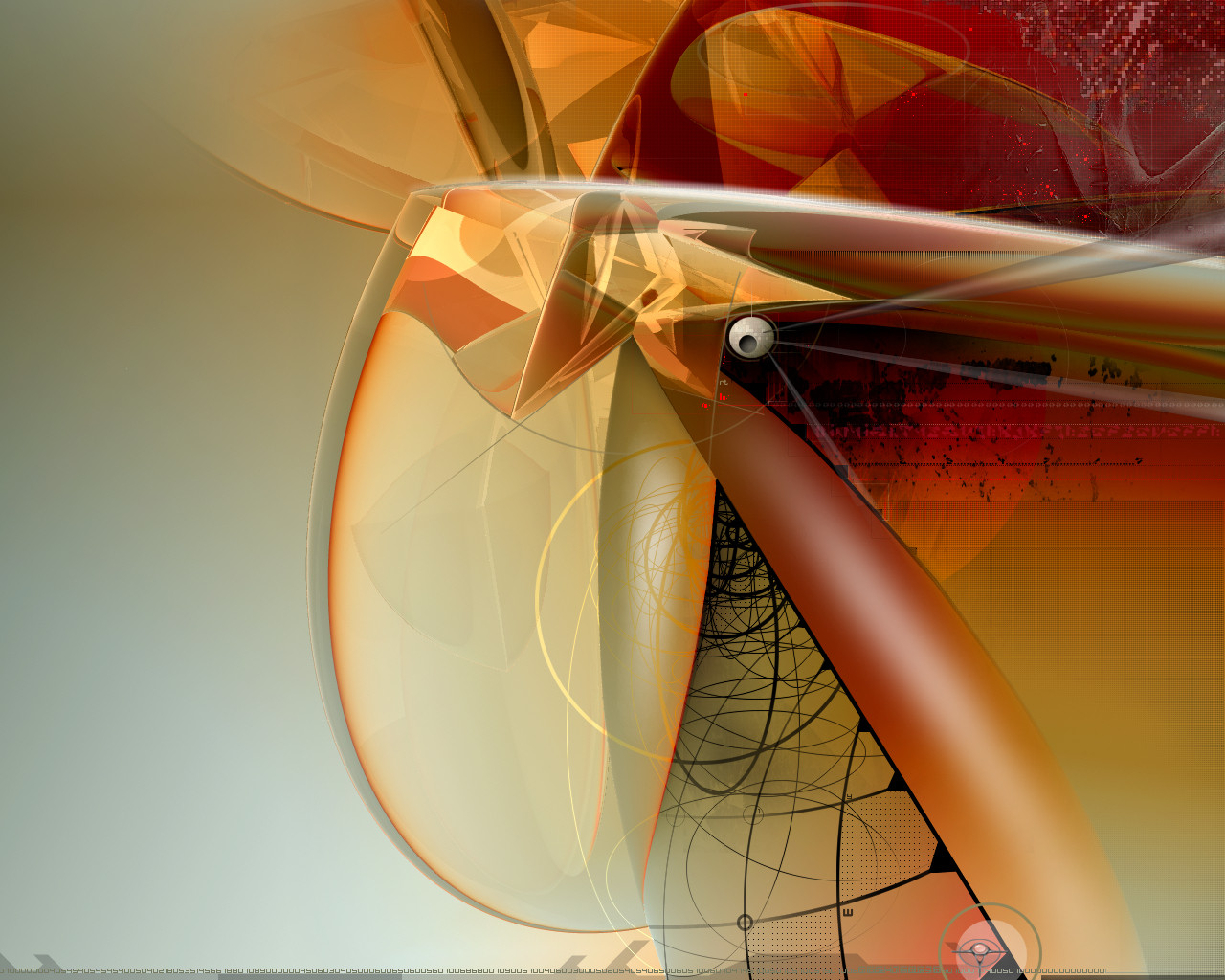
 nuvem — untitled I
Published: 2003-08-28 21:51:04 +0000 UTC; Views: 3057; Favourites: 44; Downloads: 3134
Redirect to original
Description
.I´m a bit confused with names
 (Wink)")
Related content


Comments: 51


This deviation has been chosen as a feature of the week
on
It has been found from the word: "Untitled " ( & random numbers, exceptionally)
 (Smile)")
👍: 0 ⏩: 1

welcome (=
beautiful color scheme, creative...great abstract
👍: 0 ⏩: 0


I love the title of it. Untitled 1 
👍: 0 ⏩: 0


I quite like it but think those numbers are out of place
👍: 0 ⏩: 0


my lord. this is nuts. great work... great color selection and everything that people have said already.
ur combination of styles across this piece is impressive... i dont see too much of that that works out in a balanced composition. im not so sure about the numbers at the bottom, but other than that this piece is rockin fun design candy.
haha, i just noticed the pixel art up thar. cleverclever.
👍: 0 ⏩: 0

straight to my desktop; this is Fabulous! I love the combination of styles going on here...I think the way you composed it they don't compete with one another, they are very complimentary...and the colors are fresh and soft without being too washed out or too loud....just a very well-balanced piece!
Thanks!

")
👍: 0 ⏩: 0

This is absolutely COOL! I love it and I love the whimsy in it because it really looks like a toucan joyfully caught in a fisherman's net.
👍: 0 ⏩: 0


i like the effects you did with the abstract shape, looks good
👍: 0 ⏩: 0

Very very stylistic.
Great job on this is all I can say as I run to check your gallery!
Perfect colors!
👍: 0 ⏩: 0

this totally rocks as a wallpaper. the use of space and combination of elements is great (and the color ain't bad neither..) doesn't look like a typical nuvem piece to me; nice to see your talent applied in other areas as well.
👍: 0 ⏩: 0


nice colors. i like the dirty-looking black spots
👍: 0 ⏩: 0

OMG this is awesome! theres so much too look at, soo, soo cool.... *speechless*
definete Fav
👍: 0 ⏩: 0


i like the black "tied" elements a lot, as well as the scatterplot looking red dots in the upper right... the central right handside portion of the image seems a little on the strong side... but overall i like the style
👍: 0 ⏩: 0

A beautiful arty combination of trendy and art-nouveau in one of the best wallpapers I've ever seen.
👍: 0 ⏩: 0

There can only be one word to describe it, and that's smooth.
👍: 0 ⏩: 0


Excellent abstract work!
The colors and forms are fascinating and your work is really impressive. Excellent one!
👍: 0 ⏩: 0

^syragon put it best. The different type of style in this is what makes it good. I like the flow of this piece. symmetrical and asymmetrical at the same time. Well done.

👍: 0 ⏩: 0

a bit cleaner than your usual style, nice to see some change going on. good work my friend.
👍: 0 ⏩: 0

Wonderful wp hun. I love the colors and flow. I like how it slowly goes into pixels in the top right corner, nice touch.
👍: 0 ⏩: 0

you're on another level bro.
and all we can do look up and watch.
and learn.
beautiful.
👍: 0 ⏩: 0

Wonderful abstract indeed--- love the colors....that is my fav aspect
👍: 0 ⏩: 0

")

very nice design. its kinda different, i like it!
👍: 0 ⏩: 0

interesting abstract, and I too like the digital decay...
👍: 0 ⏩: 0


wow...great colors and forms! outstanding piece nuvem! love your stuff!
👍: 0 ⏩: 0

very well constructed, i'm impressed, it's so abstract i think it should be given a whole new genre

👍: 0 ⏩: 0

that s great! so many imagination in an abstract dev, it s amazing!
can i ask you how long it took you to do this?
👍: 0 ⏩: 0


this piece works so well w/ da's colors! ")
👍: 0 ⏩: 0


Your style is magnificent. I can't stress how much of a masterpiece I consider this to be. I love the digital decay feeling to the upper right. The death star-like shape in the middle. Your color choices are so perfect I get caught staring. The forms are so 'flow' that my eye just moves around the image multiple times finding new things on each roundabout. My favorite aspect of this entire piece is the bold black flow lines in the bottom.
Wow, I can only dream of being this good at abstract design. I love it completely!!!!!!!!


👍: 0 ⏩: 0


Amazing as usual nuvem, looks like I found a new awesome wallpaper!
👍: 0 ⏩: 0

bastante abstracto, excelentes tons e formas e acho q entendo a dificuldade em dar-lhe um nome. hehe
Bom trabalho.
👍: 0 ⏩: 0
