HOME | DD
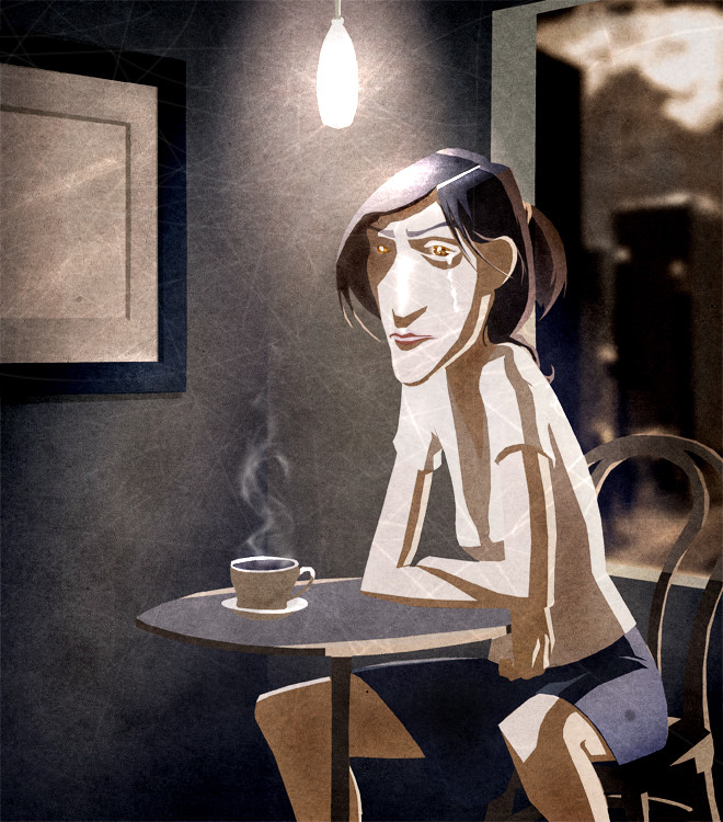
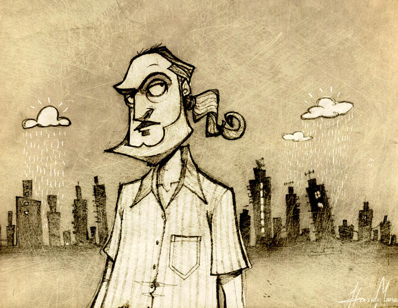
 ObservationSubway — Sad Coffee Color Changes
Published: 2008-08-30 07:01:55 +0000 UTC; Views: 721; Favourites: 19; Downloads: 26
Redirect to original
Description
The hard light and shading lines are still a big problem but thanks to all the feedback I received, I think I nailed down the color. Any comments appreciated.Related content


Comments: 17


Wow dude, it transmits...it´s so sad (in the good way). Nice colours, expressive pic.
👍: 0 ⏩: 1

Thanks. Yeah, I pondered on the colors for a while. There are still a few changes I would love to make... alas, an artists work is never finished
👍: 0 ⏩: 0


It looks really nice! And i really like the texture on it as well! Great job buddy!
👍: 0 ⏩: 1
Thank you! Its been a while, what are you up too?
👍: 0 ⏩: 1
i knooww its been hella days! Im doing mocap for IMD... yaay.. (unenthusiastically) lol. im actively looking for something.. more that i like. I needed a foot in the door and some expercience. and i got that now.. so onto the next better thing. What about u?? What have u been up to?
👍: 0 ⏩: 0

I think this is a definite improvement. It looks really stylish now (I want to say noir-ish, but I always hesitate to use that word)... and more importantly I think there's a definite moodiness (sense of purpose?) to it. I think you did a great job with the background and the harsh lighting. I actually quite like the way it is at the moment with the lack of outlines, an "undefined" kind of look; but I suppose you might add in a few lines to make it look more complete. One small point: the edge of the window (where it borders the view outside) looks a little to sharp; that is to say, it seemed to me like the foreground and the background (the view outside) were two separate pictures rather than parts of the same. I think you could soften the edge a little to make it blend into the background a bit more. You probably already noticed this -- I just though I'd point it out...
Anyway, this is your work and it's looking great! I'm glad I could be of some small help. Let me know when you've completely finished it, I'd be interested to see what it finally looks like!
👍: 0 ⏩: 1
I'm glad you took the time to write so much! Good observation on the sharpness of the window, I missed that.
👍: 0 ⏩: 0

I was happy with the style of this one
👍: 0 ⏩: 0


this is a definite improvement! i'm not that experienced, but maybe one of the light sources should be softer than the other? maybe a gradient would soften one...
👍: 0 ⏩: 1