HOME | DD
 okchickadee — Modern Ruby
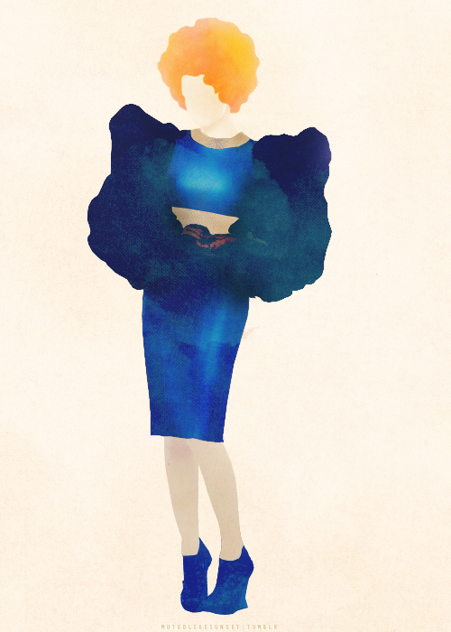

Published: 2009-01-14 04:49:32 +0000 UTC; Views: 1673; Favourites: 42; Downloads: 60
Redirect to original
Description
Ehhh, this didn't come out as I hoped. I wanted the drag aspect to be more noticeable. The dress is based on one of Iris Van Herpen's: [link]Please crit away!
EDIT: OKAY YES ANOTHER TRY.
") Maybe I will stick with this one.
Maybe I will stick with this one.
Related content


Comments: 22


Ehhhhh... I'm still reworking it?  (Smile)")
👍: 0 ⏩: 0

i like the colour version
or if you like the greys at least have some colour flow into it slightly
👍: 0 ⏩: 0

AWE BUT I LIKED THE COLORS:[ ITS PART OF THE WHOLE DRAG FEEL
👍: 0 ⏩: 0


you don't have do change anything excepting lips. bigger mouth would do the thing i guess.
👍: 0 ⏩: 0

well, angie, as your artdirector ")
what do you think?
👍: 0 ⏩: 1
Ah, thanks! I meant to make those traffic lights red spotlights originally but then it never materialized in color and I forgot all about it.
👍: 0 ⏩: 1

the hair all over is my favourite part
I think you could have gone a little crazier contrasting the foreground - golden locks of wild hair - with the background - darker
still pretty powerfull, lovely
👍: 0 ⏩: 0
i think that it may be just a bit draggyer if you made the volume on the head, like outrageous makeup tall hair big glasses etc, but this is gorgeous either way
👍: 0 ⏩: 0

Yep--well, with brush pen at least. The colors are all digital.
👍: 0 ⏩: 0


If you squared the jaw a little more or didn't have the bow cover his shoulders as much. A lot of the things that would let a casual veiwer know it's someone in drag have to do with scale, posture and outline, which can be hard to convey in an illustration. It looks great anyway.
👍: 0 ⏩: 1
Squaring the jaw--good idea, I think I might be able to fix that.
👍: 0 ⏩: 0

The face is just very feminine. Maybe if you squared the jaw a bit more, or widened the nose, it might give the appearance of a man. But very cool concept nonetheless.
👍: 0 ⏩: 0

It's a man, baby~
I'm just weirded out a bit on how both the arms are completely different sizes for no reason at all. Your handling is really nice though.
👍: 0 ⏩: 1
Aw crap, does it really seem that way? The other one's halfway behind the side of the dress.
👍: 0 ⏩: 1
Maybe if you made the other one more curved or on a slant so it would appear to be disappearing behind the body ???
👍: 0 ⏩: 0
