HOME | DD
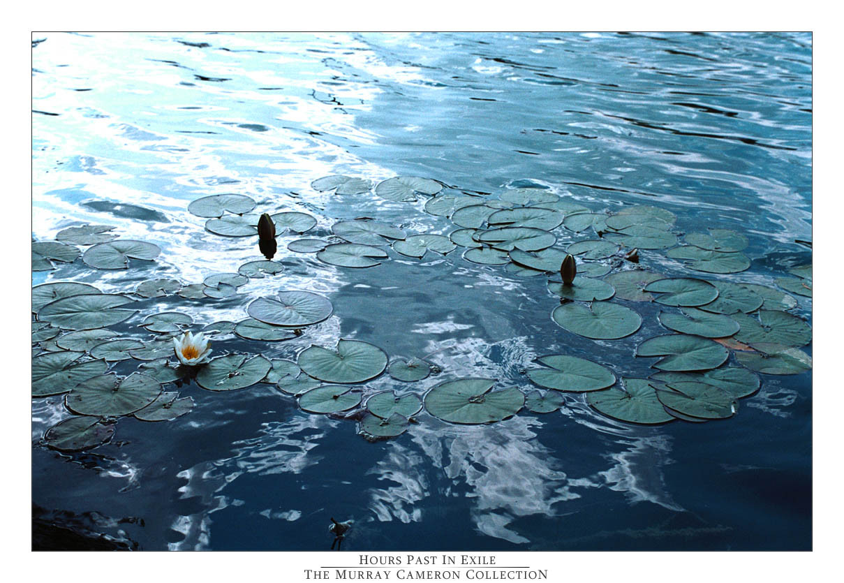
 okrandomguy — Hours Past In Exile
Published: 2005-04-04 00:43:50 +0000 UTC; Views: 440; Favourites: 5; Downloads: 44
Redirect to original
Description
This photo originally came out dullish. I inhanced the brightness, although I HATE the top left corner. No matter what I do I cant change it for the most part. Its just how the photo is. I hope it doesn't look that bad.Anyways I really liked this photo!
COMMENTs welcomed!
Related content


Comments: 27

still costs $8000.000
")
👍: 0 ⏩: 1

I absolutly love this one. i would love to buy it if I had the money.
👍: 0 ⏩: 1
I would love to sell it, if I new how lol. Just download it, print it off, and there you go
👍: 0 ⏩: 1
haha well I much rather have it as an actual picture, not just printed on a peice of paper.
👍: 0 ⏩: 1
then ill get it printed as a picture, and send it in the mail to you
👍: 0 ⏩: 1
awh, would you really do that???
👍: 0 ⏩: 1
awh, thanks for getting my hopes up xD
👍: 0 ⏩: 1
no prob!... i mean, ok ill send ya one, one day,,
👍: 0 ⏩: 1

Very, very nice composition. To get rid of that bright area, lower contrast and then enhance brightness, but not too much. If you play with it too much, it doesn't look natural anymore. You have some white areas in the foreground that almost look like paint spilled on the water. I'm thinking, too, that you reduced detail.
👍: 0 ⏩: 0

I LOVE the top left corner! It's brightness adds something different to the image and makes it feel kind of fresh. Awesome!
")
👍: 0 ⏩: 1
")

blue ...sucha perfect colour for you
i like this shot.
 (Smile)")
👍: 0 ⏩: 0

I can fix that for you if you want? ...Just because it's an awsome photo, I hate seeing it lack simply because of processing (Photoshop) troubles. Get back to me on that, cause I wouldn't mind doing all your Photoshop work. I love all your new stuff!
👍: 0 ⏩: 0

Hey...cool shot man. The sky's reflection really gives the water an awesome colour. I was just thinking about what DeadTulips said about the cropping...that probably would have been the best solution had the bright spot not been in the lily pads too. If you were thinking on manipulating it later on or something (if you're using Photoshop), make a selection around the light spot, and try a mixture of replace colour and colour balance to see if you can get the effect you're looking for. Good stuff man, keep it up!
👍: 0 ⏩: 1
Yes thats a good idea. I think I might go back to it and "fix" it with the replace colour tool! Hmm come to think of it I rushed this peice to fast. Well thanks for the awesome comment bro!
👍: 0 ⏩: 0

great picture! i agree with you on the left corner though, it definitely takes away from the plant life, but nonetheless the picture turned out good. Maybe you could go back to this place on a greyer day?
👍: 0 ⏩: 0

Hmm... This almous look like a Monet painting... with the motive and the colours as well. It has a very good atmosphere.
You could have added more green to the image... perhaps...
Its something about the light I can really get a hold on. Yes the light up in the left is disturbing and if you werent so traditional and had studied your new photshop book you would have knew how to fix that.... (u probably allready know )  (Wink)")
The way the leaves and the black lotuses ( I just have to call them that

👍: 0 ⏩: 0


this came our very beautiful i love waterscapes! although the only correction i would make is maybe cut out the high contrast in the corner of the photograph is a little distracting...
👍: 0 ⏩: 0

It's unfortunate when this happens, because it's happened to me... you have this perfect photo & somewhere in the corner is this bright light you can't get rid of... so you considering cropping, but when you crop it, you just don't like it as much. It really sucks. Anyhow... What I like about this photo, i like very much. The dark blues in this photo are beautiful. However, the corner is definately an issue. On full-view there's this aqua blue coming off of it... that's painful to the eye. Nevertheless, there's not much you can do (other than crop)... You've got no choice but to accept the photo as is... and hope for a better shot next time. Let me just say though... that which is nice in this photo is REALLY nice...
👍: 0 ⏩: 1
Thanks for the awesome comment.
I agree with you on all accounts! Im glad you understand my work here since you've came across the same problems before. There is next time but that still doesnt make this photo better har har!
Anyways thanks for the words!
👍: 0 ⏩: 0

ooo i really love it, so fresh and cool looking ^^ great job
👍: 0 ⏩: 0
