HOME | DD
 oldmarksir — The Darkness contest entry color finished2

Published: 2011-12-16 05:30:32 +0000 UTC; Views: 5757; Favourites: 78; Downloads: 82
Redirect to original
Description
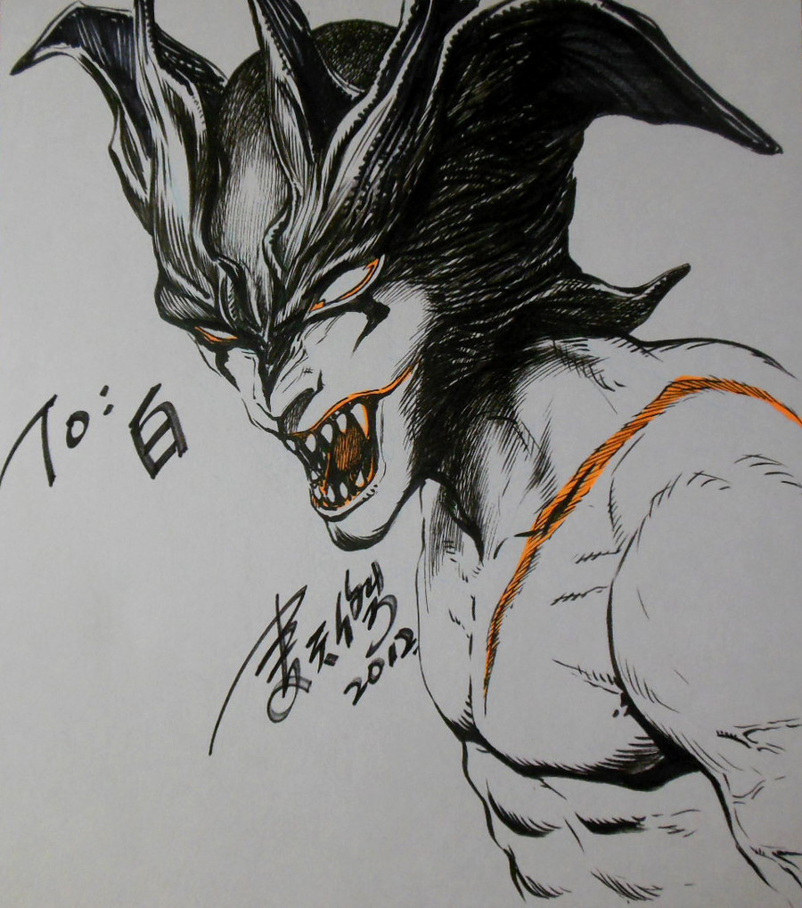
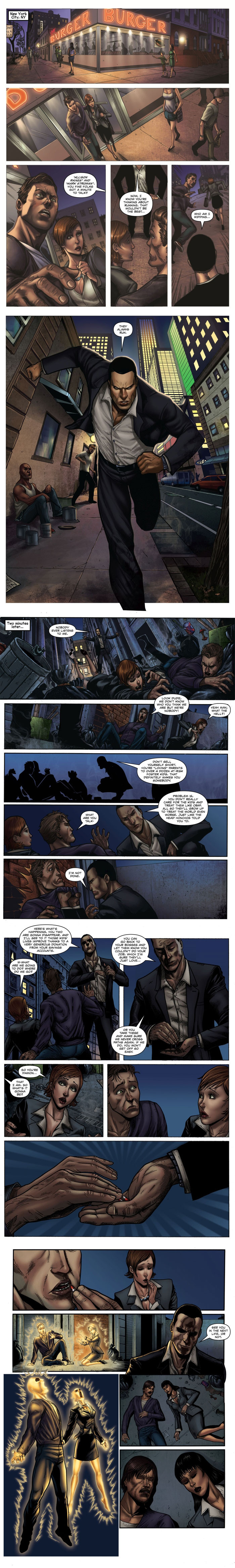
fix the mistake ..."There is some nice stuff going on here but I’m not a fan of triangle shaped panels as they always feel like everything is being forced/crammed into that space. The reader is following a story and shouldn’t be distracted by the shape of a panel. I like the spatial separation between Jackie and the Brotherhood goons in panel #1 as it sets up the rest of the action nicely. The Darkling in panel #2 is a bit too dark (pun intended) and its hard to see what he’s doing. The artist takes a risk in the last panel with the angle but for the most part it works. The only issues I have with it are Jackie’s leg being out of proportion to the angle of the shot and the “in perspective” Aaiieee. Because the SFX is in perspective and dead center it’s the first thing you see in the panel. That’s a no-no but easily fixed. I like this page a lot." -Mark Silvestri
It's my honour and luck to have comment by Marc Silvestri.Thanks alot!
Congratulations to all winners and semi-finalists.,
In fact there are so many great entries ,
I'm lucky and glad to win the 3rd prize.
Related content


Comments: 48

This is kickass!
The Darkness are better than Team Fortress 2.
👍: 0 ⏩: 1

")
 (Smile)")

I really loved yours a lot. I just love the first panel and your colors. It really stood out also I think too because of the white boards.
👍: 0 ⏩: 1


Congratulations! You were already a winner in my head before your actual win!
👍: 0 ⏩: 1


This is awesome... my only suggestion would be to change the font to something slightly more legible. Good luck!
👍: 0 ⏩: 1

thanks!I accepted the suggestion,hope you guys like it~
👍: 0 ⏩: 1

This is nice!,.....very very nice! Blood scene is awesome.
👍: 0 ⏩: 1


One of the best I've seen so far!
but..:
I think you should use a better font for the text in the bubbles...
And I think you should work on the monster (The one breaking the cable thingy ) a little more...
Good luck!
👍: 0 ⏩: 1


Damn you! that looks awesome! I mean... good luck man! xD
👍: 0 ⏩: 1
yours looks awesome too!good luck~
👍: 0 ⏩: 0

Amazing man! I'm working on mine as we speak..but this is insane...one of the best I've seen so far...The competition is tight...keep it up!
👍: 0 ⏩: 1

you sealed the deal there bro, congrats in advance! I can't stop looking at your work
👍: 0 ⏩: 1
thanks!you had good works too~
👍: 0 ⏩: 0