HOME | DD
 Ollapus — Inconsistency
by
Ollapus — Inconsistency
by

Published: 2008-12-16 17:25:47 +0000 UTC; Views: 2606; Favourites: 124; Downloads: 64
Redirect to original
Description
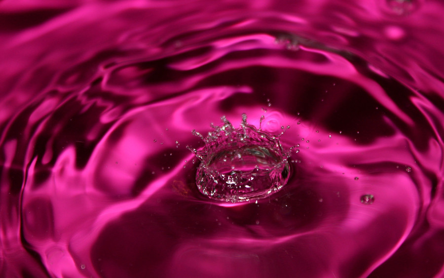
Hope you like it. I sure do.Related content


Comments: 98


")


NICE use of distortion and composition! 
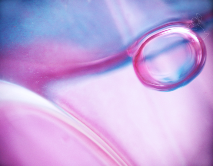
Took me a moment to realize it was a wine glass, it looks more like the background squares are being liquefied and poured out XD
👍: 0 ⏩: 1

I'm more into the rough, raw kind of aesthetic, but I can appreciate a good photograph. The checkered effect works well, too.
👍: 0 ⏩: 1

I really like the way the pattern gets redefined by the glass. Looks very interesting. What exactly is that in the background, anyway? And where's the light coming from?
👍: 0 ⏩: 1

Thanks a lot! The background is a printed paper with black and pink texture. I put light both behind the paper and in front of the glass.
👍: 0 ⏩: 1
Very nice. The light is very indirect and doesn't take up much attention, that's what I like about it.
👍: 0 ⏩: 1


I would give this a full 5 out of 5.  (Smile)")
👍: 0 ⏩: 1
Thank you very much. I'm glad you like it.
👍: 0 ⏩: 1


Well I absolutely despise pink but I really like this picture!
👍: 0 ⏩: 1
Hehe, I take that as a big compliment.
👍: 0 ⏩: 1

Yeah, interesting shot! The black and pink makes the statement!
👍: 0 ⏩: 1


Thanks a lot, I'm glad you like it.
👍: 0 ⏩: 0


Interesting shot, clever idea...one I've seen many times before but it's ok to see a new variation. Pink and black give an excellent contrast and the checkered design makes for great reflections. My only issue is the focus, It seems you were going for a blurred look which is fine, but its a little too out of focus for my liking and I think considering there are lots of squares it would have been nice to have a crisp clean image.
👍: 0 ⏩: 1
Thank you very much! Yeah, I totally agree on the focus issue. I would like it to be clearer as well. Maybe I'll redo it one time.
👍: 0 ⏩: 0


Wow! So pretty! Black & hot pink go awesome together, and the wine-glass gives it a very "good-times, party-esque" feel.
👍: 0 ⏩: 1
| Next =>