HOME | DD
 olpluvr — Hello, From the World Below

Published: 2007-10-19 06:54:49 +0000 UTC; Views: 1483; Favourites: 23; Downloads: 0
Redirect to original
Description
"Please forgive what I have doneno you can't stay mad at the setting sun
cause we all get tired I mean eventually
and there's nothing left to do but sleep"
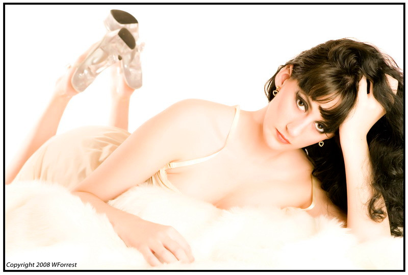
Taken on a very lovely Nova Scotia afternoon in the oldest cemetary in the city. Though it was Oct. 8th, 2007, it was warmer than most of our summer days! I had the pleasure to meet *T-Hip who contacted me for a shoot during his visit from Ottawa. I certainly hope we work together again.
Model: Me
Photog:
(Click image to enlarge)
Related content


Comments: 18

Old cemeteries are really interesting to take photos in. I like the lighting of this one.
👍: 0 ⏩: 0

Wonderful job, my dear!!
The sepia colour is a nice touch...


👍: 0 ⏩: 1

Thank you lovely! Not many other people seem to be fans of the sepia, but I'm happy that you like!
")
👍: 0 ⏩: 0

Sensual, a gothic look...like it!
You are a very beautifull model...
👍: 0 ⏩: 1
Thank you so much! *blush*
I wasn't sure if I could pull off the gothic feel, hehe.
I appreciate you adding this to your 
 (Smile)")
👍: 0 ⏩: 1
Keep going with your good work....I'm a fan!!

👍: 0 ⏩: 0

Once again, your work steals my words away, but I will try my best with them, miss. :]
Really, I like how the photo is kept in a sort of monochrome theme. I imagine it with colors and honestly, I'd have to say the monochromatic touch makes it better.
The tombstone on the right side of the piece seems to even everything out. Without it I see a gap between you and the right edge of the picture; the tombstone fills in any emptiness that might have been there.
Lastly, I have to say that taking this photo on the slope of the hill is much better than on flat ground, or even the top of the hill. Though the hillside slants, you also help even this out by remaining straight-backed.
Wonderful job, dear.
👍: 0 ⏩: 0

What I like most about this photo is the contrast in textures between the concrete tombstones, the grass, the trees and the silk/ taffon shininess of your dress.
The flow of the wind, captured in your blowing hair, is also really nice.
Albeit, I think there's too much shadow falling across your face.
It might sting a little, but maybe you could have turned your head more towards the sun?
All that shadow detracts from the features of your face, in my opinion.

👍: 0 ⏩: 1
Hehehe- the sun was in every wrong direction that day! Shadows were horrible for us but we did learn a few little things about location shooting. If I could redo this I'd tilt my head down a bit and more toward the sun.
I have the perfect headbanger hair, which works well in the wind! It was such a warm day for mid October too! Thank you for

👍: 0 ⏩: 1


Nicely composed. I think it might look better in color or b&w but the sepia is okay. You look fantastic in that dress. Have a great weekend.
 (Cool)")
👍: 0 ⏩: 1
Thank you so much! *T-Hip and I have been thinking about how to play around with the editing of this series. There is a black and white version of a picture from this series, and the rose on the grave is red: [link]
Thank you for adding this piece to your
👍: 0 ⏩: 1
You're welcome. I'd love to see the final result of your work on this series.
👍: 0 ⏩: 0

Thanks for the kind words, right back at you, it was a pleasure to meet you. Yeah hopefully we can work together again.
I think the sepia gives it an antigue look, like an old photo.
👍: 0 ⏩: 0

I have to agree with salmonosis... I mean it's a lovely picture, don't get me wrong, but I think it would've looked better with a slight incandecent/cold feel, or even in just plain color. This is just my opinion though.
👍: 0 ⏩: 1
Hmmm... color didn't seem to do anything for me or for *T-Hip . It isn't meant to inspire emotion, but to give it an antique feel to it.
 (Wink)")
👍: 0 ⏩: 1
Oh, I see. But it still looks nice.
👍: 0 ⏩: 0

i think this is a very artificial image.
The sepia tone feels forced to inspire emotion.
👍: 0 ⏩: 0