HOME | DD
 OpalMist — Life Sentence

Published: 2009-12-01 11:57:32 +0000 UTC; Views: 1138; Favourites: 22; Downloads: 42
Redirect to original
Description
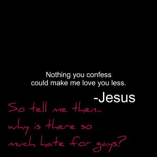
I originally started off with a crucifix design, you know, with the whole death thing, but then when I added in the ribbon, it just got WAAAAY to Jesus fish-ey, so I scrapped that, and BOOM! All of a sudden it looked 50 times better, so I just went with the whole plain thing.
Related content


Comments: 9


I think I would have used different wording, but the way you have done it definitely captures the attention and gets the point across.
👍: 0 ⏩: 1

I would have said "screw" or "Don't turn one night into a life sentence."
They just don't have the same impact yers does.
👍: 0 ⏩: 1
")


")
Looks great hun, and yeppers sometimes less is better
Strong words you used there. But making a good point.
")

👍: 0 ⏩: 1