HOME | DD
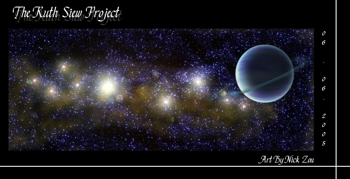
 oraclemoon — The Ruth Siew Project
Published: 2005-06-07 03:06:19 +0000 UTC; Views: 255; Favourites: 1; Downloads: 25
Redirect to original
Description
I am extremely proud of this one! It's not completely realistic looking, its not one of my best. But it's for a friend Ruth so it's special to me. The colours are alittle different from what I would normally use, but I think it worked. I love this one.Related content


Comments: 5

Its good, nice planet and rings, but the stars are a bit bright and take the focus off of the main part. just a hint,
 (Smile)")
👍: 0 ⏩: 1

That's the thing, the planet isn't the main portion of the picture, I put it there to compliment the stars; the stars in the background are actually the focus of this picture.
👍: 0 ⏩: 0

Thanks ")
👍: 0 ⏩: 1

Do'nt worry! I think it's fine, and the colours are good to! To many colours may hurt the pictures balance...I think.
👍: 0 ⏩: 0