HOME | DD
 OrangesWithJam — Smile

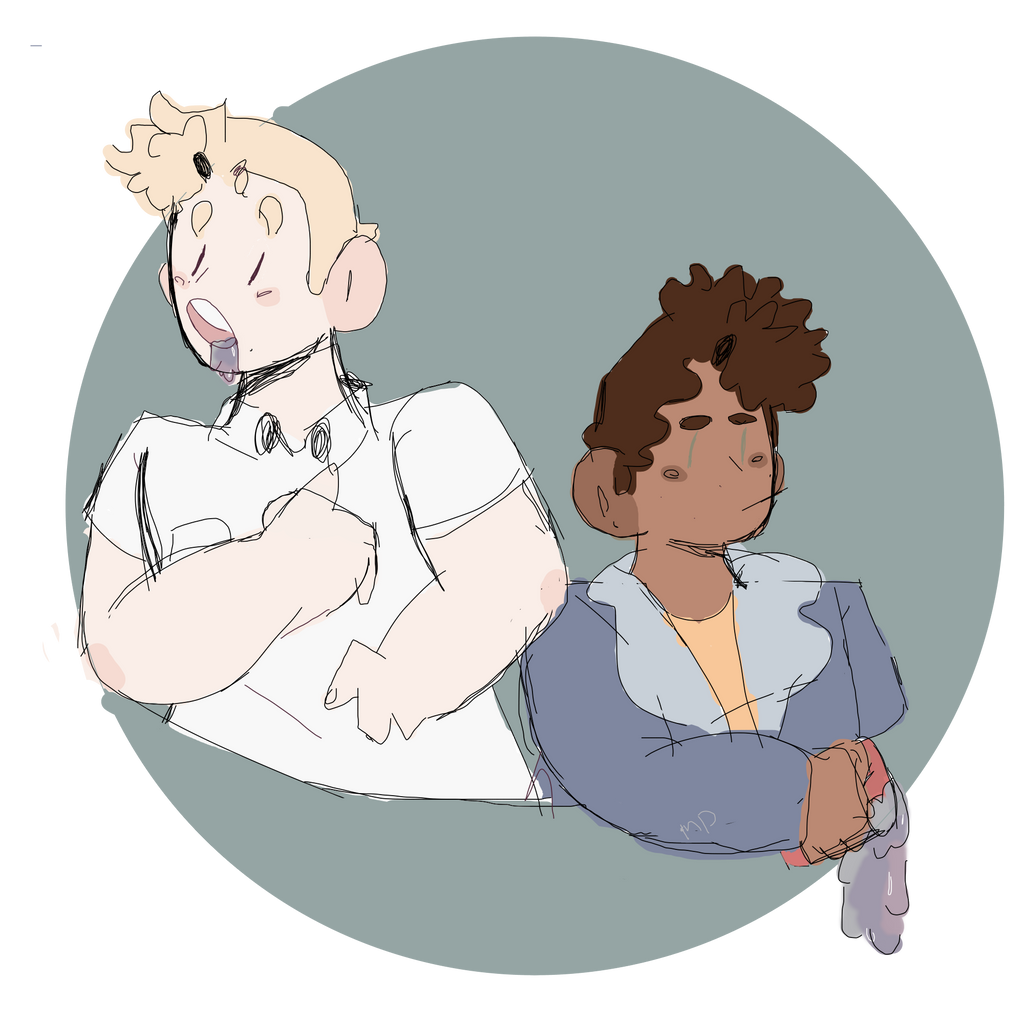
#oc #gayboy #original #originalcharacter #originalcharacters #smile #original_character
Published: 2017-11-22 17:50:04 +0000 UTC; Views: 426; Favourites: 32; Downloads: 0
Redirect to original
Description
Pictures or it didn't happenHEY LOOK I DREW SOMETHING *rejoice*
Atticus and Tess (c) Have a Great! Day
Related content


Comments: 23


XD thank you!
👍: 0 ⏩: 1

Thanks! I appreciate it <3
👍: 0 ⏩: 0

It's alright. Could put more work on the hands though, and brown pant.
👍: 0 ⏩: 1
( phfff finally someone notes the hands which are always shit) Yeah I know, i was running out of patience and literal time to finish it. plus XD i wasn't using my normal stylus i was using one that for measurements purpose it probably about half the size of your pinky, which made straight lines and any form of direction difficult to accomplish. I'm just glad my art is alright <3
👍: 0 ⏩: 1
Haha! Hands are difficult. Your style is unique. I understand your struggle with your stylus. Sometimes, I get impatient too. I mean, I can't draw this even with smaller stylus so yeah.. good job
👍: 0 ⏩: 0

Also from Project Comment! Your style is your style, and if you like it, keep going. A loose, squiggly method with blotchy colors is just fine as long as you're consistent within the work. Remember squigglevision type cartoons like "The Critic"? It works if you make it work. Not everything "sloppy" is lazy --not everything loose is bad, not everything erratic is wrong. It's your style sheet, not theirs. If this is where you are going - OK! You want it to be more of something else (manga, retro, classic, anime, realistic, chibi) then work in that direction.
The trick of using very loose lines in color is to have a solid palette of contrasting colors to define and delineate the things/people you are showing. And, you're doing it. You could up the saturation a bit to make things pop more, but looking at your other works like Camp camp , it looks like you prefer soft, pastels. Fine -- just squint a bit when you think you're done and if everything blurs together, you need more color distinction.
Thick legs, stumpy hands, pyramid necks? Fine -- those are your style artifacts. Define your style sheet and go with it! Experiment to suit and keep drawing!
👍: 0 ⏩: 1
Thank you so much for advice! I really do appreciate it so much, I really am working to fix some things about my style that I myself don't like! I'll make sure to take into account what you've told me next time I draw

From project comment. I like your style at least will be great when you improve more because this has some problems. First just is that the line work and coloring looks too sloppy. I know its part of the style and is not added just to be lazy, but if you are going to use sketchy line work and coloring you have to keep it to a minimum. People still have to differentiate parts and know what is going on at first glance. Also with the coloring the guy on the right side his finger less gloves is colored over the line work. It's doesn't mach the rest of the piece and looks lazy. I advise you to first sketch the basic shapes and figures out and make another sketch layer more precise, and to keep the coloring closer to the lines so you know what things are colored. Second the anatomy. Its decent but haves some problems. The neck is not that natural it's starts out fine but at the bottom it's too wide and it looks like an cut off triangle. This is also a nitpick but the heads are too small in more stylized pictures the heads are bigger. Not a big problem I just found that odd. The best thing about this is their faces, it's appealing and stylized and the rest of the lines and colors in this should be like the face. (sorry if this is confusing)
👍: 0 ⏩: 1
Thank you!
phfff i know i'm lazy, I just run out of patience with my own art at times, especially since my mom limits the amount of time i'm allowed on it. I probably will go back and fix some of the colors in this piece, the lineart though. I don't know whats wrong with me at this part, i have the patience to do MULTIPLE sketches of it and trace over them but sometimes i do one sketch and even then the lineart turns put shitty XD especially with this piece because i was using a stylus thats half the size of my pinky finger. I just suck at necks and i'm learning and trying to get better at them, browse my gallery and you'll see they use to be WAY worse. But thank you for taking the time to look over my art, i'll work on improving and giving more time to it ( when i'm not a lazy shit

This is really cute, but there is something weird about it which I think is the head size. They look a little bit to small, but other wise this is really good!!!
👍: 0 ⏩: 1
XD thank you, I'ma be honest though I'd rather the heads be too small then to big but thanks for the critic <3 I do appreciate it
👍: 0 ⏩: 1
Your welcome and I can agree with the small head thing.
👍: 0 ⏩: 0

Really neato! I like how lose and confidant it looks! The colors and characters are great too!
👍: 0 ⏩: 1
X3333 Thank you! I'm really glad you like it! I've been trying hard to fix some mistakes in my art work but hearing something kind about ti doesn't hurt! Thank you for boosting my self esteem <3
👍: 0 ⏩: 0
XD phhhhhhff noooo don't make there be sexual tension between a 25 year old and a 15 year old boy. There more like scars caused by being rewound X3
👍: 0 ⏩: 1

Well it looks like there is cum on his face and lip and like ees
👍: 0 ⏩: 1
