HOME | DD
 osullivanluke — Fixing Apple's new iWork+iLife icons

Published: 2013-10-21 13:21:35 +0000 UTC; Views: 7358; Favourites: 15; Downloads: 814
Redirect to original
Description
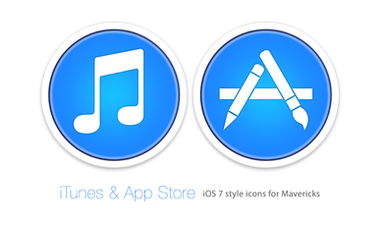
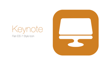
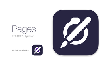
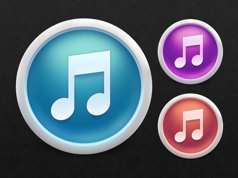
The new iLife icons are awful. The new iWork icons are okay. But they'd all be so much better if Apple stopped crapping gradients over EVERYTHING that they make (ffs).So I fixed them. And they look better. (but still not great!)
Related content
Comments: 7

I don't think they should be flat, just the gradient less harsh. The Pages and iMovie ones are fine, but Keynote and GarageBand icons are too much.
👍: 0 ⏩: 1

Yeah, the iWork ones have grown on me over time and I actually quite like them now, but yeah, the iLife ones definately need toning down.
👍: 0 ⏩: 0

Any chance of being able to download the pngs?
👍: 0 ⏩: 1

I don't have the full res PNG's cos I did them before the full-res icons were released and it was only a quick thing. I might make a high-res version of the iLife ones sometime, but I quite like the iWork ones now!
👍: 0 ⏩: 0

It's mind blowing the fact that Apple has been using their marketing team do do most of the design work on iOS 7!! I can't believe it! Apple has an incredible design team, why did they all of a sudden switch software design to the marketing team??
👍: 0 ⏩: 1

Yeah, I thought that as well.
Then again, they said they wanted a fresh set of designers so that the icons didn't look too similar to the old ones. So I guess they got what they asked for.
I just wish they let their in house design team have a quick look over them before shoving them in everyones faces...
👍: 0 ⏩: 0

That's right, the flat is rather successful. He should renew these new icons and break the myth that they maintain.
Is it possible to put both versions for download.
Thanks.
👍: 0 ⏩: 0
