HOME | DD
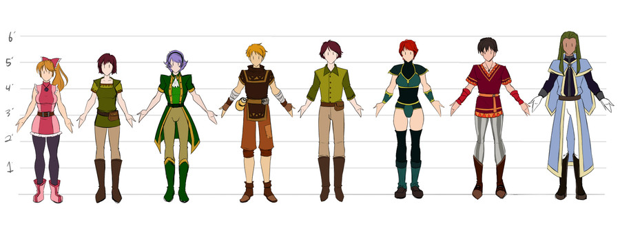
 Otakatt — 2012 - Cast of Characters
Published: 2012-11-16 06:14:23 +0000 UTC; Views: 490; Favourites: 4; Downloads: 14
Redirect to original
Description
It's about time! <3 So happy.Related content


Comments: 3

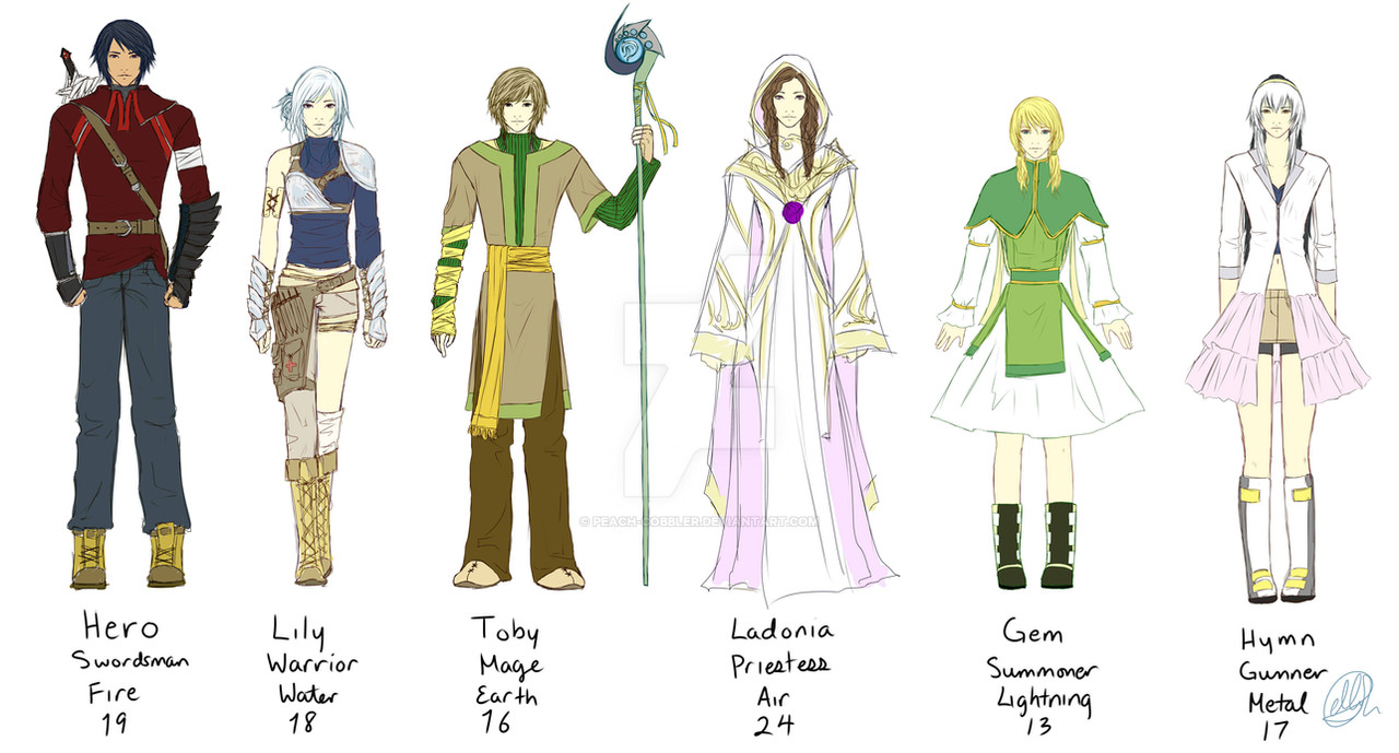
Pretty cool designs, especially the outfits. I want to pick out a few favorites, but I look at them again I find that there are things I really like on all of them.
I really like the first girl, the one in pink. Her outfit is really cute...I like how it's pretty simple, with the wide band of darker pink breaking up the lighter pink. And I like the kinda furry trim on the skirt and on the "sleeves." The kinda big, pink boots make the bright outfit even more fun, as does the bow in her hair. I like that she has the dark leggings...coupled with the bright, energetic colors of her outfit, it communicates that she's active athletic, not a damsel who needs saving. I also like how you drew her figure; she's a bit curvier and more muscular than the other ladies, which, again, gives some information about her personality.
I like the girl next to her. Her outfit is kinda simple, too, but it's also more low key, with less flashy colors. She seems a bit more reserved and quiet than the girls on either side of her. I like the styling on the sleeves and "collar" of her shirt -- simple elements that add a lot of interest to the outfit.
The purple haired girl is great, too -- I love the swooping shapes that her hair curves/curls into in the back. Her coat is great; I like how in the front it curves to wrap around the contour of her body. The little tie is fun, too.
I like the guy next to her...his outfit makes him seem like an active, maybe martial artist/wandering type. The patch on his pants show how his class might differ from the others, or as I assumed, that he might be more accustomed to traveling/wandering alone. That said, I really like that you gave his shirt/tunic a design on the chest that reflects the design on the bottom -- the triangle shapes add some energy to his outfit, too.
I like the next fellow because he looks very refined and classy and proper. His outfit looks like what well-to-do person today would wear, but fantasy-world-ized a bit. That one initially stood out to me for some reason.
I like the warrior women who's next. I like the shapes you built her armor out of, an I like the contrast of the greens in her outfit to the red of her practical, short hair.
Love the next guy's outfit. I love all o the patterns on the trim of her shirt, and the flashy (compared to the others, at least) pants, and the boots. He's a very colorful, interesting looking guy.
The last guy looks good; I like the design of his coat, and I like his long hair. For some reason, though, he's the one I get least excited about. I like that he seems to have this air of maturity and authority, like he's the veteran figure who warmly gives advice to the team. But his outfit and look kinda feel like a lot of wizard/sorcerer/magic-guy (or girl) characters I've seen before.
That said, they all look great! I like the attention you put into making them all unique, and how you communicate something about their personality through their designs that shines through even this lineup where none of them have any real expressions in their faces or their poses. Very cool. : )
👍: 0 ⏩: 1

Thanks for the comments! They're very much appreciated. ^^
Both me and my friend who is working on this project with me are partial to the girl in pink. FUN FACT: Her original design was green/greenblue clothing and pink hair. She also had more boring boots. She, along with some others, have sorta just evolved as I've tweaked them. Character design is pretty aggravating at times, but it feels good to finally get a design down that works.
The second and fifth people on there are actually the same person, in a sense. The idea for this project is you can pick to be the boy or girl. A lot of your observations on the characters just by their design is spot on. You're very good at that. Or maybe I did something right, haha.
If you haven't seen the old designs, I have them in scraps. [link] Of them all, the guy with orange hair was the hardest to do and took the most time to get right.
And I saw your comment on the other picture, it definitely is the same guy. XD I'm glad you liked that one as well. I think my main problem is his collar, so I'll probably adjust it so it's gone. I Don't think it works well with his hair at all.
👍: 0 ⏩: 1
Oh, the girl in pink's new design is soooo much more fun and exciting than the old one. I think that update worked out really well.
Thank you for showing me that older pic, though. I hadn't seen it before, and while I think the newer designs are largely stronger, it's really fun to see more of their personalities show through in their faces and their poses there. : )
As for my observations being mostly accurate...I'll definitely attribute that to your designs. The more of your art I see, the more I'm impressed by it.
👍: 0 ⏩: 0