HOME | DD
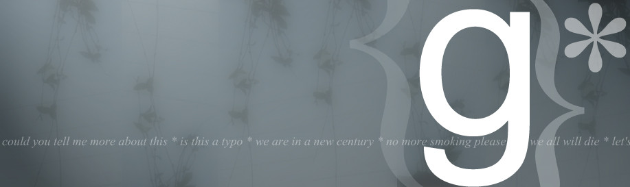
 overlook — arial g size 350
Published: 2000-12-15 13:07:40 +0000 UTC; Views: 663; Favourites: 3; Downloads: 117
Redirect to original
Description
i did this from one photo, this photo was taken during my trip to greece, i tried to use as much as i can of times new roman, because it isn't used alotRelated content


Comments: 13

Overall i like it, Although i do beleive the background is a little blurred. The text is very clean and the color scheme works extremely well. I guess i would just look into playing with the background or bringing the text off the background a little more. Just my ideas. Awesome pic overall and yah gotta love times new roman!
👍: 0 ⏩: 0

I like it, its very clean and nice, I love the little star thing by the "G" it looks cool
👍: 0 ⏩: 0

weeee, my first rating here at deviant.. hello all btw! good job dude, as always
👍: 0 ⏩: 0

Yeah... I like it!... Nice style there. I can't complain about the "g" either, cuz I like it. Its nice when a image has something that gets attraction at once when you look at it.
Maybee this could do as a wallpaper... would like to see that!
👍: 0 ⏩: 0

good job,i like it. I haven't seen alot of good design type images in awhile.
👍: 0 ⏩: 0

yeh, i agree the "g" is bright...it looks like just a beginning, you should add something to the left... but its a nice start,ilike the background too
° thisign °
👍: 0 ⏩: 0

I love the background photo!! really! but the "g" is quite a bit disturbing. its too big and too eyecatching...
but overall, a very nice piece of work
illphorm
http://www.illphorm.net | http://www.holominds.com
👍: 0 ⏩: 0

i like the background.
..::: be free :::..
http://www.theomoi.com
👍: 0 ⏩: 0


i like the way it looks..but it is a little dull.....it gets a poit across though...
D I G I
http://www.awedigi.com/optic
👍: 0 ⏩: 0

the colors (or better: the shades of grey you used are cool, as well as the overall approach. but the photo is hardly recognizeable, and the incorporation of the typography is...i dunno how to put it...flat. ould be better if it was more like emerging out of the background.
would also be nice if the photo was less blurry and had more contrast.
👍: 0 ⏩: 0

guyz rate it, i need comments feedback, negative or positive, anything
👍: 0 ⏩: 0