HOME | DD
 overlook — build me up

Published: 2001-02-16 07:47:49 +0000 UTC; Views: 417; Favourites: 2; Downloads: 78
Redirect to original
Description
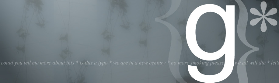
I did this yesterday, trying to make new experiments and I think it worked. It looks pretty neat.I would love to see some commenting on this peace.
Related content


Comments: 13

I love it, apart from the text at the bottom. I think it'd look better in white personally.
~ BlackIce
Dedicated to stamping out stupidity.
👍: 0 ⏩: 0

everything looks cool, but i would kill the build me up text, cos its competing to much with the rest of the nice picture...
Lifes pretty straight without twisties!
👍: 0 ⏩: 0

I like it, though it could be more to it... The photo is beautiful and i actually like the white text most...
👍: 0 ⏩: 0

raw man...i like it all...the text on the bottom looks nice for the style...is it was printed out....it would look nice with the text there like that good job!
D I G I
http://www.awedigi.com/optic
👍: 0 ⏩: 0

bottom text aside...i dont know what your intentions were exactly with the meaning behind this or if you wished there to be any meaning at all...but if there is and im anywhere close to being right I LIKE IT.
👍: 0 ⏩: 0

The bottom text definitely doesn't fit in the picture. But the rést supreme - really ! I love this simple font and nice photo combination.
👍: 0 ⏩: 0

woa... I like it! But I gotta agree to the other comments... do something about that "build me up" text!
[ www.abnorm.net ]
👍: 0 ⏩: 0

it's got great elements but something needs to be done with bottom half of the piece mainly, you guessed it.....the text. it's really out of place.
..::: be free :::..
http://www.theomoi.com
👍: 0 ⏩: 0

this is cool, an original and nice composition. but i have to agree with teem and illphorm: the text at the bottom is too much disturbing.
-------------------------
http://www.haohmaru.com
👍: 0 ⏩: 0

yep. the text at the bottom is a bit disturbing. but it looks...NICE!
illphorm
http://www.illphorm.net | http://www.holominds.com
👍: 0 ⏩: 0

I think overall it's okay, but the 'build me up' text at the bottom detracts from the rest of the image, and there's a little too much white space. Apart from that, nice job.
👍: 0 ⏩: 0

pretty cool, i just dont like all the white at the top
----------------------------------
http://www.createdbycheney.com/
👍: 0 ⏩: 0
pixelphreak [2001-02-16 07:51:23 +0000 UTC]
nice type the botom one could do more but its stil unique
👍: 0 ⏩: 0