HOME | DD
 p-h-o-e-n-y-x —
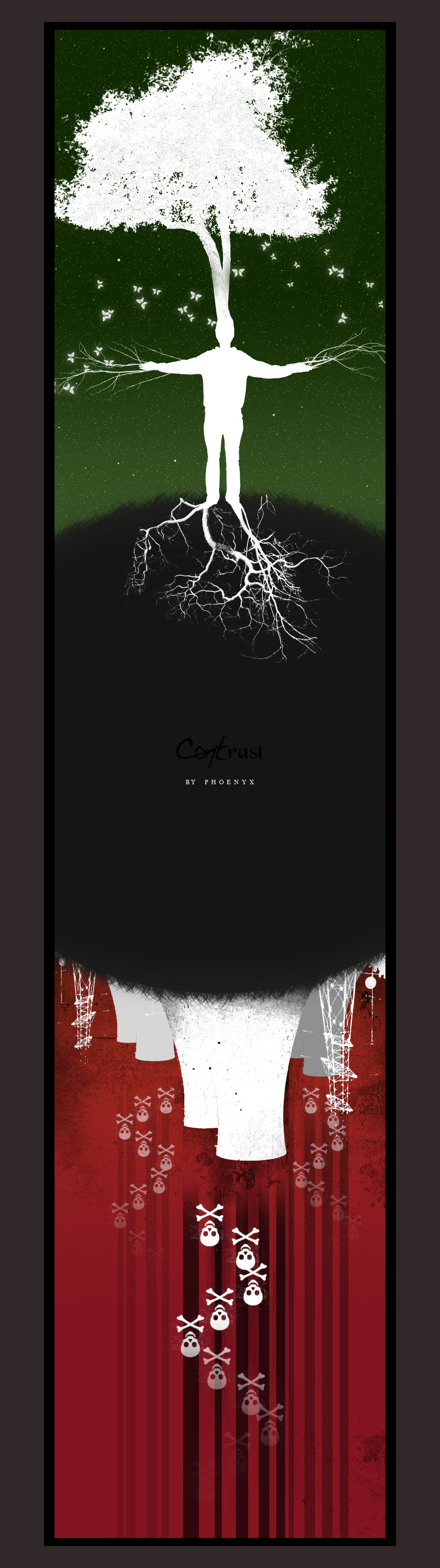
CONTrast
p-h-o-e-n-y-x —
CONTrast
Published: 2005-12-19 20:49:25 +0000 UTC; Views: 17256; Favourites: 665; Downloads: 3544
Redirect to original
Description
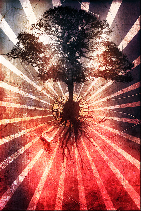
This is my 5. step of the battle versus Slippy [link] at [link] !This time the word "contrast" have inspired me and gave me the idea.
Related content


Comments: 227

powerful, just utterly powerful. I'm at a total lack of words, it's VERY well done.
👍: 0 ⏩: 0


great!
the contrast is realy present:
green/red
death/life
ecology/pollution!


👍: 0 ⏩: 1


no im sorry ... its a quite old piece so i havent got a high resolution version of this one ")
👍: 0 ⏩: 0


Insane. I love the contrasting theme on this.
Great concept.
It's really unusual, I ain't ever seen anything like it before.
👍: 0 ⏩: 1
thank you very much 

👍: 0 ⏩: 0

")

the switch between the tree and man a bit weird. other than that good
👍: 0 ⏩: 0


this piece is really brilliant  (Smile)")
you have such tallent, i really like this piece. well done
👍: 0 ⏩: 1
thank you for that nice comment
👍: 0 ⏩: 0


Very interesting concept, and very well executed
Bravo!

👍: 0 ⏩: 1
thank you ! i really appreciate your comment
👍: 0 ⏩: 0


Really awe-inspiring.
👍: 0 ⏩: 0


amazing!
great idea, and unbelievable realization!
👍: 0 ⏩: 0


BRILLIANT . i feel warm and fuzzy looking at it : D love it man . favd AND watched
👍: 0 ⏩: 0

wow, this is some tight work!
I think it would make a badass snowboard/ skateboard graphic..

👍: 0 ⏩: 0

that is absolutely amazing. such extreme contrasts, but that is life. death/destruction and the rebirth of life. just an amazing job.
👍: 0 ⏩: 0

It just shows what pollution can do... and a billion other things. Wonderful piece.
👍: 0 ⏩: 0


Just LOVE IT SO much... that I which DA would sell canvast that size with out scalling it or cropping it!!!!!!!! and also if they lower the freaking price.. but maybe it does coast that...
👍: 0 ⏩: 0

hello fellow DD deviant  (Wink)")
👍: 0 ⏩: 0

A wonderfully-illustrated and starkly defined interpretation of "contrast" itself. Excellent job, fantastic visual.
👍: 0 ⏩: 0

the opposite sides of the world idea was perfect!
its hot
love it
👍: 0 ⏩: 0


I am sure it was no accident that the pollution part of the piece resembles hell in the old dark ages' paintings of earth vs. heaven and hell.
Powerful.
👍: 0 ⏩: 0


| Next =>