HOME | DD
 p-h-o-e-n-y-x — ID
Published: 2006-03-03 14:24:22 +0000 UTC; Views: 4126; Favourites: 15; Downloads: 128
Redirect to original
Description
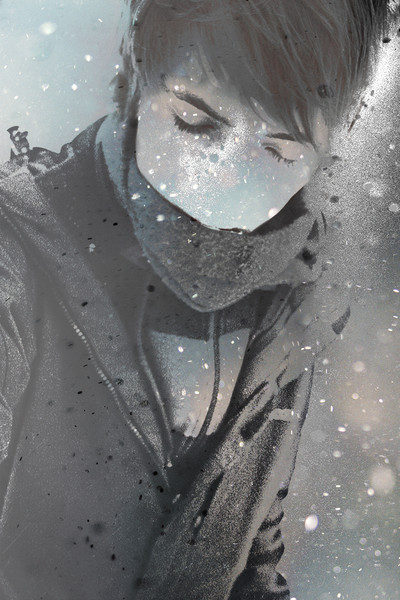
my IDupdate: my 4th ID (15.3.09)
Related content


Comments: 51

Very cool. Reminds me of the game Final Fantasy.
👍: 0 ⏩: 0
 (Wink)")


du...hast.....die.....HAAARE SCHÖÖÖÖN...du hast die haaaare schöön,du hast,du hast,du hast die haare schööööön
sorry,konnts mir nicht verkneifen,aber ich mags wirklich leiden

👍: 0 ⏩: 0

 (Smile)")


____________________________
update 13.12.08
____________________________
👍: 0 ⏩: 0

das thing that you wear rocks, I really want one of those man
👍: 0 ⏩: 2
that particular kind of jacket I mean
👍: 0 ⏩: 0

Das Foto sieht richtig stylish aus, würd die Font vielleicht ein wenig grau einfärben und eine kleinere Schriftgröße wählen.
Trotzdem sehr nice ; )
👍: 0 ⏩: 0

forschperspektive!!! meine absolute lieblingsperspektive ^^
👍: 0 ⏩: 0


and hey, we all know that you are 17 AND that talented, so stop beating the dead horse you fucking bitch
👍: 0 ⏩: 0

____________________________
update 20.3.08
____________________________
👍: 0 ⏩: 0


Das Logos ist auch extrem hammergeil! Schrift passt, Phoenix passt, alles passt ^^
Echt TOLL!
👍: 0 ⏩: 1


That's just damn cool. shit man, I wish i could do half the stuff you could do!
👍: 0 ⏩: 1
hrhr ")
👍: 0 ⏩: 0


It looks very clean and precise..almost like something that could be a tatoo...good job ^_^
👍: 0 ⏩: 1
thanks! i think my reference was a kind of tattoo ... but i designed this logo a time ago so i cannot remember what i really used as my ref.
👍: 0 ⏩: 0


das logo gefällt mir, aber den schriftzug solltest du weglassen ;o schaut sonst aus wie ne wiener würstchen packung

👍: 0 ⏩: 1
hm ok wenn du meinst
👍: 0 ⏩: 1
ganz weglassen... es geht um den unteren part, finde der passt net zu dem stylishen vogel. najo subjektives empfinden halt.. vll magst du das ja
")
👍: 0 ⏩: 1
also ich finds gut und ich bin ja scheinbar nicht der einzige ...naja ich werds bei dieser ID ermal so lassen. danke für die kritik !
👍: 0 ⏩: 1
ich sag nur zeichenabstand, kinder..
👍: 0 ⏩: 1