HOME | DD
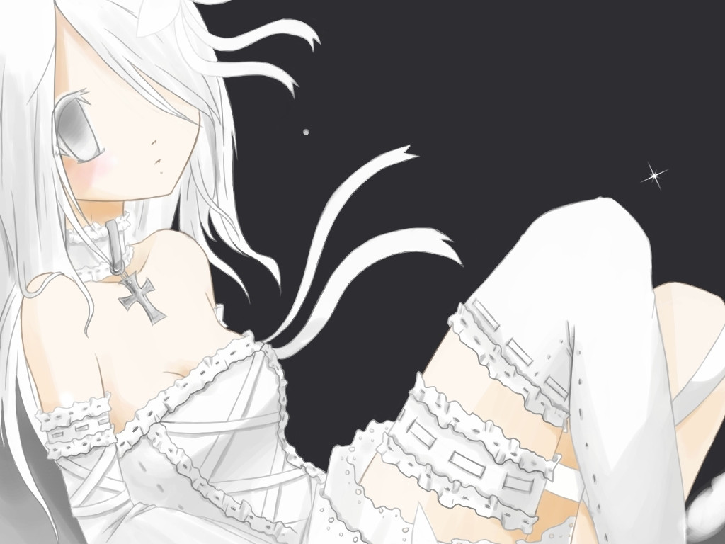
 p-o-c-k-e-t — My Pet Angel Cover 2

Published: 2007-06-15 22:52:44 +0000 UTC; Views: 2273; Favourites: 52; Downloads: 206
Redirect to original
Description
This is the second option for the My Pet Angel volume 1 cover. What do you guys think? This one or the other one? Neither oft hem look like covers >.<here's the other version:
[link]
Related content


Comments: 68

There's not much there and I haven't been working on it >.<
👍: 0 ⏩: 0


I think that this should be the second vol. In my opinion. Personally because the other one is where she comes in the Manga right? and she comes in naked right? so it makes sense and this one for some reason says to me Vol. 2 ^^
👍: 0 ⏩: 1
Hmm ^^ good idea, maybe I will, I just don't want people to get the wrong idea though, because the nudity and bloodiness is very temporary
👍: 0 ⏩: 1
i like it though it kinda of reminds me of creation. and stuff too its very elegant and so full of emotion and makes you want to read it and hoiw she got that way ansd who she is. and the pink cover is like oh i know who she is and i'm glad the story continues. you know what i mean?
👍: 0 ⏩: 1
kinda haha ^^ Thank you, I'm glad you like it
👍: 0 ⏩: 0

The texture of the clothing is good. And somehow, the ropes are very interesting to look at. Very stylized.
👍: 0 ⏩: 1
Thank you ^^ the ropes were a byatch to draw!
👍: 0 ⏩: 0

The first one is far more of an attention grabber than this one, but either would work.
👍: 0 ⏩: 1
Okay ^^ Well we all know why the first one grabs YOUR attention teehee!
👍: 0 ⏩: 1
You wish! The blood/abuse grabbed my attention before the poofs did. It's not often you see an angel in that much distress you know. It begs the question why..... commonly known as a page-turner.
👍: 0 ⏩: 1
Of course, I'm not complaining about the poofs 
")
👍: 0 ⏩: 1
Why is that a surprise? It's not like they were the focal point of the picture you mean woman!
👍: 0 ⏩: 1

I like this one a lot better. ZOMG! CLOTHES!!!
👍: 0 ⏩: 1
haha how strange huh?
👍: 0 ⏩: 1


I still liked the first first one much better. More edgier. And just prettier methinks.
👍: 0 ⏩: 1


LOVELY! I like this one better than the first :>>
👍: 0 ⏩: 1

woo looks great im undecided really which to pick

👍: 0 ⏩: 1
haha ^^ It's okay! It's good if you like both!
👍: 0 ⏩: 1
hmm well i dunno im actually leaning towards this one now

👍: 0 ⏩: 1

so they're ropes now?
yeah I like this one a lot better, it's pretty!
she's wearing a sack? ha ha ha, saw a commenter say that, it sounds so funny
👍: 0 ⏩: 1
yaya ^^ Yeah it's a sack did you ever see the video for oasis by Gackt? Well it was semi-inspired by that!
👍: 0 ⏩: 0

I like this one much more than the other one.

👍: 0 ⏩: 1

very pretty except that you might want to add a bit a bit more definition to her form...her white hair blends in places with the white background and...that isn't exactly pretty when it gets printed out
maybe a shadow that defines her shape would do the job, or something else, it's your call
 (Smile)")
👍: 0 ⏩: 1
aww I kinda like that it blends in ^^ perhaps I'll do a test print to see how it looks!
👍: 0 ⏩: 0

o_o;
Fine. Then... I *will* read it. >>
👍: 0 ⏩: 0

I like this better than the other one now that its complete lol, mostly because of the little sketchy background you did. And light pink and brown always complement each other!
but i still love the other one too!!!!!! lol
👍: 0 ⏩: 1
Thank you ^^ Glad you like it!
👍: 0 ⏩: 0

I actually like this cover more than the other. It covers the space more and the texture makes it all the more awesome! <3
👍: 0 ⏩: 1
| Next =>