HOME | DD
 p40 — Solidgold

Published: 2006-07-23 15:52:38 +0000 UTC; Views: 2814; Favourites: 46; Downloads: 118
Redirect to original
Description
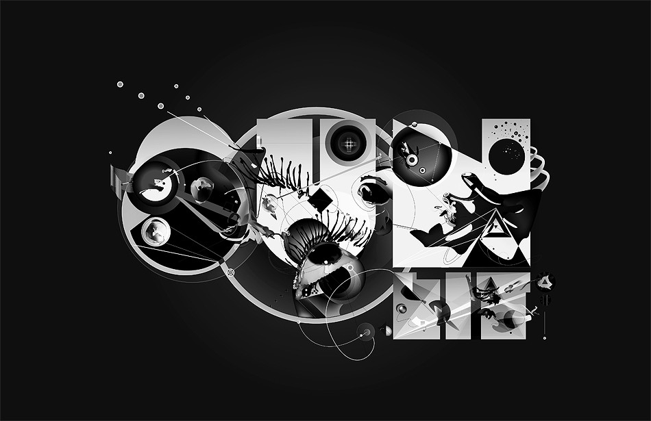
A follow up to the style I have used in Charcoal.Solidgold is what's popular. Solidgold is a lifestyle. Solidgold is happy. Solidgold is "living". Living your life.
full view to appreciate

Related content


Comments: 94


i like your style m8 ! im trying to do stuff like yours
")
👍: 0 ⏩: 1

This is one of the best "grundge" i have ever seen, like the style and colors really much.
👍: 0 ⏩: 0

I'm not so sure about the circles. I love the brightness of the lines, and I wish the green & pink were used more around the circles.
This is very nice though.  (Smile)")
I don't know if you intended the lines to be soundwaves from the turntables, but I can almost feel a beat in them.
👍: 0 ⏩: 0

Nice effect and the way you did it is great. can tell you spent a while on this. nice one
👍: 0 ⏩: 0


you are an amazing artist! i love it so along with your charcoal one so much! keep it up! ")
👍: 0 ⏩: 1

very nice, good colours and choice of blur, love the title too!
DR
👍: 0 ⏩: 0


this is so trippy i love the colours and the patterns
👍: 0 ⏩: 0

out of the 5 thumbs that you had posted to comment on, this one caught my eye automatically. It's probably because it has my favorite colors, but it's very eye catching
👍: 0 ⏩: 0

I reall love the colors in the piece and tha placement of objects. It is a great composition!
👍: 0 ⏩: 1

can't say I like the circles/lines... they just don't do anything for me.... but the colors are nice..
and the background is great...
👍: 0 ⏩: 0

This is awesome. All your abstract stuff is awesome. You've definitely got talent.

👍: 0 ⏩: 0


Cool, I especially like the background of this....nice texture.
👍: 0 ⏩: 0

I love the combination of gold/yellow and black and white.
👍: 0 ⏩: 0


Very nice composition! I like the metallic "ground" and the different circles. Awesome!!
Nice works...

👍: 0 ⏩: 0

I like some of your works but I must write a sincere critique here (no hard feelings).
I dont quite dig your concept(s). What's solidgold in this picture? Most of the colours are black/greys.
Also, that part about lifestyle's and stuff? What's the connection between that and the symbols you are showing here? Also, I think this belongs to "vector art" category. And, one last thing... Start using some original stuff, this circle vector brushes are waaaaay over-used in each and every deviation.
👍: 0 ⏩: 1

lol he didnt really put "advanced critique encouraged"
👍: 0 ⏩: 0
I like some of your works but I must write a sincere critique here (no hard feelings).
I dont quite dig your concept(s). What's solidgold in this picture? Most of the colours are black/greys.
Also, that part about lifestyle's and stuff? What's the connection between that and the symbols you are showing here? Also, I think this belongs to "vector art" category. And, one last thing... Start using some original stuff, this circle vector brushes are waaaaay over-used in each and every deviation.
👍: 0 ⏩: 1


The color choice against the grayscale background is quite effective for this piece.
You are quite talented! great piece ^___^
👍: 0 ⏩: 0

I'm not much into this type of art, but I like the texture of the background and the constrast of the colors with it.
Seems like the background is being scratched to reveal the color!
👍: 0 ⏩: 0


Very nice texture, contrast, on the tones of gray-black-white !
 (Cool)")
👍: 0 ⏩: 0


hum, it reminds me somehow of Kandinsky...
the colours are marvellous, i like this grey background with the green and the pink on it - i'm just wondering if it is balanced... hrm... quitedynamic, in fact.
 (Wink)")
👍: 0 ⏩: 0

TranscendenceEngine [2006-09-13 12:29:44 +0000 UTC]
Nice. I like the contrast between the gray and the colors, although I'd make those a bit more vibrant.
👍: 0 ⏩: 0


This is fantastic! I'm a big fan of this type of art. This has a very edgy feel.
👍: 0 ⏩: 0

Anything other than photography isnt really my thing - but i realllly like this, and alot of your other stuff for that matter.
Good job!!
👍: 0 ⏩: 0


The texturing's really good but the design would look much better if there was more vector design at the centre. Its nowhere near as charcoal but its still very nice.
Nice style. Keep it up!
👍: 0 ⏩: 0


nice piece of artwork. Urbanize style like poster. Hehe!
👍: 0 ⏩: 0

| Next =>