HOME | DD

pain16 — batman color design

Published: 2011-06-02 01:35:20 +0000 UTC; Views: 3771; Favourites: 42; Downloads: 0
Redirect to original
Description 
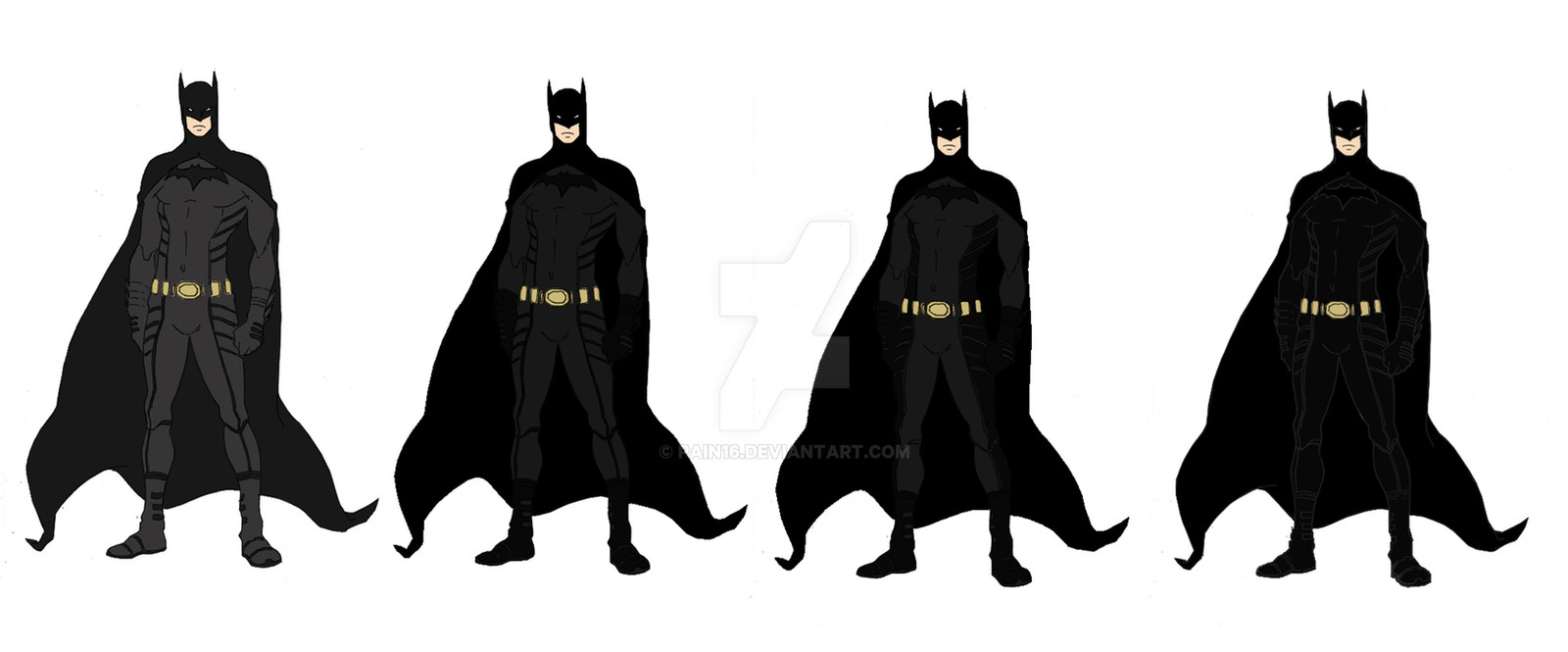
here are the color designs for my batman short animation i'm working on. I'd really like to know which one you like the most.

Commissions open check journal
Related content
Comments: 25

Bullcroc [2011-10-22 22:07:17 +0000 UTC]

#3

👍: 0 ⏩: 0

Liobits [2011-06-11 03:29:51 +0000 UTC]

I like the second and third.

👍: 0 ⏩: 1

pain16 In reply to Liobits [2011-06-11 04:35:27 +0000 UTC]

the third one is going to be in the final animation

👍: 0 ⏩: 0

rickytherockstar [2011-06-11 01:47:08 +0000 UTC]

i like the 2nd and 3rd one

👍: 0 ⏩: 1

pain16 In reply to rickytherockstar [2011-06-11 02:03:43 +0000 UTC]

3rd all the way

👍: 0 ⏩: 0

zedarg [2011-06-09 15:37:09 +0000 UTC]

second one. or first

👍: 0 ⏩: 0

fqtt [2011-06-09 15:22:00 +0000 UTC]

I'd say the second or third... I think the colours go together better in the second one

👍: 0 ⏩: 1

pain16 In reply to fqtt [2011-06-09 15:32:04 +0000 UTC]

, my fav is the third

👍: 0 ⏩: 1

fqtt In reply to pain16 [2011-06-09 15:54:48 +0000 UTC]

I like it a lot too, but it just seemed like there was a bit too much of a contrast that would make Batman stick out instead of blend in when he's trying to sneak up on the bad guys Whichever one you go with is going to be totally awesome, though! Will you post the animation here when you're done?

👍: 0 ⏩: 1

pain16 In reply to fqtt [2011-06-09 17:51:20 +0000 UTC]

most likely, if not here, on youtube

👍: 0 ⏩: 1

fqtt In reply to pain16 [2011-06-10 01:28:09 +0000 UTC]

awesome! I'll keep my eyes open for it

👍: 0 ⏩: 0

GingaGirl86 [2011-06-09 14:42:24 +0000 UTC]

I like the first one :3

👍: 0 ⏩: 0

Brightosquee [2011-06-03 05:35:08 +0000 UTC]

Hmm I like the third one, but it'd be nice if the inside of the cape was a little lighter in color.

👍: 0 ⏩: 0

ever-so-much [2011-06-03 00:57:07 +0000 UTC]

I really like these redesigns as a whole, but think my favorite is the middle-right one. Think the contrast works really well.

👍: 0 ⏩: 1

pain16 In reply to ever-so-much [2011-06-03 03:12:59 +0000 UTC]

cool thanks

👍: 0 ⏩: 1

ever-so-much In reply to pain16 [2011-06-03 03:22:26 +0000 UTC]

You're welcome!

👍: 0 ⏩: 0

IIIXII [2011-06-02 17:55:15 +0000 UTC]

2nd and 3rd

👍: 0 ⏩: 1

pain16 In reply to IIIXII [2011-06-02 20:28:42 +0000 UTC]

coolz, the 3rd is looking like the winner

👍: 0 ⏩: 1

IIIXII In reply to pain16 [2011-06-03 06:33:00 +0000 UTC]

👍: 0 ⏩: 0

valchan22 [2011-06-02 02:57:01 +0000 UTC]

I like it! #2/3 are nice because of the contrasting colours

👍: 0 ⏩: 0

MaNicusEvictus [2011-06-02 02:52:36 +0000 UTC]

num-bah 1 gj

👍: 0 ⏩: 0

ParisAlleyne [2011-06-02 01:57:39 +0000 UTC]

3rd one all the way

👍: 0 ⏩: 1

pain16 In reply to ParisAlleyne [2011-06-02 02:24:44 +0000 UTC]

coolz thanks for your opinion

👍: 0 ⏩: 0

Sizzle3 [2011-06-02 01:36:49 +0000 UTC]

I kind of like the third one.

👍: 0 ⏩: 1

pain16 In reply to Sizzle3 [2011-06-02 01:41:37 +0000 UTC]

Sweet i like that one too, thanks for saying

👍: 0 ⏩: 0