HOME | DD
 palax — Surrender

Published: 2009-05-12 12:37:22 +0000 UTC; Views: 1607; Favourites: 30; Downloads: 76
Redirect to original
Description
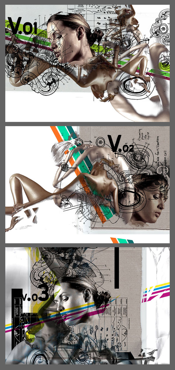
PS CS IIIFree typo work
Related content


Comments: 11


Berk abi tebrik ederim... Affına sığınarak birşey sormak istiyorum; diğer çalışmalarına oranla bu çalışma biraz adha sert geldi bana bunun özel bir sebebi varmı diğerleri daha ince ayrıntılar ve daha zayıf karakterlerle besliydi çünkü...Umarım anlatmak istediğimi doğru ifade edebildim
👍: 0 ⏩: 1

Doğru saptama yapmışsın. Ağırlık noktası çalışmanın ortası ve
4 tarafa sert bir geçiş tercih ettim. Farklı sitiller kullanmakta
fayda var. Keza tekrarlamak iyi olmaz kendini.
👍: 0 ⏩: 1
teşekkürler  (Wink)")
👍: 0 ⏩: 0

no big, dude. you better be busy over there.
👍: 0 ⏩: 0

24 views only?! i'm shocked. Great work, visually captured me, great use of typography & imagery, the image doesn't over power the typography but still maintaining it's purpose in the background. I noticed you used the "Astral Pro" does that in any way represent astral projection? (just out of curiosity cos i saw it on one of your previous piece of work) Great Work once again! keep up the excellent quality of work  (Smile)")


👍: 0 ⏩: 1
No problem my friend.
Im not working for pageviewing.
Thank you so much for your support.
👍: 0 ⏩: 0
