HOME | DD

PallalaAutumn-change

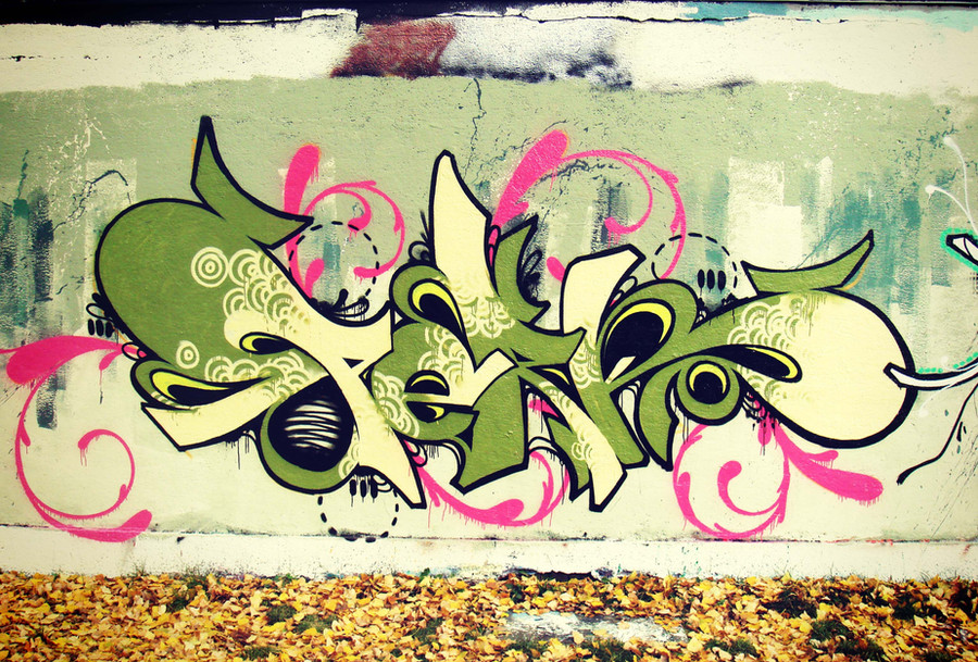
Published: 2007-11-28 21:07:05 +0000 UTC; Views: 25771; Favourites: 913; Downloads: 632
Redirect to original
Description It's my second freestyle,
and its now my second Daily Deviation ^^

Thanks to all who comment and fav this picture
and especially thanks to
Related content
Comments: 190

boot-cheese-3000 [2012-04-06 06:42:08 +0000 UTC]

niiiiice.......the fill-in is the dopest though, that and the color scheme is on point.

👍: 0 ⏩: 1

Pallala In reply to boot-cheese-3000 [2012-04-24 15:01:28 +0000 UTC]

Thank you

👍: 0 ⏩: 1

boot-cheese-3000 In reply to Pallala [2012-04-25 04:01:28 +0000 UTC]

oh most definitely.

👍: 0 ⏩: 0

craeon777 [2011-12-23 16:13:10 +0000 UTC]

nice style

👍: 0 ⏩: 1

Pallala In reply to craeon777 [2011-12-30 11:30:15 +0000 UTC]

Thanks

👍: 0 ⏩: 0

raeblackfyre [2011-07-11 19:04:22 +0000 UTC]

I like the patterns inside the writing on this one.

👍: 0 ⏩: 0

PoisonPriincess [2010-08-05 20:26:13 +0000 UTC]

Nice ! love the colors

👍: 0 ⏩: 0

jaspie1 [2010-06-29 09:10:44 +0000 UTC]

dope !

👍: 0 ⏩: 0

PixelChanting [2010-06-10 21:07:43 +0000 UTC]

Stunning.

👍: 0 ⏩: 0

CiaSalonica [2010-06-10 14:14:25 +0000 UTC]

wow!!!! amazing!!!!
the style is sooo cool!!!
I love the combination of the colours!!
keep it up!
definetely a fave

👍: 0 ⏩: 1

Pallala In reply to CiaSalonica [2010-06-14 10:45:58 +0000 UTC]

Thanks dude I will not stop

👍: 0 ⏩: 0

PattersonArt [2010-06-08 23:26:43 +0000 UTC]

I love the circular shading. The colors work really well together as well.

👍: 0 ⏩: 1

Pallala In reply to PattersonArt [2010-06-14 10:47:29 +0000 UTC]

Thanks dude

👍: 0 ⏩: 0

yuzchris [2010-06-08 06:30:03 +0000 UTC]

The colors are amazing. Keep up the good work.

👍: 0 ⏩: 0

Alphabeatcovers [2010-06-08 04:58:21 +0000 UTC]

AWesome colors. =?D

👍: 0 ⏩: 0

Gendrome [2010-06-08 04:29:04 +0000 UTC]

Unlike the black scribbles I see around the city, this is brillant! true graffiti.

👍: 0 ⏩: 1

Pallala In reply to Gendrome [2010-06-14 10:48:26 +0000 UTC]

Yea but this is on a legal space

👍: 0 ⏩: 0

Mokbee [2010-06-08 04:22:09 +0000 UTC]

i must not know much about graffiti, i guess...
congratz on your, 2nd dd?

👍: 0 ⏩: 1

Pallala In reply to Mokbee [2010-06-14 10:48:38 +0000 UTC]

Thanks

👍: 0 ⏩: 0

clippys [2010-06-08 03:39:58 +0000 UTC]

nice

👍: 0 ⏩: 0

xavirfrost [2010-06-08 03:30:47 +0000 UTC]

Beautiful!!!

👍: 0 ⏩: 0

f-souza [2010-06-08 03:10:34 +0000 UTC]

amazing x__X

👍: 0 ⏩: 0

Devoolo [2010-06-08 02:54:02 +0000 UTC]

Very good styling and color.

👍: 0 ⏩: 1

Pallala In reply to Devoolo [2010-06-14 10:48:52 +0000 UTC]

Thanks

👍: 0 ⏩: 0

Izho [2010-06-08 02:46:32 +0000 UTC]

👍: 0 ⏩: 0

Flipacoin [2010-06-08 02:02:39 +0000 UTC]

10/10

Excelent in every aspect. What type of cap you used? And, how many cans you use?

Wathever, is excelent!

👍: 0 ⏩: 1

Pallala In reply to Flipacoin [2010-06-14 10:49:55 +0000 UTC]

I dont know it is 3 years ago so...
Thanks

👍: 0 ⏩: 0

PreetikaSharma [2010-06-08 01:50:10 +0000 UTC]

that's nice

👍: 0 ⏩: 0

bettafisch [2010-06-08 01:12:15 +0000 UTC]

wow

👍: 0 ⏩: 0

complimentarybrick [2010-06-08 00:42:52 +0000 UTC]

YOUR COLOUR SCHEME IS SUBLIME!!

👍: 0 ⏩: 0

wannabephoto [2010-06-08 00:38:16 +0000 UTC]

this is so amazing

👍: 0 ⏩: 0

Scorpion-MK [2010-06-07 23:14:48 +0000 UTC]

Pretty cool! congrats

👍: 0 ⏩: 0

Red-Steel [2010-06-07 23:12:13 +0000 UTC]

nice work

👍: 0 ⏩: 0

MIckEe224 [2010-06-07 22:08:42 +0000 UTC]

i love the detail-def makes the pic and the colors r good

👍: 0 ⏩: 0

PinstripeKiwi [2010-06-07 21:55:38 +0000 UTC]

Gorgeous!

👍: 0 ⏩: 0

clippys [2010-06-07 20:32:59 +0000 UTC]

pretty

👍: 0 ⏩: 0

Floppyflop [2010-06-07 19:24:52 +0000 UTC]

This is very well done.The designs and the colors work really well Great job

👍: 0 ⏩: 1

Pallala In reply to Floppyflop [2010-06-14 10:50:51 +0000 UTC]

Thank you

👍: 0 ⏩: 0

Samson50 [2010-06-07 19:18:44 +0000 UTC]

niiice

👍: 0 ⏩: 0

cerifairie [2010-06-07 18:11:00 +0000 UTC]

LOVE IT!!!! Dope.

👍: 0 ⏩: 0

waffelcakes [2010-06-07 18:07:19 +0000 UTC]

sick, but the words are to distorted. i have either
sperre
sperbe
soperre
soperbe
perre
perbe

i like the pink that sick,

👍: 0 ⏩: 2

Pallala In reply to waffelcakes [2010-06-14 10:54:37 +0000 UTC]

To distorted maybe you do not know wild-stylez
Its perk only perk

👍: 0 ⏩: 0

Ricardo-Rick In reply to waffelcakes [2010-06-07 21:54:42 +0000 UTC]

wrong It's Perk

👍: 0 ⏩: 0

warglyph [2010-06-07 16:39:43 +0000 UTC]

now this is what i call "homey"

cool work dude!

👍: 0 ⏩: 0

FeelSoMood [2010-06-07 15:20:41 +0000 UTC]

Cool!

👍: 0 ⏩: 0

savethelove [2010-06-07 14:41:38 +0000 UTC]

Very cool!

👍: 0 ⏩: 0

Baxxow [2010-06-07 13:27:26 +0000 UTC]

Cool!

👍: 0 ⏩: 0

Braciak [2010-06-07 12:21:28 +0000 UTC]

wow ! Cool !! Great Shot !

👍: 0 ⏩: 0

Nornes [2010-06-07 11:59:01 +0000 UTC]

I like the use of patterns that we don't see usually in street art! I mean those japanese-like white patterns and the pink "flourishes". Good work!

👍: 0 ⏩: 1

Pallala In reply to Nornes [2010-06-14 10:56:10 +0000 UTC]

Thank you I use it often in combination like these petterns too!

👍: 0 ⏩: 0


| Next =>