HOME | DD
 Pandarice — holy pose

Published: 2006-08-04 14:21:09 +0000 UTC; Views: 19345; Favourites: 406; Downloads: 129
Redirect to original
Description
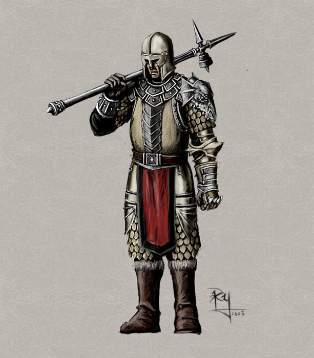
just some random 'white warrior' ... holy .. paladin .. um just wondering should i remove the glowing cross on his helmet ? .. kinda korny isnt it ?Related content


Comments: 13

Nah you shouldn't change the cross, it gives it something unique. It's really good work

👍: 0 ⏩: 0

i believe the glowing cross should be red, more holy-christianity than blue, other than that, great job
👍: 1 ⏩: 0

Looks a BIT like something you'd see in Heroes of Might and Magic 5...
👍: 0 ⏩: 0

wow...
favved!!
... im gonna end up faving your entire gallery...
👍: 0 ⏩: 0

i like the sign on the helmet...dont know why but it looks good there.usually the heredity stuff are on the shield and shoulders.Looks great i like it
 (Smile)")
👍: 0 ⏩: 0

the glow is ok man, make it red! Then it will look like some freaking Inquisitorial agent!
👍: 0 ⏩: 0

Arr... I hate paladins =,....,= Mayby that's because I love to play thief-character in every rpg
All in all it's great picture, as usual =]
")
👍: 0 ⏩: 0

Sorry about the typos! I noticed them just as I hit 'send'
👍: 0 ⏩: 0
Very cool! I liek the wrmor design. As for the cross, I think you should just make it red or gold, to match the rest of the armor.
👍: 0 ⏩: 0

Instead of just getting rid of the symbol you could make it gold to match the rest of the armour or do some other symbol, and then maybe incorperate the same symbol onto the shield. That might work well.
👍: 0 ⏩: 0

hehe, really nice concept design. Um, the glowy part...I don't know how you feel about it but it looks rather misplaced in the picture. It doesn't really complement the rest of the armour.
👍: 0 ⏩: 1

I think that would suit it better, since symbols are usually embroided on the shield and not the helmet.
👍: 0 ⏩: 0