HOME | DD
 paperairplane — Baker Graphix 001.
Published: 2005-09-29 13:51:57 +0000 UTC; Views: 63; Favourites: 0; Downloads: 5
Redirect to original
Description
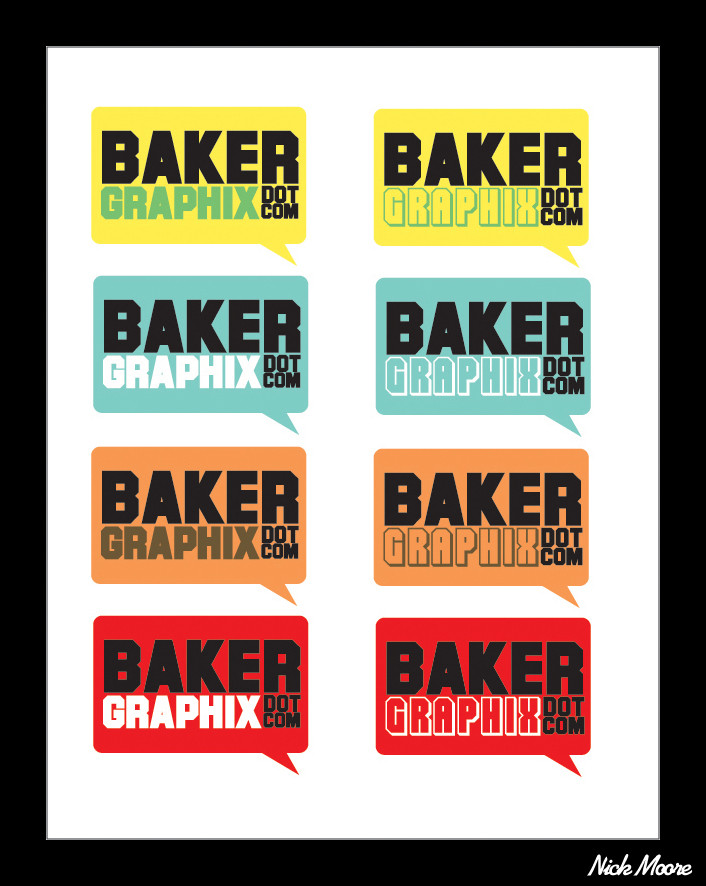
Class assignment: Make a logo for the Baker Graphix program.Related content


Comments: 8

number one, line 2
simple, clean.
its important to have in mind all the possible uses when you create a logo, specially sizes (huge in an outdoor ad or tinny in a pencil for example) i think that works really well.
great job
👍: 0 ⏩: 1

Thanks girl.
I just tried to see which color combination works best.
I like that one the most out of all of them too.
 (Smile)")
👍: 0 ⏩: 1
· damn youre so smart. like me. lol ")
👍: 0 ⏩: 0

how goods baker.
thats my last name
i like your work.
👍: 0 ⏩: 1
Is it really your last name?
Thats pretty sweet.
Too bad that that url is already taken if you ever decided to make a personal graphix website.
👍: 0 ⏩: 1
ya it is.
i was teased by the kids in kindergarten.. being endlessly asked to bake them bread
yeah.. damn them.
oh well.
👍: 0 ⏩: 0

I love that font too.
I think I like the 2 second one the best though.
👍: 0 ⏩: 0