HOME | DD
 ParadoxDigital — Death from Sandman - recolored
Published: 2014-02-23 22:30:36 +0000 UTC; Views: 1105; Favourites: 24; Downloads: 21
Redirect to original
Description
Digital inking: vitali-iakovlev
vitali-iakovlev.deviantart.com…
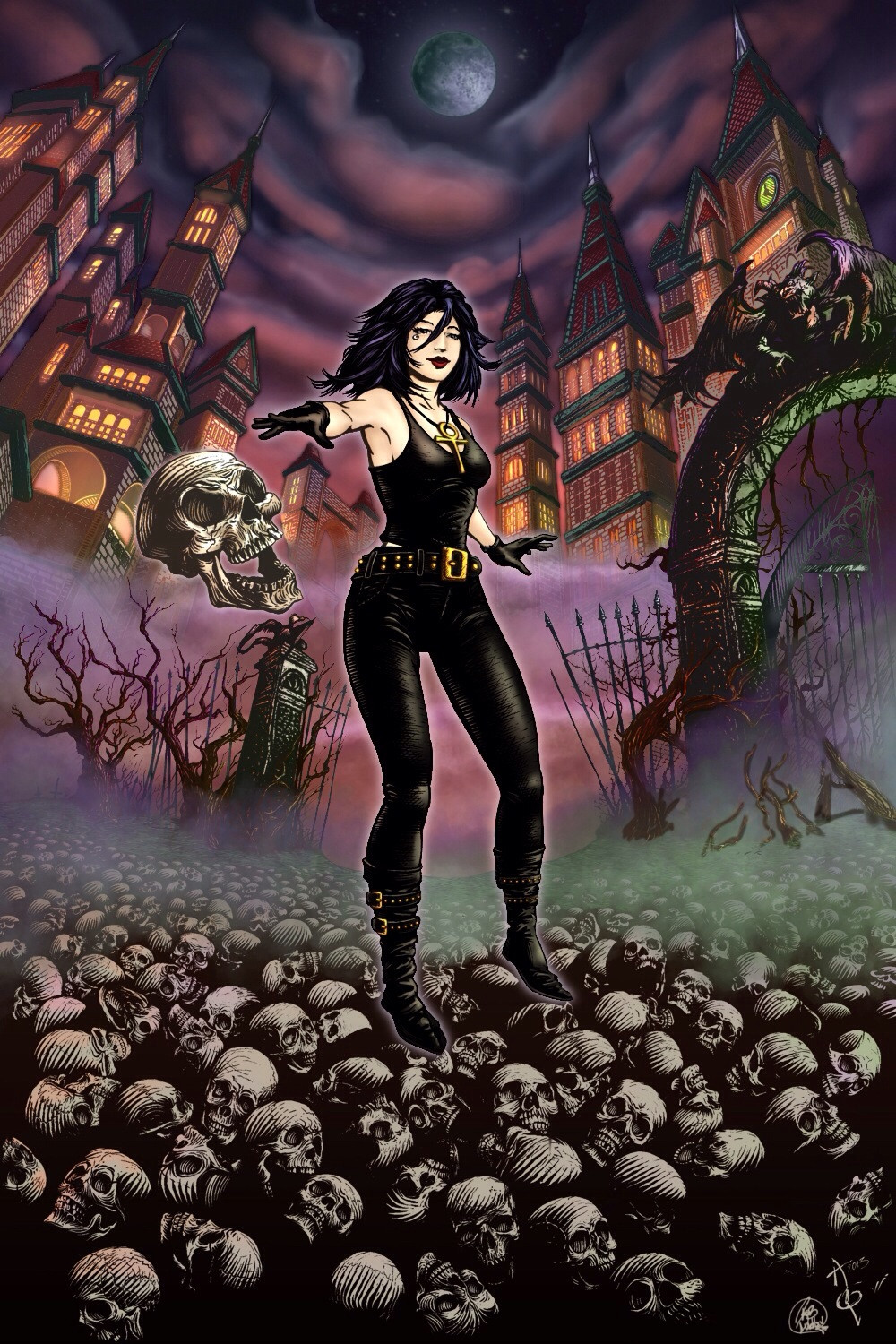
I normally do not revisit anything, but I decided that the previous color need just a bit more highlighting, reworking on the backdrop and the fog elements.
Let me know which one you think is better previous one is here - paradoxdigital.deviantart.com/…
Related content


Comments: 9

Hi, Rob. I've come across this interesting picture and wanted to show you: fav.me/d5ivb7c
You see, how the picture is overall dark, yet the contrast between colors and inks is still remarkable, every ink line is visible. The inks of the buildings in the background are slightly lighter, adding perspective. And the colors of the foreground building are very “detailed” varying in hues from cold to warm.
I hope it explains what I meant earlier. Cheers
👍: 0 ⏩: 1

Wow... We're on the same page, I completely understand what you mean now. Let me know when your next ink is ready,
👍: 0 ⏩: 1
Here you go: fav.me/d78xj8y
👍: 0 ⏩: 1
Damn, that's insane!
👍: 0 ⏩: 0
Hi! Yes, this version looks better. You improved the fog and the sky, and the picture looks much more atmospheric.
On the other hand, the image as a whole is too dark IMO. Look at the examples of professional colorists. The colors are more subtle, which allows for a certain contrast between inks and colors. The coloring of each element is also more "detailed", varying in tones and hues according to the environment and lighting.
Consider watching this tutorial: www.thegnomonworkshop.com/stor…
👍: 0 ⏩: 1
Thanks, I gotta learn how to walk before I run. Thank you for sharing that link... The more I keep at it the better it will get, it's my hobby that keeps me calm...
I took your advice and lightened up it up a little.
👍: 0 ⏩: 1
That's great that you are passionate about art. That is the only important thing. Do not allow anybody to discourage you. Keep going, and with experience will come excellence. I am certainly looking forward to seeing great art from you!
👍: 0 ⏩: 0

The sky is looking better but the one big thing that you're missing is that the girl as a character has absolutely white alabaster skin, not the "normal" skintones that you've used here. Plus her clothes are black, so make her top like you did get pants and you'll be on the right track. Hair is black not brown as well.
Think of her as the ultimate goth and you've got it
👍: 0 ⏩: 1
Thanks for the help... I gave her a pale skin tone and gave her a goth style... It flows so much better.
👍: 0 ⏩: 0