HOME | DD
 paranoidinhell — Destruction

Published: 2004-11-04 15:17:56 +0000 UTC; Views: 156; Favourites: 0; Downloads: 22
Redirect to original
Description
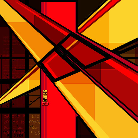
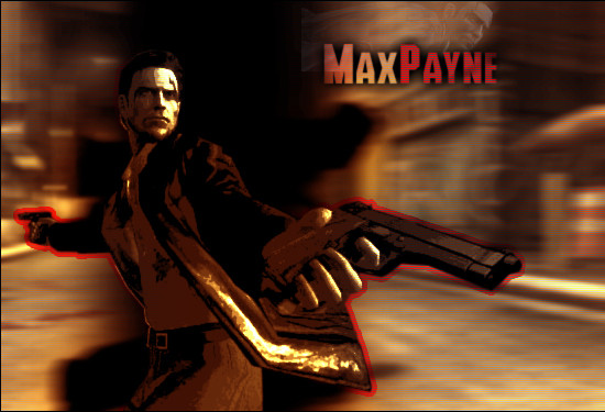
Well, first off the explanation why this is the political section, it might be self explanatory to some, but I mainly made this after the result of the elections in america... (Next to that its also for a battle with 'Destruction' as theme) and this idea mostly evolved while working at it ...I think I wasted an hour, maybe 2 ( 1 and a half ? ) on thise one, just a lot of photos and a bit of brushing...
Related content


Comments: 11

Congratulations on avoiding the acid commentary found on all the other political pieces of art.
I didn't like the stars at first, but after a while, I started to understand your choice.
When I looked at it a second time, the stars reminded me of something you might see on a box of cereal or a cheap plastic toy for children. This was especially striking to me because I just did a whole thing today on my blog about the commercialization of Halloween and Christmas, and how our spend-happy society is ruining the very best things about American culture.
I know art means different things to different people, but this is what I got out of it.
Many kudos!
👍: 0 ⏩: 1

there's little use to put comments down on big political rants in here since its DeviantArt and not DeviantPolicalRant eh
It's indead meanth in such a way as you explain, a clean polished topping on a more darker defined background.
Thx a lot for the comment!
👍: 0 ⏩: 0

very progressive somehow... strong colors and contrasts. nice job.
👍: 0 ⏩: 0


Somehow the part with the stars don't seem to fit well with the rest imo. The whole picture is more or less distorted, and the background of the stars is the only clean (white) on the whole pic.
A gray/dark gray distorted background there aswell perhaps would look better.
Just my two cents ..
👍: 0 ⏩: 1
that would be possible too, but I did this on a purpose ... the contrast between the clean part and the distorted is something what adds to it imo ... It represents for me the clean shinyness of the surface against the distorted depth ..to put it that way ...
but I can imagine that someone (you for example ")
👍: 0 ⏩: 0

It's very weird. Somehow it's too abstract for me to comment on. The stars look nice, really ironically meant of you!  (Smile)")
👍: 0 ⏩: 1
yeah, I made some changes at the end concerning the colors and I suppose it didnt totally work out ... updated/changed now ..
👍: 0 ⏩: 1
Yeah, Bernard, now it's a way better. It looks more American. The red color symbolizes not only the blood, but you can associate it with the stripes on the flag. "The only Bush I trust is my own!"
👍: 0 ⏩: 1
yeah, the only thing that I pity this way is that its soo horribly obvious like this ...mm... maybe I'll see if I can find another way...
👍: 0 ⏩: 1
Well, it's obvious, maybe only for intelligent deviants
")
👍: 0 ⏩: 0