HOME | DD
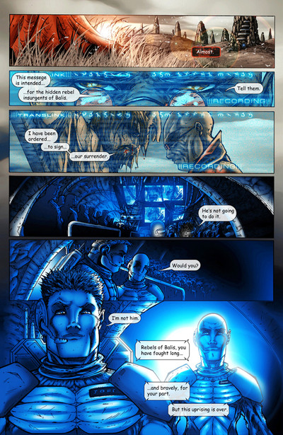
 particle9 — Butcher of Balis Page 3
Published: 2006-11-04 07:58:05 +0000 UTC; Views: 4732; Favourites: 36; Downloads: 0
Redirect to original
Description
This is the third page in my first published book called Ecru: the butcher of Balis the first book in the Ecru Series.If you would like a copy of the book please go here...[link]
pencils, colors, layout and letters were done by me.
Related content


Comments: 23

Great work! Must say that I'm compelled enough about the story that Im going to pick up a copy.
The blue back lighting on the last panel is great. Also like how you used diffrent shades of blue to give the effect of ubiquitous computer monitor lighting. The figures also look fantastic I really like the profile of the bloody guys face in panel three. Yeah the grass in the first panel is an awesome touch. The computer lettering screen stuff looks tight too.
g'work,
Christopher.

👍: 0 ⏩: 1

Wow well thank you very much. Im honored that you like it haha. Unfortunately the book isnt offered in stores at the moment. I am in talks with a company for distribution but no word has come back yet. At the moment though any books can be ordered on the web site store over at
[link] so head on over there and check it out
👍: 0 ⏩: 0

*Cries*
So awsome...I only hope that someday I'll be able to get an artist a quarter as talented as you to draw my hero Striking Speedster...*snif*
Amazing...simply amazing...*snif*
*Walks away clutching a picture frame*
👍: 0 ⏩: 0

How long does it take you to do a page anyways?
Killer effects. Love it, truely. Usually comics have upper case in their lettering, but- yeah. Cool effects and all. Might look further into this as well. Ye gots some skills though sometimes I think your faces are a tad squished (meaning the distances from eyes to lips seems a little narrow- but no worries, still looks really good). The coloring is great. All in photoshop yes? Do you have any tutorials on how you do your coloring? I think you should make one, yes I do. xD;; (I'm always looking for better ways to color). Tah.
👍: 0 ⏩: 1
haha thank oyu man, I do in fact have tutorials available to review on the P9P boards in the school for fine arts section. you have to be a member to gain access to it, but there are a bunch of photoshop tips and tutorials and what not available to take a look through there.
Im not sure how long it takes me to do a page because time doesnt really matter to me at this point. Im more concerned with putting out quality than quantity, because I dont have a demand large enough to warrant giving up quality  (Smile)")
Glad you like it
👍: 0 ⏩: 1
Kewl. Defiantly shows that you take your time on each page. Kudo's. I'll have to check out those tuts, thanks!
")
👍: 0 ⏩: 0

not a fan of the lettering but everything else is spot on cool!!!!
👍: 0 ⏩: 0


the detail on that 4th panel always makes me drool in envy of talent. xP xD
👍: 0 ⏩: 0

I really need to look more in to this book. From what I've read, the storyline sounds great. And besides that, I absolutely love the artwork.
👍: 0 ⏩: 1
hehe, well I think its a good book...... but then I am rather partial to it  (Wink)")
👍: 0 ⏩: 0

I gotta admit, you've set up a wonderful mood here, especially with the change from the outside world and the technological world.
The characters are well fleshed out, and the storytelling flows very well (which is something a lot of comic book artists lack for the sake of the art ).
Keep it up! I'm always eager to see more of your work!
👍: 0 ⏩: 0

-goes to kick his comic book distrubutor to carry more Aspen and Ecru stuff.-
👍: 0 ⏩: 0

hahaha, i have this, its good stuff, even got the autograph lol
👍: 0 ⏩: 0

I've allllways loved the blue panels on this page,
👍: 0 ⏩: 1
hahaha, hey I gotta please the ladies too with a little man drawings some times right
👍: 0 ⏩: 1
Exactly
👍: 0 ⏩: 0

sweet work..but you know you need more babes in this page lol JK
👍: 0 ⏩: 1
hahaha but.... that wouldnt make sense in terms of the story man!
👍: 0 ⏩: 1
")


Awesome! I love the colouring and the artwork is just superb, as always! Great job! x
👍: 0 ⏩: 0
