HOME | DD
 PascalPixel — Dirty Harry

Published: 2009-12-18 13:39:27 +0000 UTC; Views: 2590; Favourites: 49; Downloads: 144
Redirect to original
Description
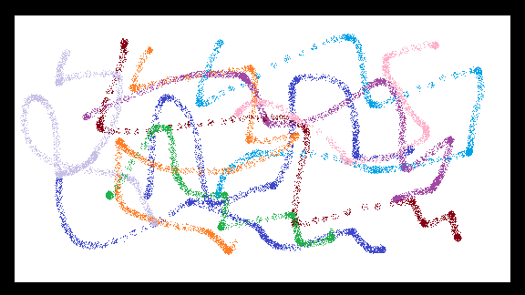
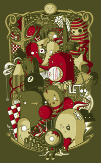
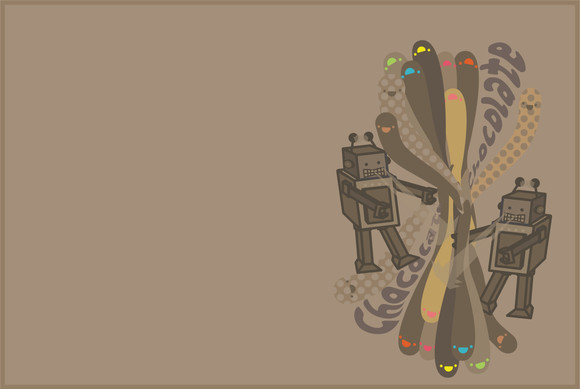
School AssignmentCombining hand-drawn paint with digital fonts is a nice method
Related content
Comments: 11


btw how about some collabo?
you on a form of chat yet?
👍: 0 ⏩: 1

nope. still not a fan of chat. email!
pretty busy these days so i don't want to commit to a collab. just no fricken time unfortunately.
👍: 0 ⏩: 0

Kickass words.
Justify it and it could be great on a tee.
Well done mate
👍: 0 ⏩: 0

The font is Arial?? 
👍: 0 ⏩: 0

Loving this one more than the other one! Would have loved to see some more tweaking of the kerning between some of the letters but great nonetheless!
👍: 0 ⏩: 1

thanks!
i think it's a little '2006'
its arial! i mean: wheres the museo?!
👍: 0 ⏩: 1

I actually love the use of Arial in this piece, don't get me wrong
👍: 0 ⏩: 0
