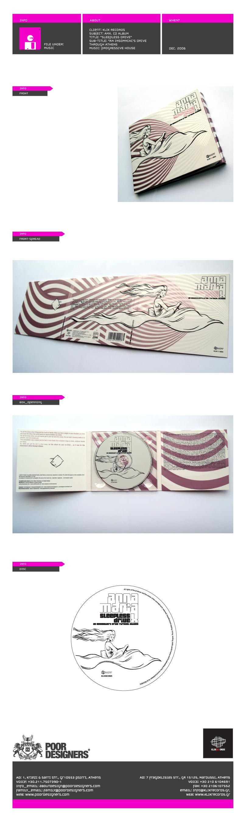
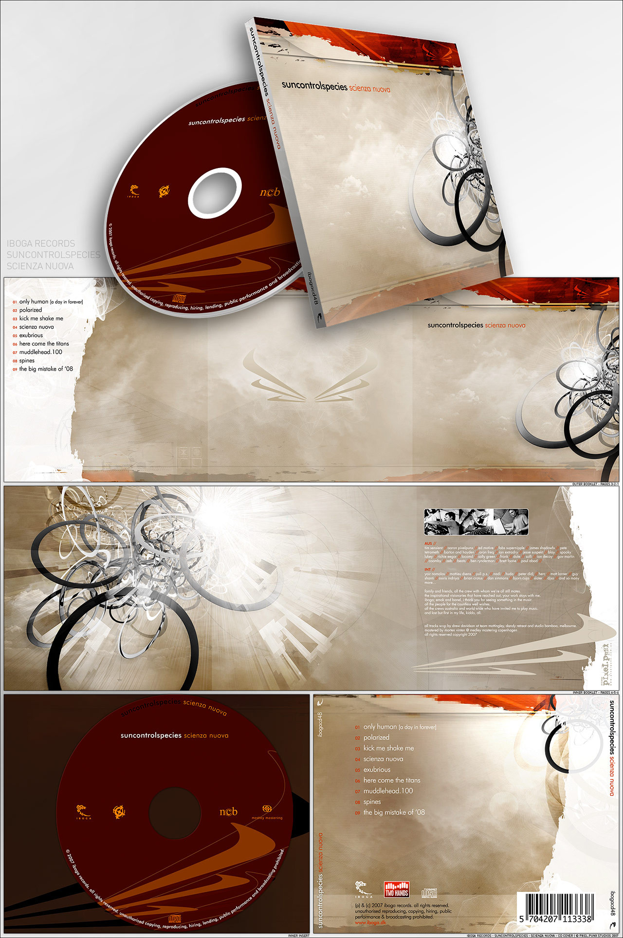
HOME | DD
Published: 2007-05-25 13:18:44 +0000 UTC; Views: 23086; Favourites: 398; Downloads: 250
Redirect to original
Description
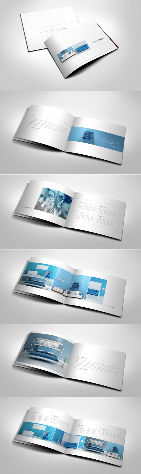
Noa Studios Cover design,Order at [link] !
Dedicated to =sunsE
Thanks to *ether
Edited on comments from:
~pitters
~verticalpoint
*SuperFex
~RazyBerry
~mesme8
~pedribeiro
`depthskins
Related content


Comments: 318
")

 (Smile)")

aoiugh.. nice. nice niceeeee
but i prefer paper as the material of the cover, more suitable with the design of the cover.
just an opinion though..
👍: 0 ⏩: 1
PascalPixel In reply to onz87 [2007-11-27 10:23:33 +0000 UTC]
you mean you have a single-paper holder?
👍: 0 ⏩: 1
not like that.. erm.. hard to explain...
👍: 0 ⏩: 1
")


Oh that does look refreshing. A good design
👍: 0 ⏩: 1

Thats awesome! 
👍: 0 ⏩: 1
PascalPixel In reply to yorkey-sa [2007-11-27 10:24:30 +0000 UTC]
thanks! you have a stylish avatar btw
👍: 0 ⏩: 0


dAmn! I love the way you do your designs.. great work.. how i could learn much from your designs..
👍: 0 ⏩: 1
hi! sorry, been busy.. it's just now that's i've logged on.. you'll send me the psd of this one? whoa! I'm truly honored! thank you!... hmm... my email?
👍: 0 ⏩: 1
oh! thanks!!! gonna check it out now...
👍: 0 ⏩: 0


saw this at konvulse , really nice work bro
love it
👍: 0 ⏩: 1
PascalPixel In reply to FlowisKing [2007-08-15 14:30:10 +0000 UTC]
hey thanks, i'm still trying to get into konvulse :/
👍: 0 ⏩: 1
no problem, ive been there , not anemore tho
goodluck bro
👍: 0 ⏩: 0

REALLY REALLY NICE. the colors are great and the retro theme is awesome. only one little down side(but not really much of a problem) the white text(on the bottom-left pic)is a little hard to read behind that light tan color.(I'm talking about the copyright...ect.)but this is a very little error but you should keep it in mind on future projects.  (Wink)")

👍: 0 ⏩: 1
PascalPixel In reply to koshic [2007-08-27 18:59:44 +0000 UTC]
thanks!! yeah but if i make it prolly white it would look weird right now
👍: 0 ⏩: 1
maybe but a stroke on it or maybe a shadow...
👍: 0 ⏩: 1


cool!
where to find that wood background ?

👍: 0 ⏩: 1

| Next =>