HOME | DD
 PoorDesigners — AMX_SLEEPLESS DRIVE_CD_ARTWORK
by-nc-nd
PoorDesigners — AMX_SLEEPLESS DRIVE_CD_ARTWORK
by-nc-nd
Published: 2007-01-12 13:36:18 +0000 UTC; Views: 3523; Favourites: 35; Downloads: 70
Redirect to original
Description
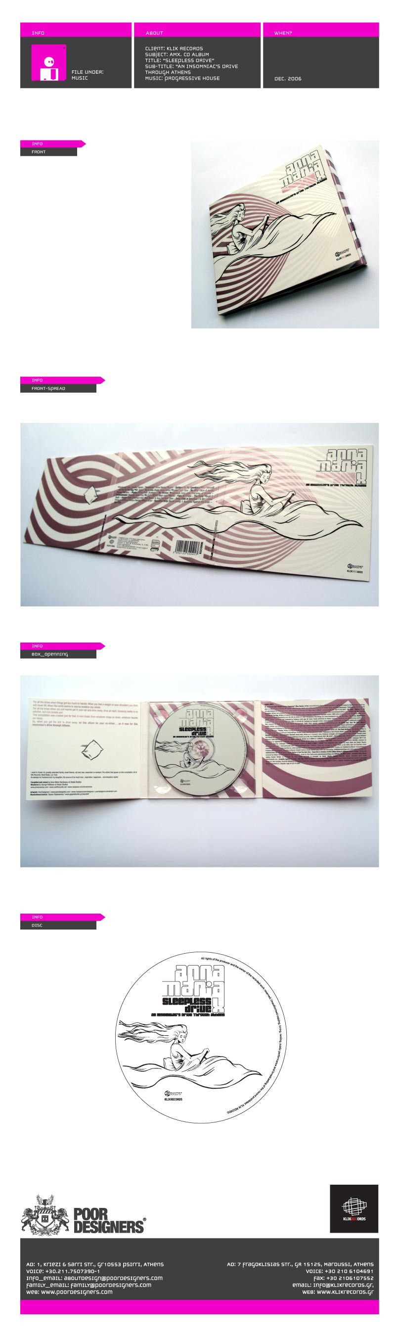
CD cover. AMX_sleepless drive_dec.2006Progressive house .gr>>illustration artwork by our talented family member
originally designed with a different, brighter metallic pantone, but shit happens in the printhouse...
result is decent though, so...
 (Smile)")
Related content


Comments: 28


 (Wink)")


mertsi bokou bokou..
76.
👍: 0 ⏩: 1


Great design, you can say it flows, also the metalic color along with the varnish creates transparencies and tones that enhances it a lot.
And *t-drom 's illustration is perfect.
👍: 0 ⏩: 1
thanks for the comment i agree for the varnish it really ads up to the creative work and to the object's (cd) appearance, and if only the color pantone wasn't messed up by the printhouse, it would be more alive...
👍: 0 ⏩: 1


Wonderful. I love the consistency throughout this. Very flowy.
👍: 0 ⏩: 1
thanks very much man...
'though there was a fuck up in color, in the printing process, it came allright...
👍: 0 ⏩: 0


")