HOME | DD
 PastryJournal — Formal picture

Published: 2016-04-17 05:25:03 +0000 UTC; Views: 344; Favourites: 15; Downloads: 2
Redirect to original
Description
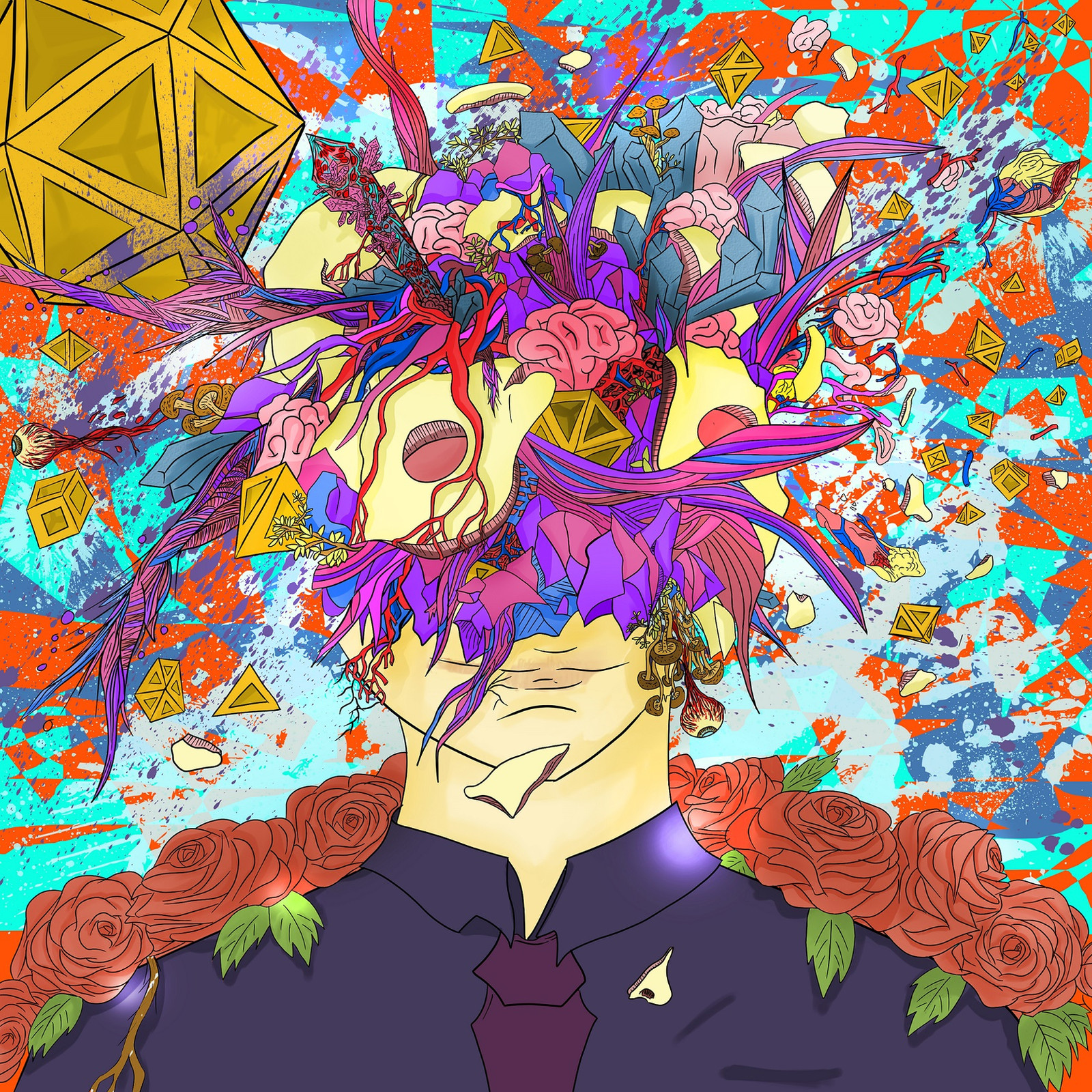
not a formal picturewearing a nice suit will make you look good
that's only that
Related content
Comments: 13

Nice work! I really love the huge amount of details and used colors! Those golden cubes and pyramides flyin' around really make it look really deep, just like the concept of the brain flowing out of the head. It shows you really like to scribble around and paint! Also you've chosen shapes and colors very well in that pic, they fit together perfectly! All the sharp shapes do mix and look very agressive, supported by the colors, 'cause they're mostly containing red.
What I don't like is the traditional manga or anime style, but that's only some personal opinion, I think it's mainly concluded by the way you did draw the head and the fact you're usin' classical anime symbols like crystals, roses, etc. Also I think you could have used deeper lights and shadows, they're a lil bit too unimpressive, ether u did draw em almost everywhere, the roses for example first look like they're only one color, but on a second look u see that they got light and shadows, but they're too light to notice them. But anyway- respect for your work!
👍: 0 ⏩: 1

nuuuu dem i felt guilty from your comment
in your own preference what caused the manga style art
the color blocking? or the thick line art?
pls do tell if you get link to works that suite better with this concept pls link example if okay
I will also study that
thank you for one true comment
👍: 0 ⏩: 1

I edited the comment and added more info. And pastryjournal.deviantart.com/a… for example does not look that much anime-like. Keep up that dope work!
👍: 0 ⏩: 1

lol thats a mask the one skinned the face ...I see so that means its not really by the way the coloring or line art was done but rather by the objects that caused it to make childish? okay thanks for perspective on that!
👍: 0 ⏩: 1

Wow, like this picture I am "Mind blown". Nice work, it has a combination of graphiti and abstract art style.
👍: 0 ⏩: 0

Hullo there from !! The Clown came knocking...
I absolutely love the surreal elements you have portrayed in this. And although this is a jamboree of colors, the choice and placement of them makes them a part of the unique whole. I especially like the usage of the same color palette to portray the boy's skin and elements covering the place where his eyes should have been and the left side of his head. Almost gives him a ghostly/buggy look. And yet much of it is done with a careless demeanor that keeps the jagged surrealism of this alive. However, there are a few elements that seem a bit too overdone. Like the splashing of colors in the background. The elements that broke out from the core and floating about are each unique pieces that you have chosen to show as detached from the core and not blasted out from it, for if they did they wouldn't have been as unique wholes as they seem here. So, the splashes of colors in the background seems a bit out of place and creates a jarred effect. I strongly feel that a piece where you are using elements to create that splashing effect itself, you don't need your background pastels to redo it. The normal mix of colors that the background would have created with the blending of the uneven shapes will serve your purpose better and create a strong foreground for your elements. Thereby, hold your audience in the piece.
But except for that minor flaw this piece is absolutely stunning. Also I would like to add that the usage of Fauna (roses, mushrooms, fungi) in the painting gives a strange liveliness to the piece. Awesome work.
Smile.
👍: 0 ⏩: 1

YES! constructive comment thank you for this!
I guess I failed to show wildness and insanity in the background
I will keep in mind the things you said about exaggerated bg's
thank you Sir !
👍: 0 ⏩: 1


