HOME | DD
 patchwork536 — Comparison

Published: 2009-12-29 23:05:42 +0000 UTC; Views: 207; Favourites: 0; Downloads: 10
Redirect to original
Description
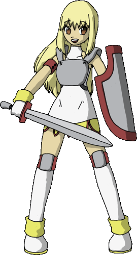
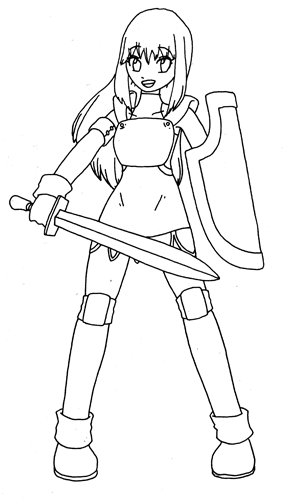
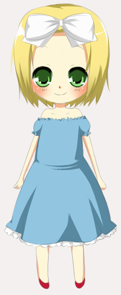
Which one do you prefer ?Related content


Comments: 2

Second, the more saturated colours add interest and focus to the face, as far as character design, plus the pose is much better and flows more.
👍: 0 ⏩: 1

Thanks a lot, I think second is better but I want to be sure.
Thanks again.
👍: 0 ⏩: 0