HOME | DD
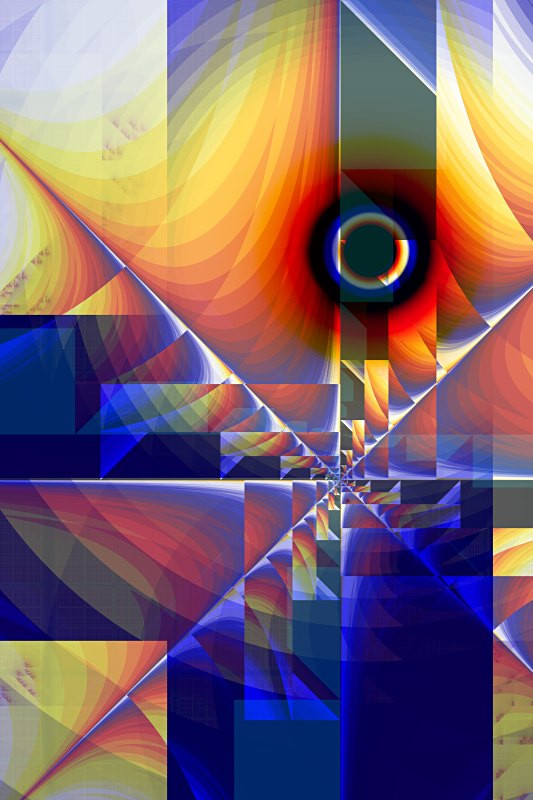
 PatGoltz — Rapinsky
Published: 2006-04-30 13:28:53 +0000 UTC; Views: 1490; Favourites: 27; Downloads: 87
Redirect to original
Description
This is a new image. Made in Ultrafractal.Featured in 's journal here: [link]
Thank you!
Related content


Comments: 44

Hi, sis,
I wanted to let you know that I am featuring this work in my latest journal.
[link]
L&H,
Anj
👍: 0 ⏩: 1

Wow! Thanks!
As a result, apparently, two people have faved it so far. I appreciate it!
H&L,
Sis Pat
👍: 0 ⏩: 0

The more I gaze at it the more I like this work. Choice of colors and the technique to merge several type of geometries is amazing.
I feel it is trying convey something to me but not able to put it in words ..
Some change in the rather calm life which is piercing hard into into trying to become a part of it but the resistance is causing wild events to happen around. Colors signify a mix of emotions in those events.
 (Smile)")
👍: 0 ⏩: 1
What a neat interpretation! Thanks for your awesome comment!
👍: 0 ⏩: 1
You are most welcome Pat
👍: 0 ⏩: 0

A beautiful example of assymetrical artwork that still retains balance and shows an interesting display of geometry.
👍: 0 ⏩: 1
Thank you, and thanks for the fav! I worked hard on the composition of this one.
👍: 0 ⏩: 0


Nifty 'geo-fractal" vibe and image composition - me like!
👍: 0 ⏩: 1
Thank you! It's certainly one of my favorites.
👍: 0 ⏩: 0

This is totally stunning Pat, an absolutely gorgeous piece of work 

👍: 0 ⏩: 1
Thank you so much! Thanks for the fav! I am very pleased with it, and intend to do some more like this.
👍: 0 ⏩: 1
It's so beautiful, and you are always very welcome
👍: 0 ⏩: 0

Its a very well composed abstract piece, reminds me a little of Mondrians work with the vivid primary colours and the regimented shapes. Nice work.
👍: 0 ⏩: 1
I see what you mean. Thanks! I will make more in that general style, when I get a chance. Thanks for visiting!
👍: 0 ⏩: 1
It would be interesting to see more in that style, and you needent thank me for commenting, its a pleasure to comment on such beautiful artwork. You are most welcome
👍: 0 ⏩: 1
Thanks! I fully intend to make more in that style. It's something I wanted to do for a long time, and I'm going to do it again, quite a few times.
👍: 0 ⏩: 0

i luv the colours in this. so abstract and vivid
👍: 0 ⏩: 1
Thanks very much!
👍: 0 ⏩: 0

this is just beautiful! The colors are wonderful and the circle brings it all together!!
👍: 0 ⏩: 1
Thank you so much, and thanks for the fav! This is one I am especially fond of. I will be making more in the same idea.
👍: 0 ⏩: 0


Thank you! That's a neat idea.
👍: 0 ⏩: 0

sTUNNING.. I really thought it was a painting.. I love the name
👍: 0 ⏩: 1
Thank you, and thanks for the fav! I know what you mean about it looking like a painting. I think it does, too.
👍: 0 ⏩: 0


oooo that's really cool. it looks like some sort of modern painting that was all offset.... very artistic. the colours are good too. blue is a great contrast to the gold and orange in it... it relaly makes it stand out and gives it more depth and feeling... great job!
👍: 0 ⏩: 1
Thanks so much! I appreciate the detailed critique, too.
👍: 0 ⏩: 1
you're very welcome ")
👍: 0 ⏩: 0

Very, very nice. Great colors, and a very pleasing shape.
👍: 0 ⏩: 1
Thank you, and thanks for the fav!
👍: 0 ⏩: 0

Simply lovely color gradient and wonderful composition!
👍: 0 ⏩: 1
Thank you and thanks for the fav! This is the one I like the best.
👍: 0 ⏩: 0